I’ve put this page together and plan to keep it up to date with all the sketches I do for my vizzes and how they look compared to the final version. It’s really interesting to see how things change from one to the other and also to see where I have had several iterative sketches to get to the final version.
Goat Butter – #GamesNightViz Jun/July 2024
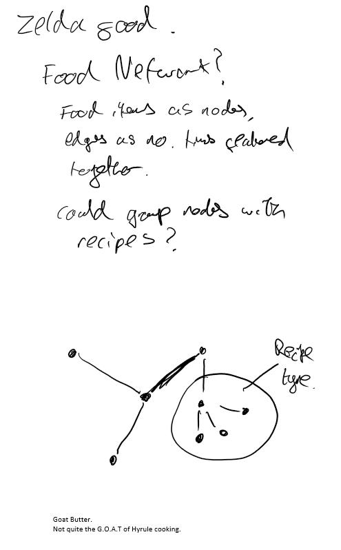
My first #GamesNightViz entry as a co-lead! So had to have a go at it. When I saw the ingredients list I immediately wanted to try a network chart. My sketch shows that originally I was thinking of also putting in some grouping around maybe recipe types, but in the end I kept it simple and stuck with just having the Network Chart on its own.
Makeover Monday Week 2024 – 7
I couldn’t resist doing this Makeover Monday as it meant I could re-use my relaxing octopus viz! My sketch initially had a waffle chart showing the 3 in 4 stat, and when I was building it struck me that using a pie chart a la Pacman could look like it was eating the octopus! And that’s what I went with! I did keep the pleading text bubbles!
Americans are happy to eat Octopus
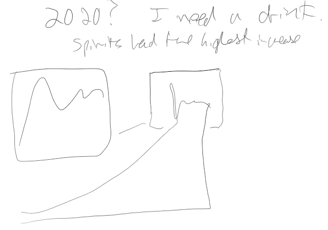
Data+Movies – The Worst Winners
This one broadly worked out in line with my sketch – dot plot along the top, Dynamic pop-up when you select from the scatter in the main viz.
The main change was switching the year to be on the X-axis, which was pointed out by Serena Purslow – and made a lot of sense! A good example of why to ask for feedback, as you may just not see something obvious.
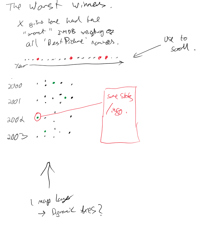

The Worst Winners – Data+Movies
Everton and Plymouth Argyle
I had an idea of a split viz showing Everton’s 22/23 season vs Argyle’s as they were so different.
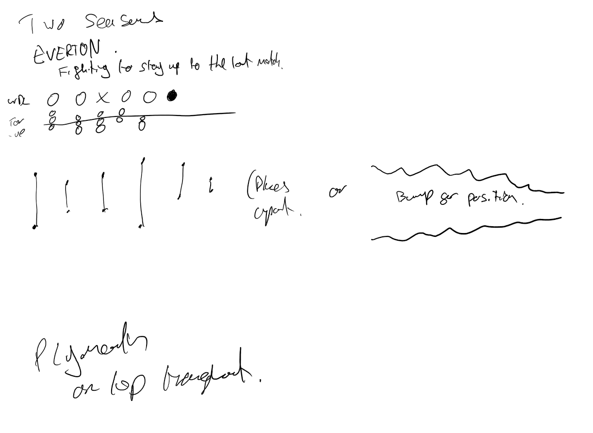
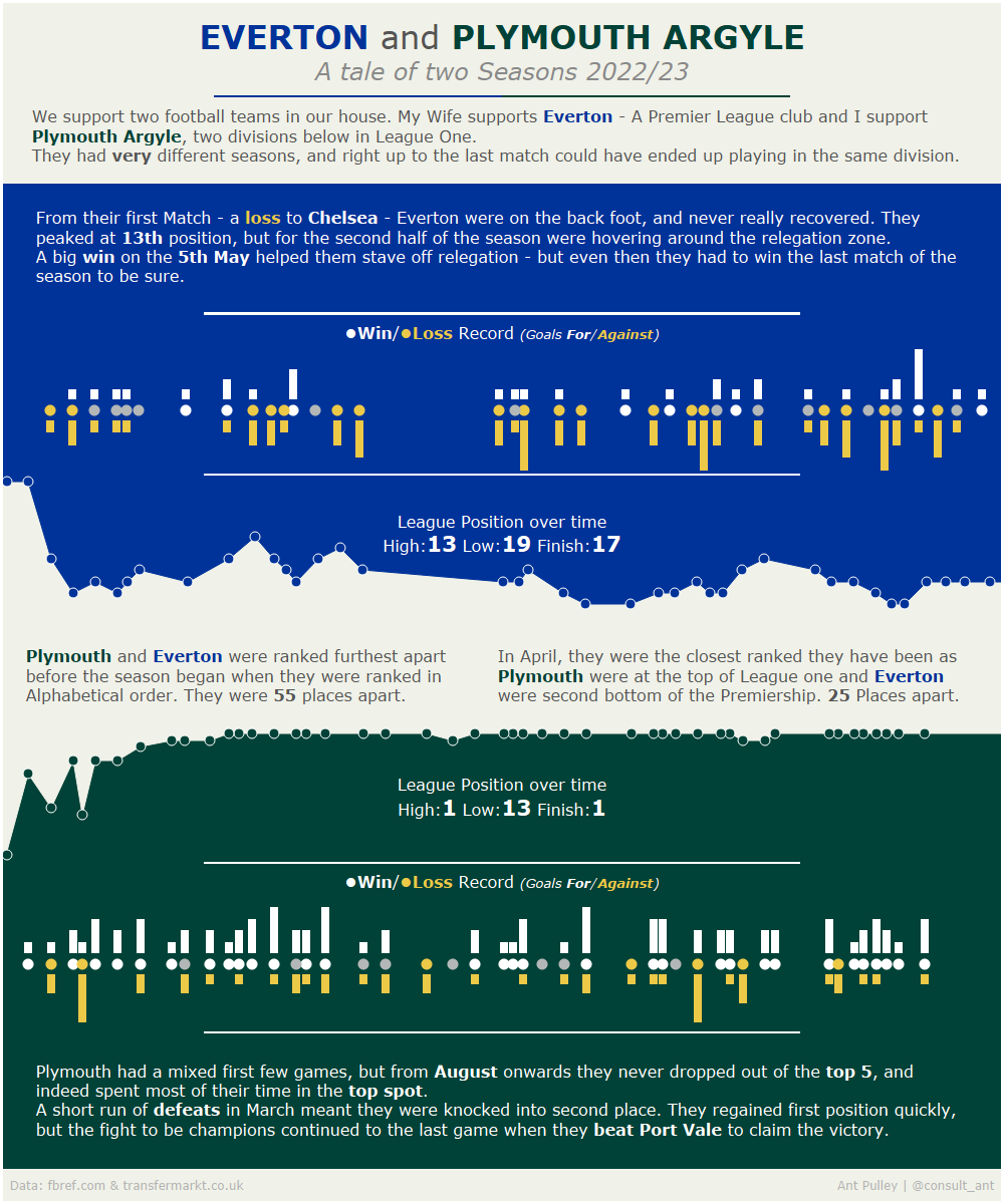
I had a few ideas of how to split the viz up – either using some form of dub-bell plot or a bump/line chart. And then would have a viz showing the game results and scores that line up with the position chart. I ended up going with the line chart as it meant I could write some commentary in between!
6 Months of Feeding
I had an idea for this that I wanted to show months as vertical ‘Bands’ and have charts in each band reflecting that month – with an overall line chart that ran across them all.
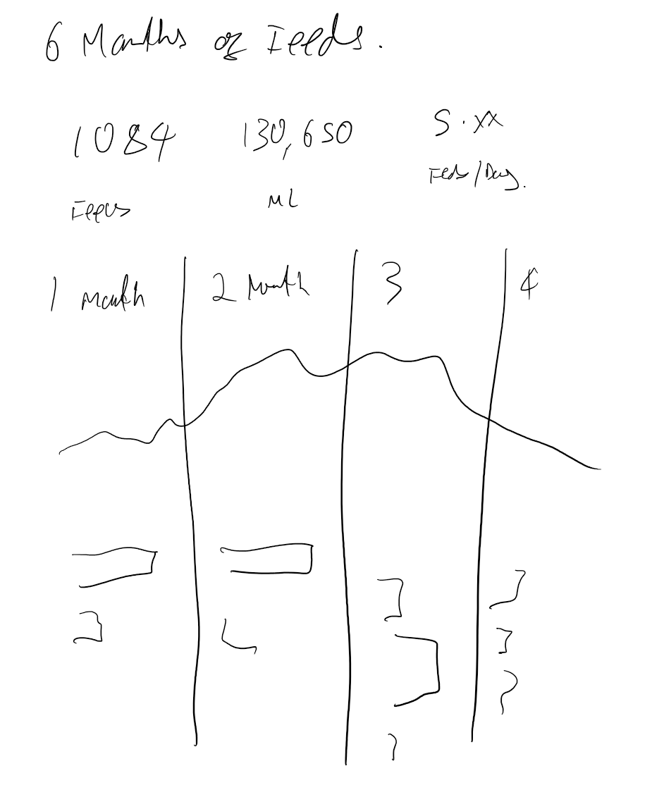
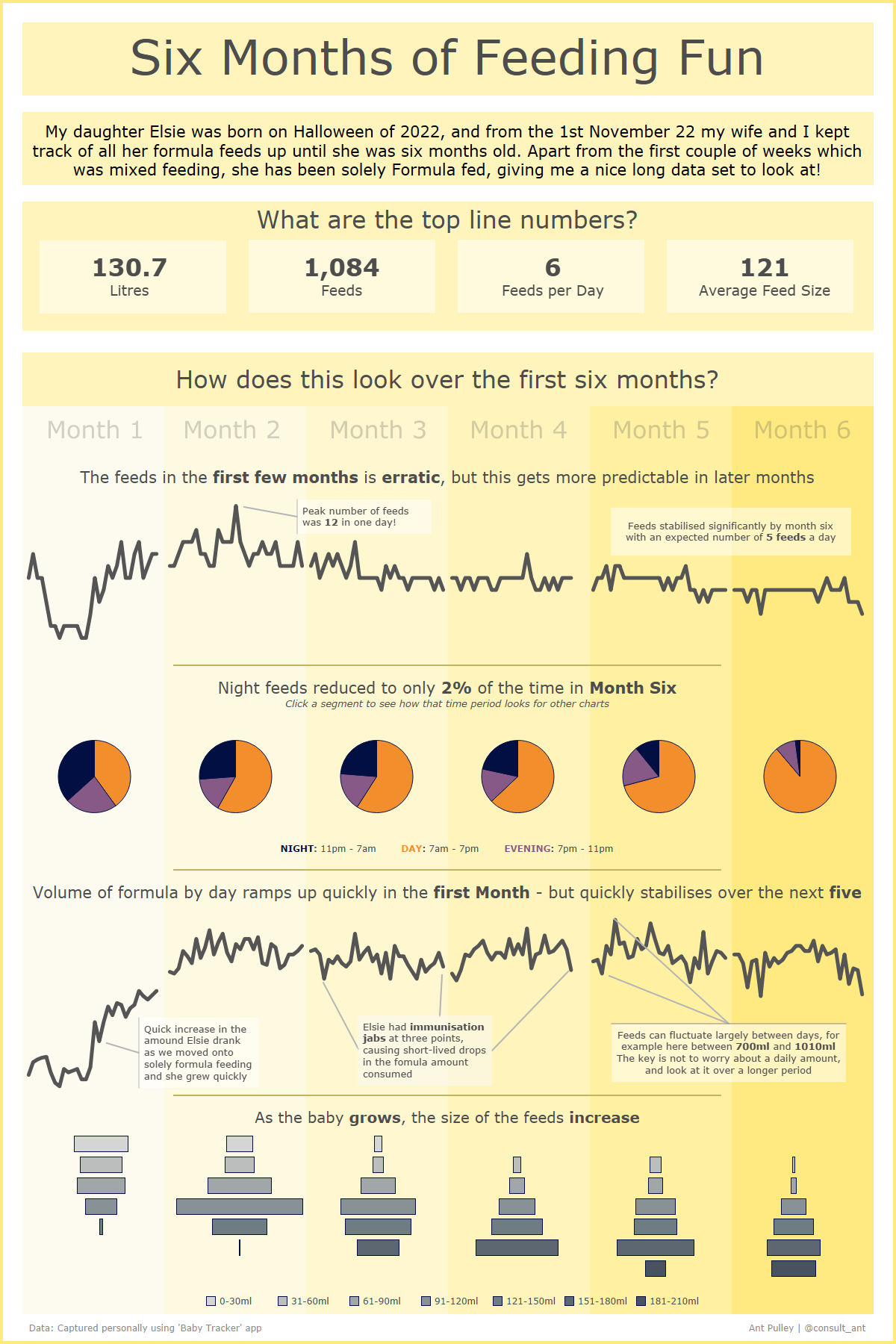
The final viz achieved what I was aiming for – but just with more detail and some extra charts. I decided it looked better to split the line chart over the ‘Bands’ but still feels like it is one continuous time period.
https://public.tableau.com/app/profile/ant.pulley/viz/6MonthsofFeedingFun/ElsieFeeding
100 Public Vizzes
My initial ‘sketch’ of this was very loose, and I was looking at using more number focussed visualisations. Although the idea was still some form of animation:
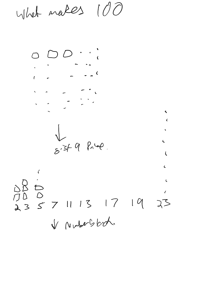


In the end, I took some of the elements in my sketch and then used some other slightly silly elements (surprised?) for the rest of it.
https://public.tableau.com/app/profile/ant.pulley/viz/100PublicVizzes/Funwith100
Lord Of The Rings – #Datafamcon
I’d had the idea of a splash page, and then a few different ideas, with a couple of themes (mostly Ring related!):
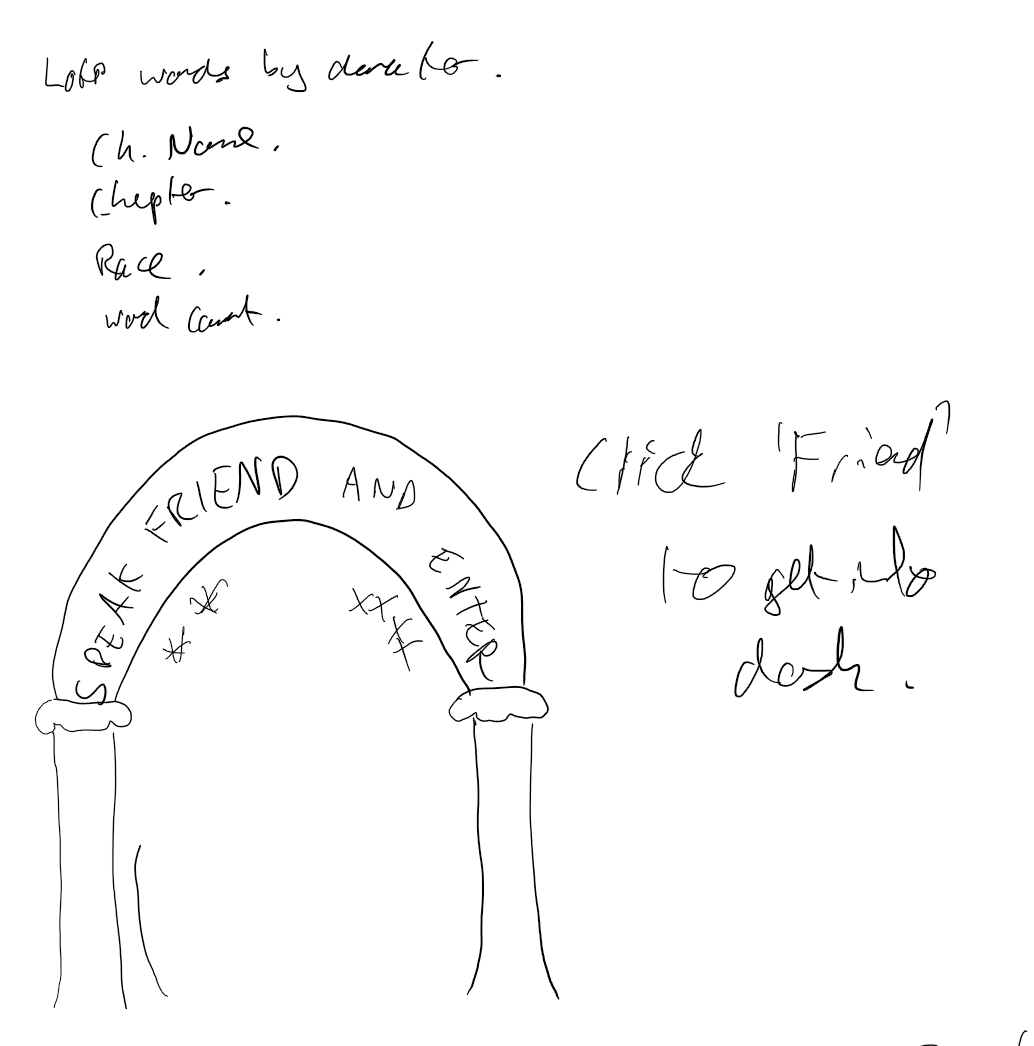
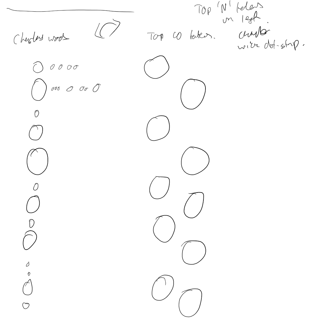
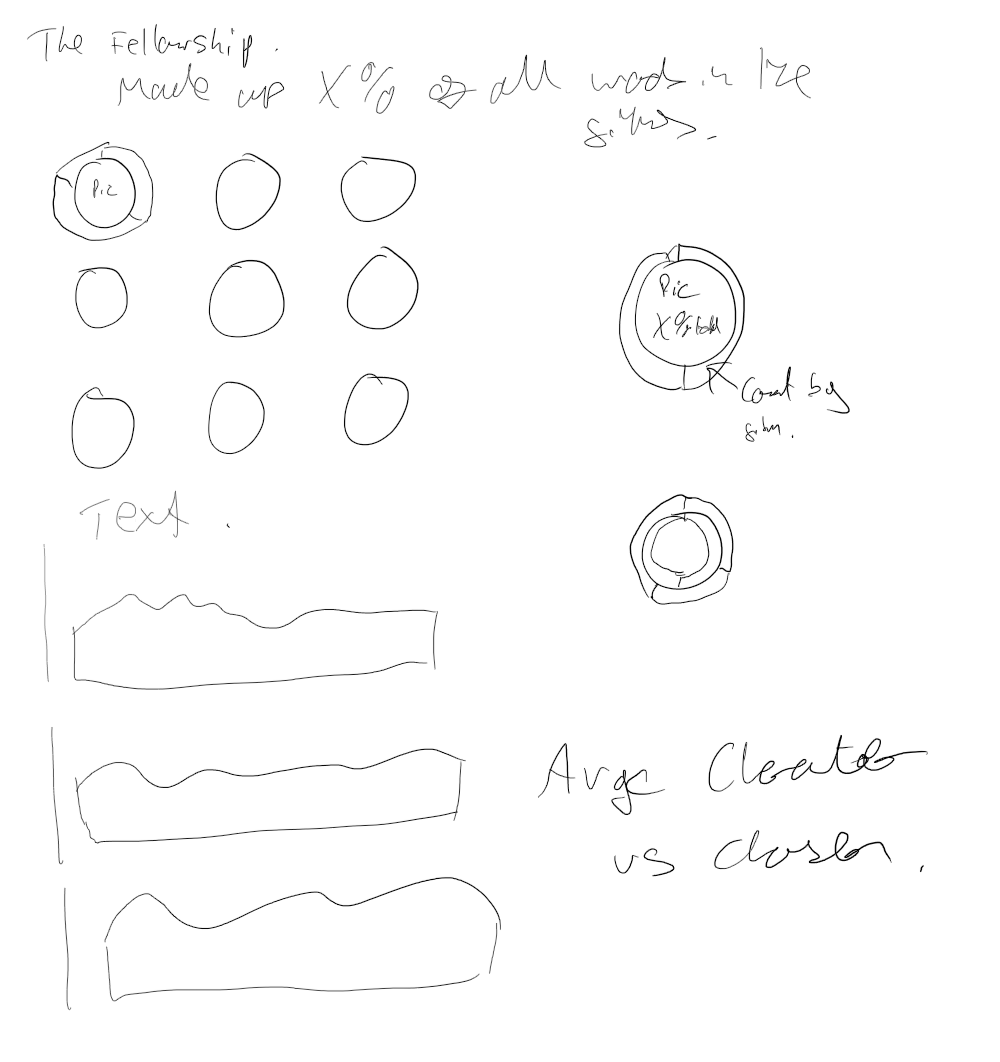


I got the splash page working more or less as drawn, and then had a combination of my sketches end up in the final version.
https://public.tableau.com/app/profile/ant.pulley/viz/LOTRWordsSpoken/Entry
Twitter ’22 Review
I had some notes written and a couple of idea sketches on this one:
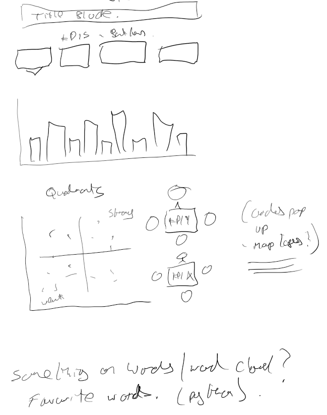
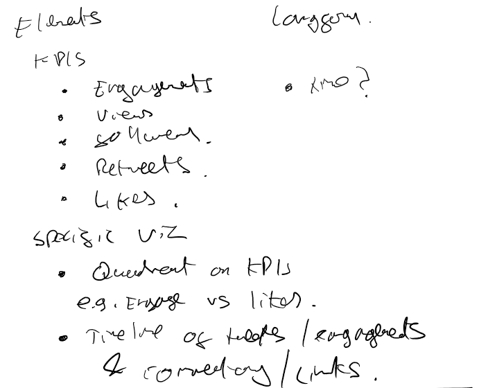

I stuck with the long-form idea and KPI tiles at the top, but the rest of the content changed a fair bit as I decided to go a different way!
https://public.tableau.com/app/profile/ant.pulley/viz/TwitterReview2022-consult_ant/Twitter2022
Tableau Souls
Not really a sketch, more an order of what I was planning on putting on the viz:
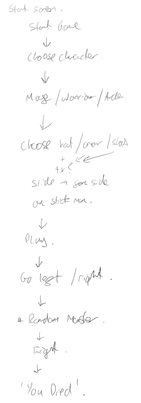
I got most of it in, although originally it was going to be a little more complicated with a left-right option and random monsters!
https://public.tableau.com/app/profile/ant.pulley/viz/TableauSouls/PickCharacter
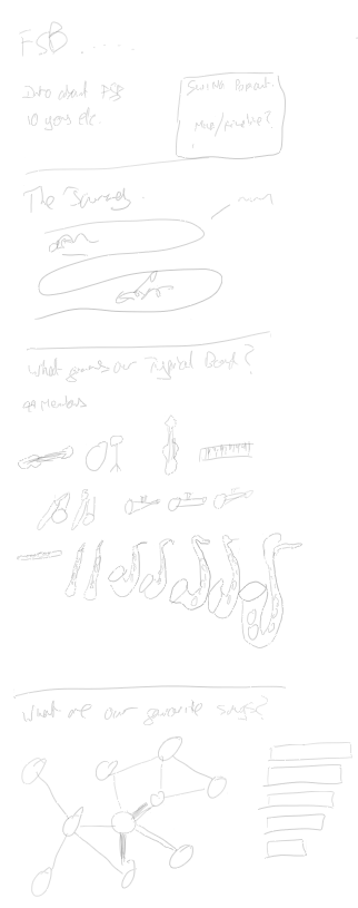
Making Music – Iron Viz 2022
I had a few sketches for this one, trying to work out what charts I might use – settling with a parliament chart as my opener:

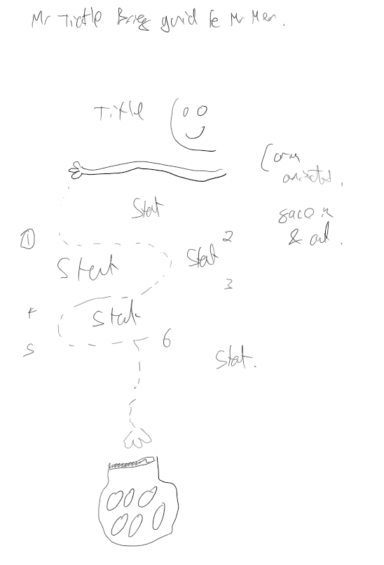
Mr. Tickle
Originally I was going to use Mr. Tickle to introduce some Mr. Men facts, and then I just decided to go with an animated Mr. Tickle!
https://public.tableau.com/app/profile/ant.pulley/viz/Mr_Tickle/MrTickle
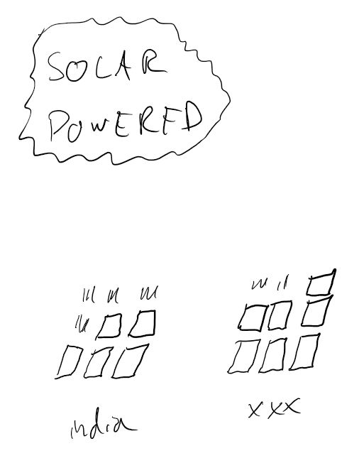
Makeover Monday Week 2021 – 37
I had a fun idea for this week’s solar power viz to use waffle charts styled as solar panels. Here is the sketch vs. Reality:
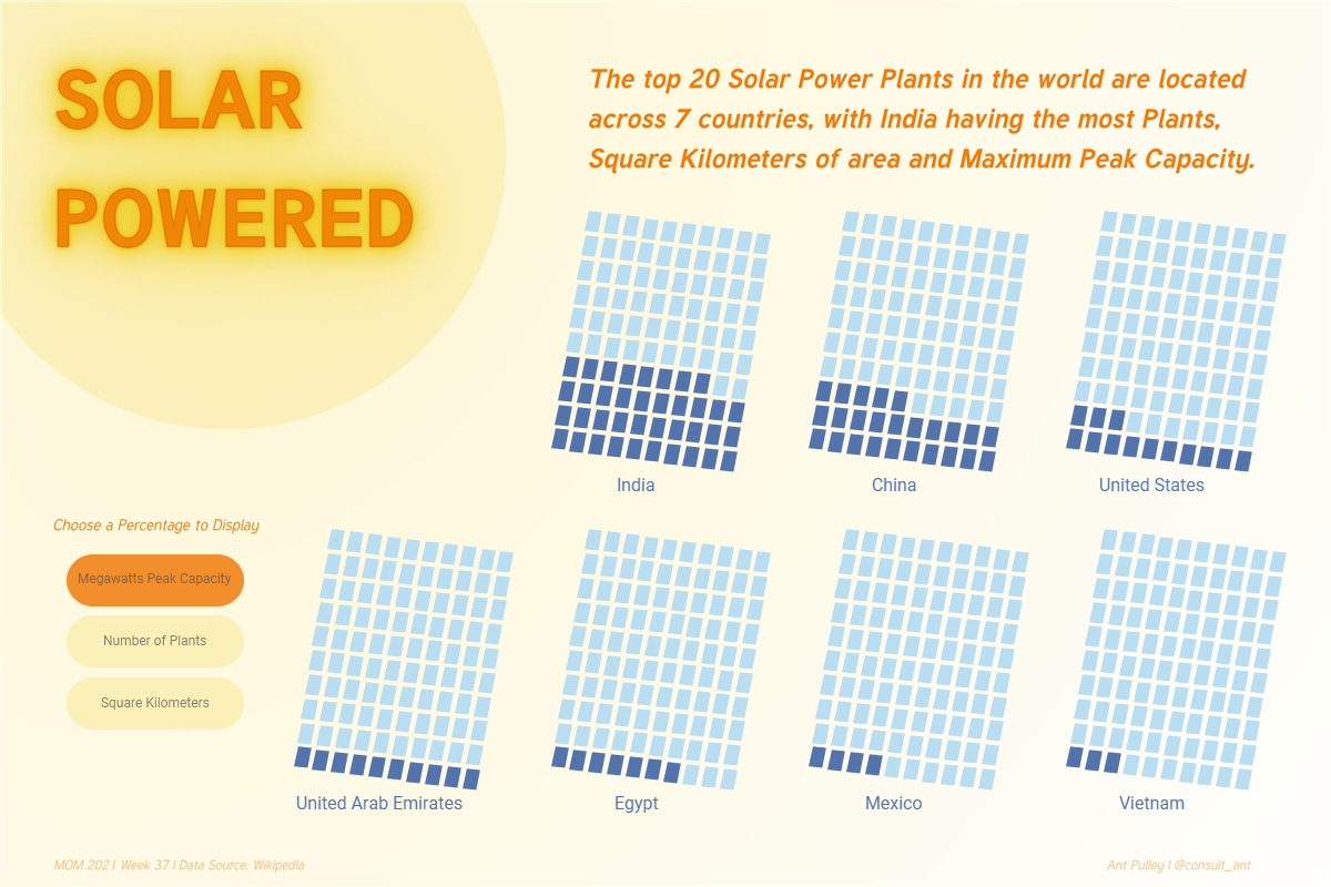
https://public.tableau.com/app/profile/ant.pulley/viz/SolarPowered/SolarPowered
Ronnie O’Sullivan
I had a very basic design and list of stats I wanted to use in this before jumping straight in.

https://public.tableau.com/app/profile/ant.pulley/viz/TheRocket-RonnieOSullivan/RonnieOSullivan
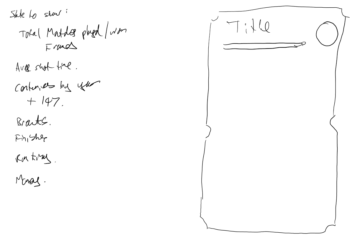
One Year of Tweets
This dashboard started off in a bit more of a traditional direction:
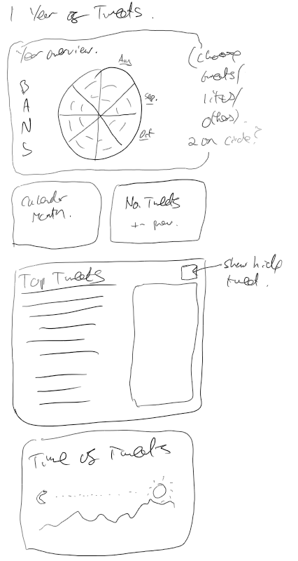
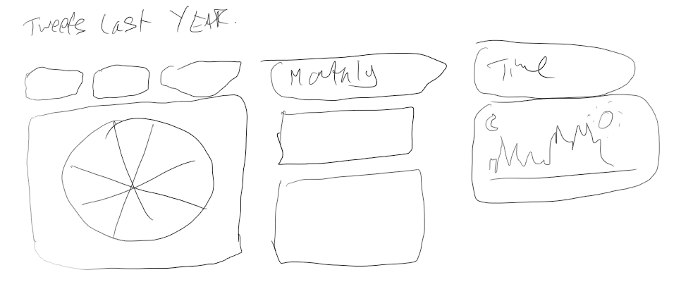
Before I decided to try something a little different and more interactive with the design:
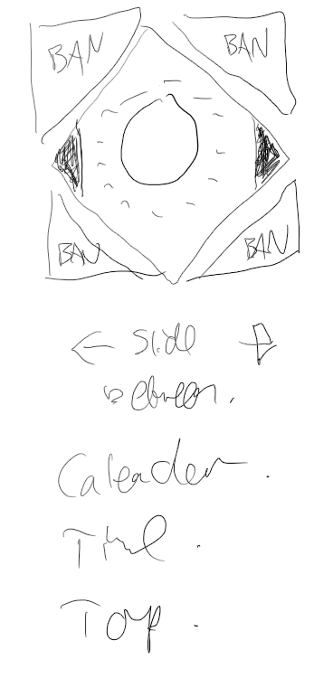
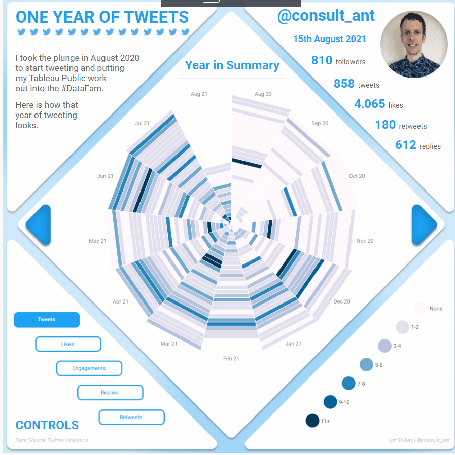
My initial plan had been to Animate between the different views (hence the ‘Slide Between’ comment – but for various reasons I couldn’t get it working. Still very happy with the result!
https://public.tableau.com/app/profile/ant.pulley/viz/OneYearofTweets/OneYearofTweets
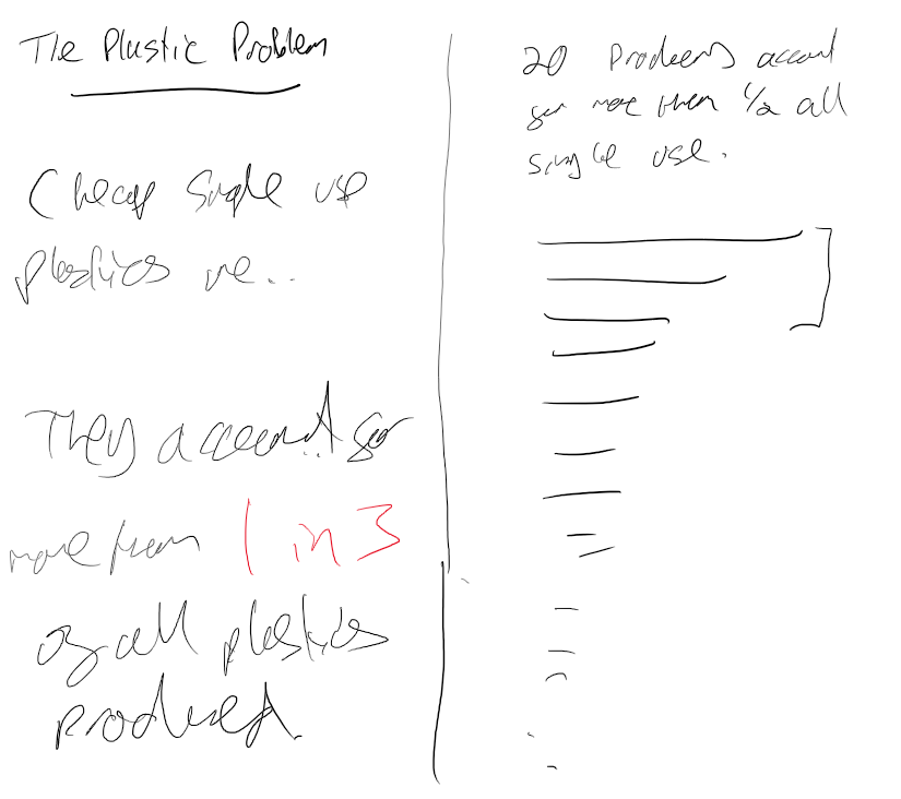
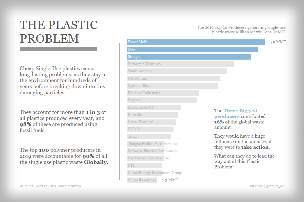
Earth Overshoot Day
I had a few sketches trying to work out how I would show the dataL


And then settled on the below approach before building the viz:

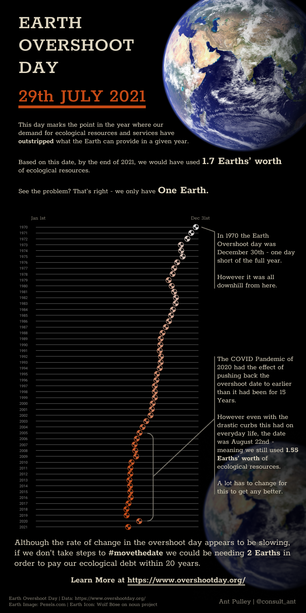
https://public.tableau.com/app/profile/ant.pulley/viz/EarthOvershootDay/EarthOvershootDay
#IronViz 2021
For my Iron Viz entry I had a lot of sketches:

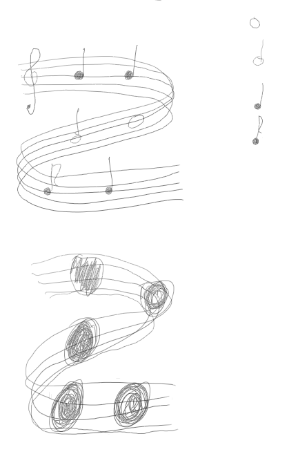
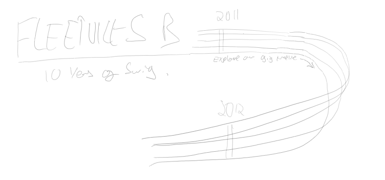
The above iterations show how I was thinking of doing the viz. Starting with blocks of a story, then thinking about how a timeline would look and it growing into forming the musical stave as well.
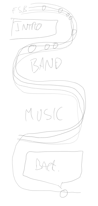
The final sketch had a broadly similar structure to the final viz – the final viz actually having a few more twists and turns in it.
Makeover Monday Week 2021 – 22
This was a straightforward one. I wanted to have the format of text on the left with key information, then a simple sorted bar chart on the right. Kept pretty much to plan, but also included some annotation on the chart for more info.
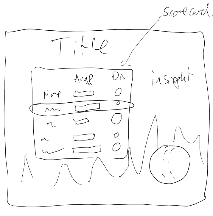
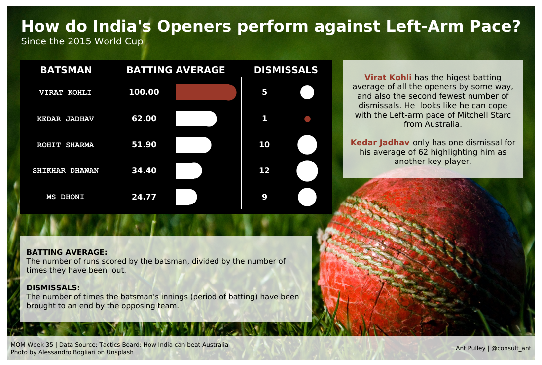
Makeover Monday Week 2020 – 35
I had a couple of initial sketches – a simple scatter plot, and then some thoughts around using an actual cricket pitch.
In the end I went with a scorecard approach, with the aim of having an image in the background. Managed to keep pretty close to the sketch!
Makeover Monday Week 2020 – 39
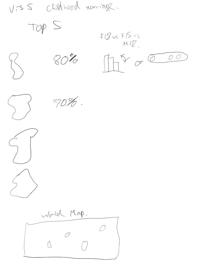
For this makeover Monday I had the idea of showing small multiple maps, a key metric and a small multiple chart of some description. I had also planned to put a world map in the bottom. In the end I decided to keep it simple and exclude the world map and was pleased with how clean it ended up.
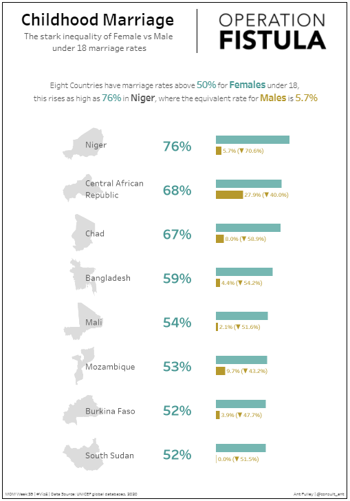
Makeover Monday Week 2020 – 46
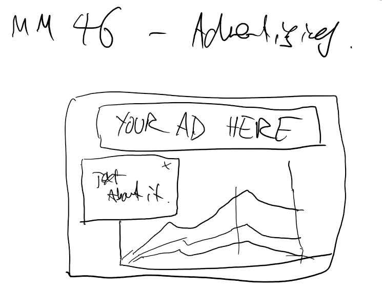
My idea for this data set was to have it look like advertising pop ups you used to get a lot in browsers. I’d also just discovered Figma so was having fun playing round with some basic shapes and fonts in that. The pop-up giving the commentary and a line chart underneath. Managed to keep it fairly close to the sketch on this one!

Makeover Monday Week 2020 – 47
A few initial sketches for this one, thinking about doing a ‘difference’ chart of some sort for each time period, but then decided to keep simple with a line chart.

The final sketch was more about layout and I wanted to try something with the title on the left and chart on the right.

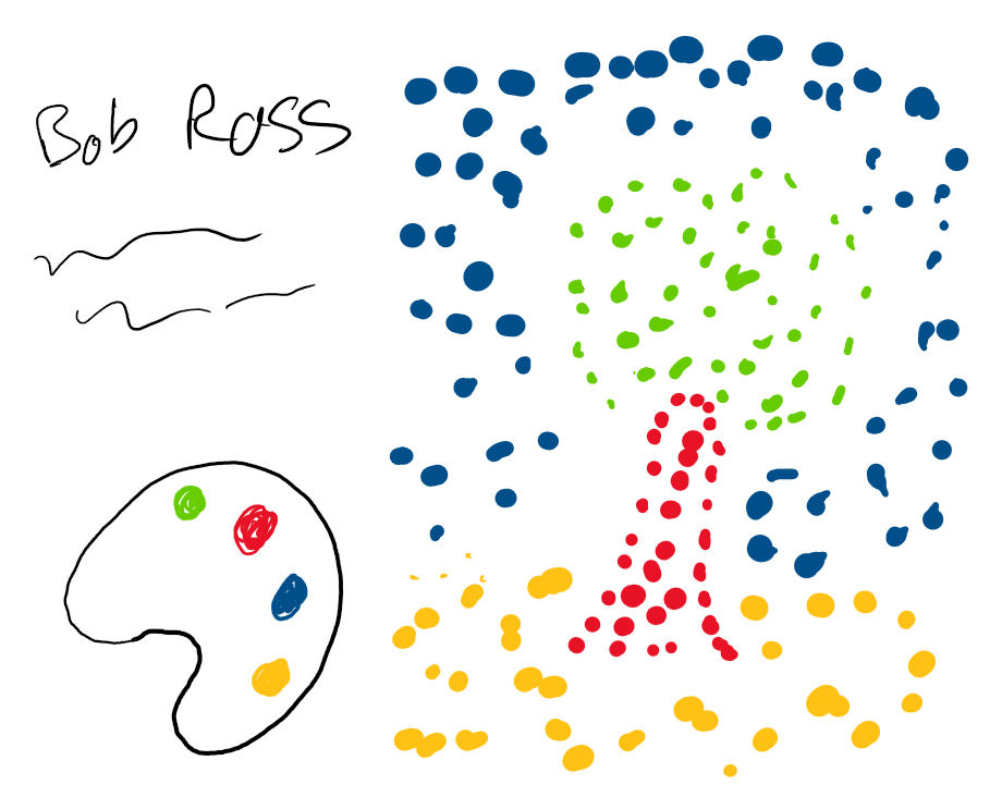
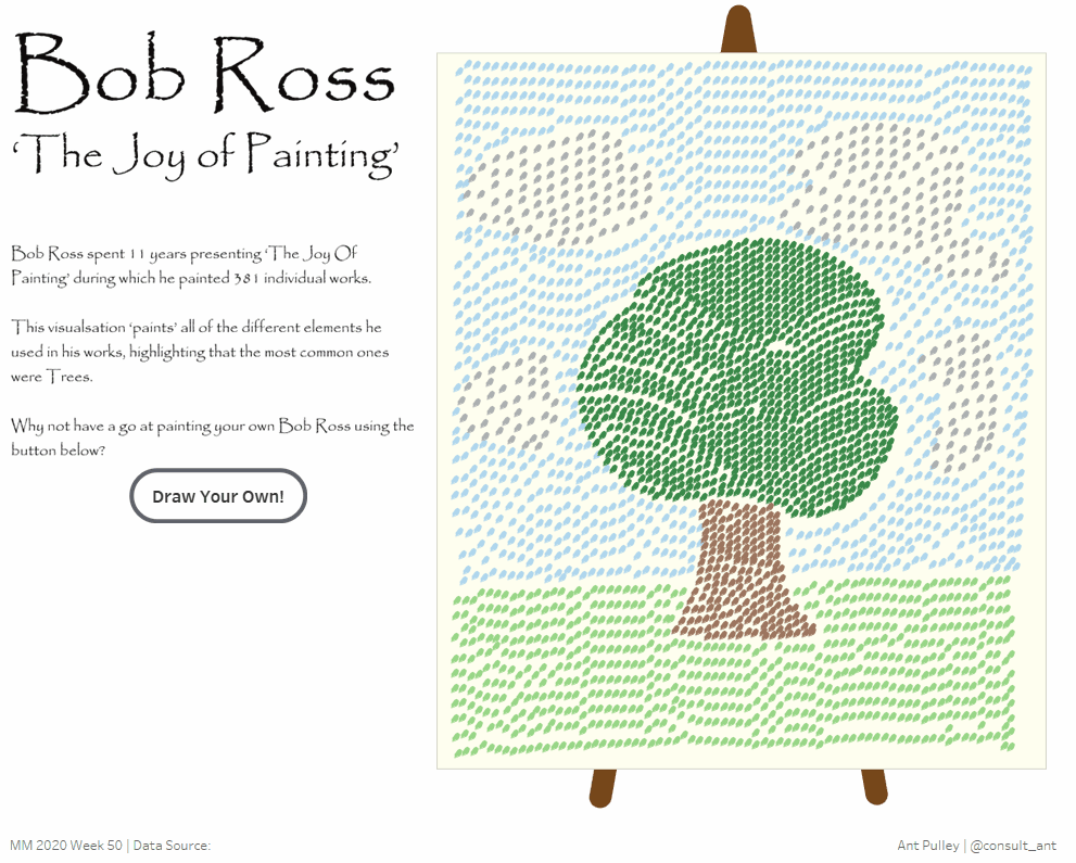
Makeover Monday Week 2020 – 50
My sketch for week 2020-50 pretty much ended up as the ‘Front’ page of my ‘Draw Your Own’ Bob Ross when I ended up getting carried away with parameter actions! The only thing that didn’t make it across was the ‘Paint Pallete’ style legend
Makeover Monday Week 2021 – 2
For week 2 2021, I sketched out something to do with Maps as I wanted to try out Map Layers. The idea was having curvy lines pointing to key stats and info about the top few countries. Really please with this one and how it turned out, mostly kept to plan with mainly formatting amends.

Makeover Monday Week 2021 – 4
I kept this one quite clean visually – and initially sketched out some BANs and a couple of bar charts offset from each other. In the final version I decided it felt a better composition having the charts next to each other given the amount of text I was using.

Makeover Monday Week 2021 – 5
This week was a good example where I scaled back from my initial sketch. I wanted to do an animated story where I would move through various charts and end up with a picture of a windmill to denote wind power. In the end I didn’t have much time that week so settled on a simple story following 3 charts – all designed native in Tableau.


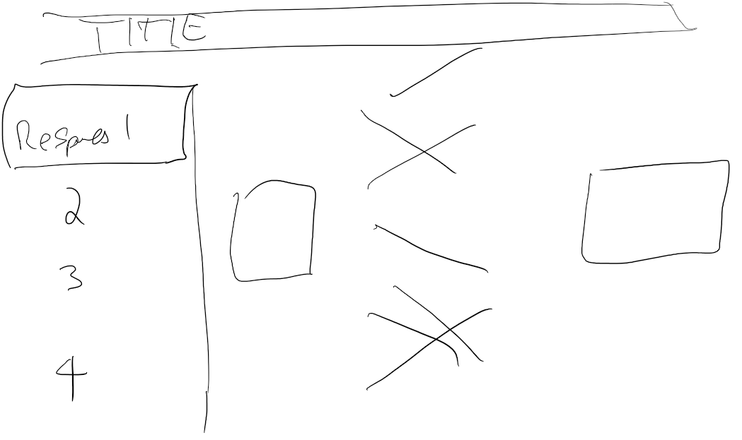
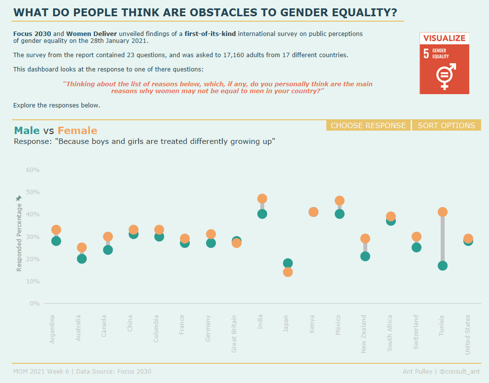
Makeover Monday Week 2021 – 6
I’ll be honest – I’m not 100% sure what I was aiming for with this sketch, and pretty much went freestyle in Tableau. Happy with the result and the functionality it provided.
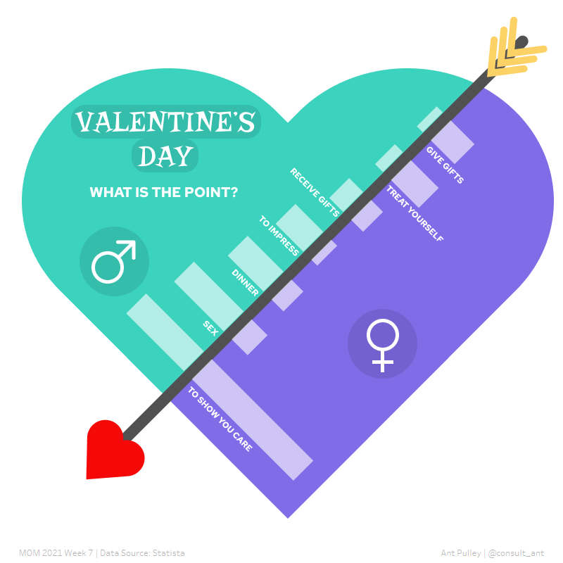
Makeover Monday Week 2021 – 7
This is one of my favourite ones and I kept to the sketch pretty well. Most of this was done in Figma with the bar chart built as polygons in Tableau. The only real change from the sketch was the decision to keep all the text inside of the heart.
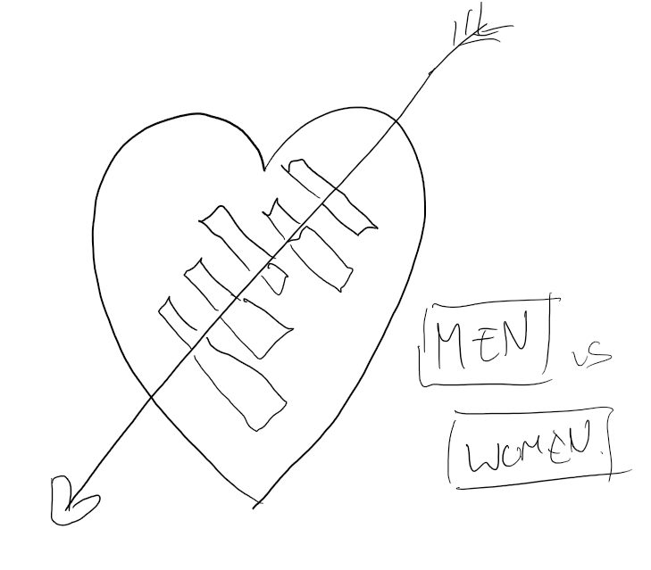
I thought it would also be amusing to include the below which was part of my sketch. Believe it or not this was me trying to work out how to rotate a bar chart 45 degrees and draw the polygons. I’m sure it made sense at the time!
Makeover Monday Week 2021 – 9
I sketched out the shape of this viz, knowing I would probably put a line chart on the right and an image in the background.

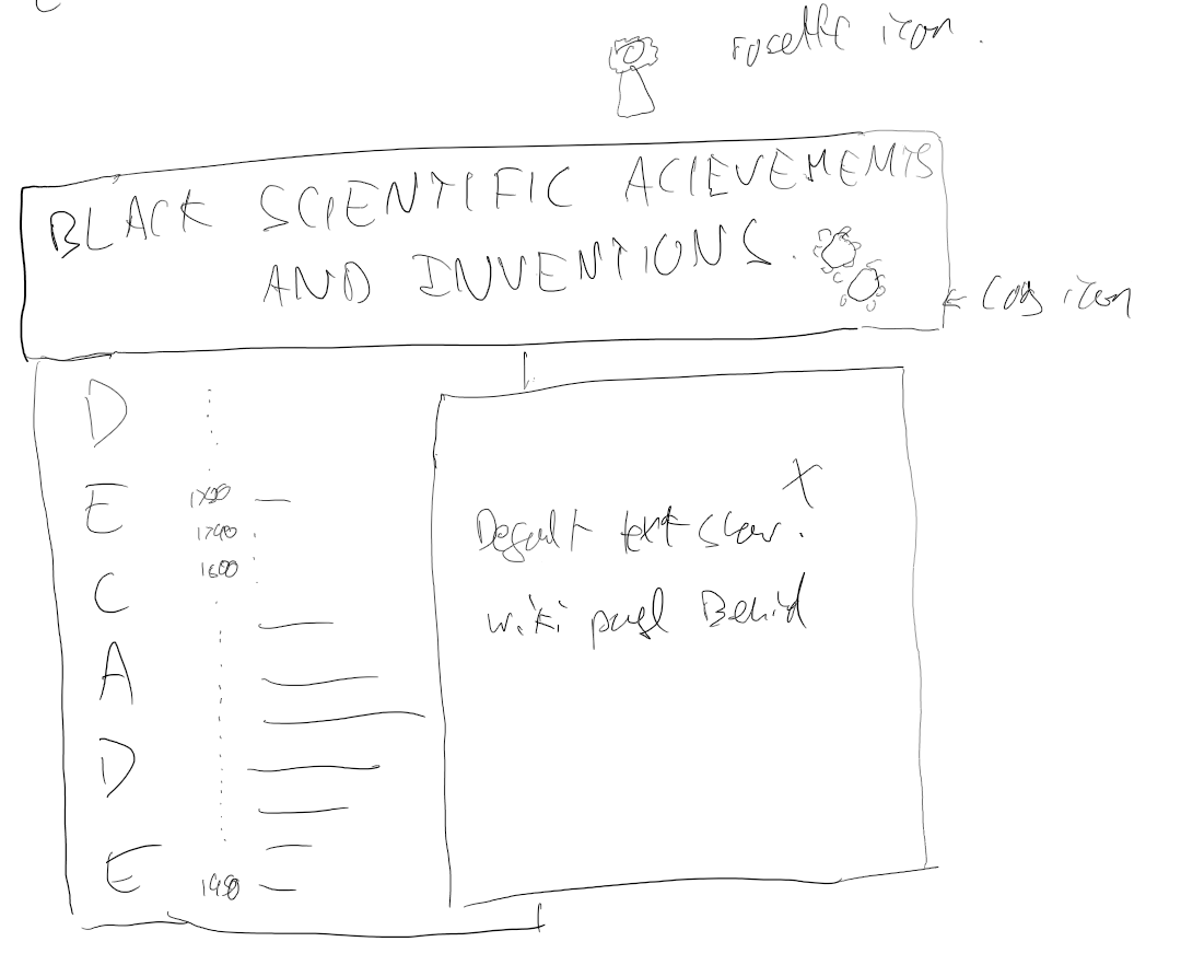
Diversity In Data Feb – Black Scientific Achievements and Inventions
I had a few sketches for this one, but all heading along the same lines and building on each other. ‘Blah Blah’ is my ‘Lorem Ipsum’!

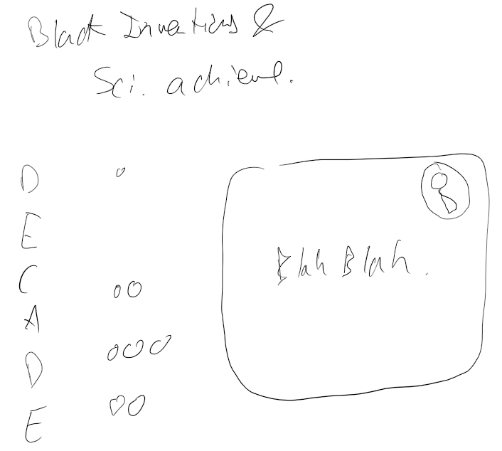
The final sketch was just sorting out the layout of the dashboard.
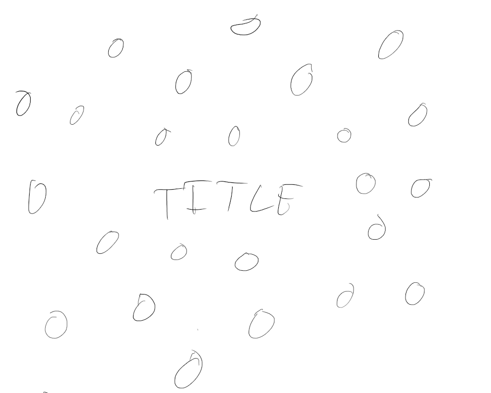
Diversity In Data Feb – Notable Black Achievements
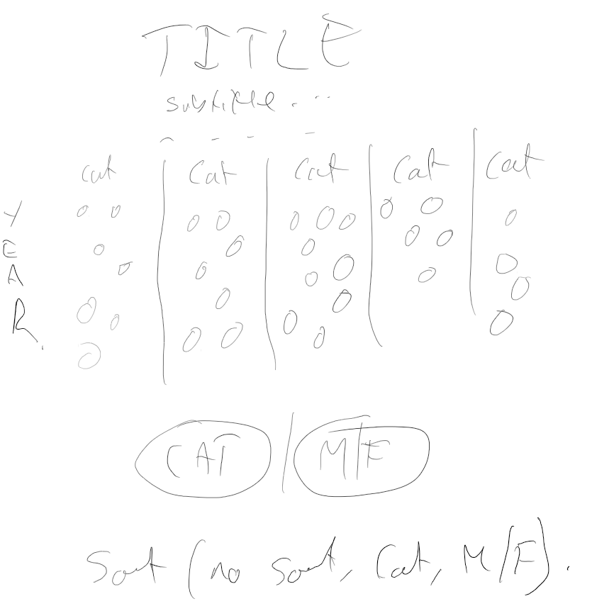
For this Diversity in data data set, I was initially thinking of having a title in the middle and all the achievements scattered around it.
In the end I went for a more interactive and animated approach which closely mirrored my second sketch.

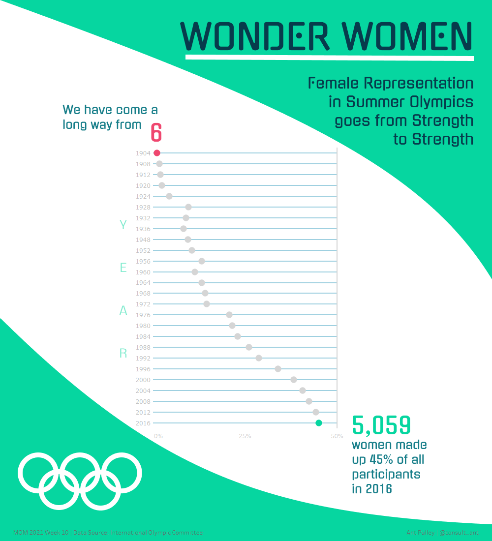
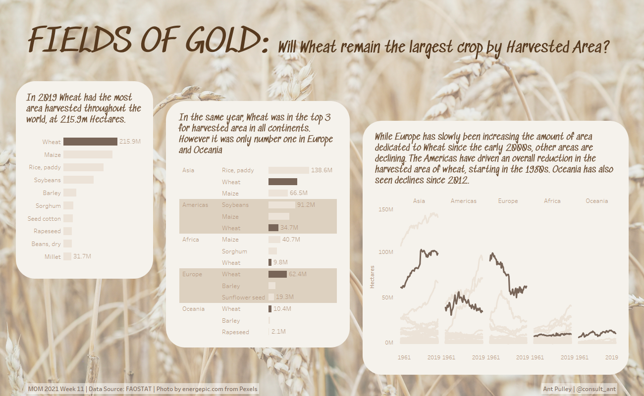
Makeover Monday Week 2021 – 10
Another sketch that closely resembled the final version – although with this one I was trying to be a bit bolder with design style!
Makeover Monday Week 2021 – 11
For this week I did a bit more exploratory sketching rather than just sketching the one idea, and it helped me form the final version.

The final sketch, although no charts in it, was more for formatting and working out how the page would look.
Makeover Monday Week 2021 – 12
I started off with a sketch aiming to show small multiples for various categories.
But then I decided it would be more interesting, and a little bit more fun, to focus on a specific element. Sketch ended up very similar to the final design.

Mario Day
One of my favourite vizzes! The sketch was very simple (although started off as a 4×4 square), but I did write a list of some functionality I wanted to include. The embellishments all came later!


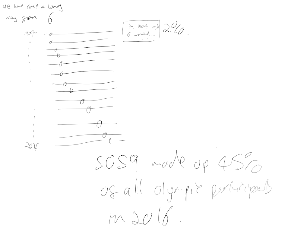
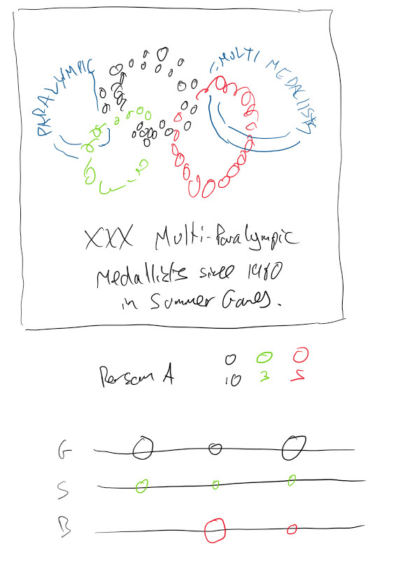
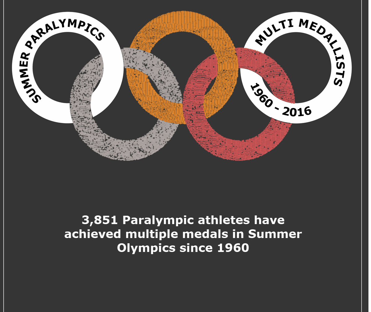
Diversity In Data – Multi-Paralympic Medallists
The top part of this sketch is pretty much exactly as it was in the final version. I decided the bottom part wasn’t needed and that there was more impact keeping it simple.
Diversity In Data – London Wheelchair Marathon
Another one which ended up very similar to the final. I used the sketch to decide which way round I would put my two scatter charts.


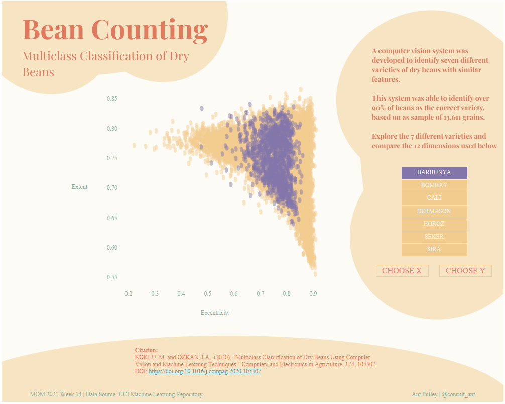
Makeover Monday Week 2021 – 14
Beans. I just wanted to get some Bean shapes into this one, and kept it very similar to the original sketch!
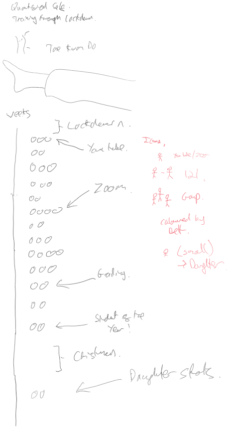
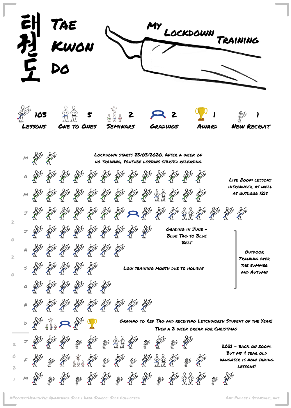
Project Health Viz, Quantified Self – Tae Kwon Do
I really wanted to try some hand drawn pics/icons in this viz, so here some ‘Sketch’ elements are in the final dashboard anyway! Ended up keeping mostly to plan, just changed the way I categorised things and how I presented the overall stats.
Makeover Monday Week 2021 – 20
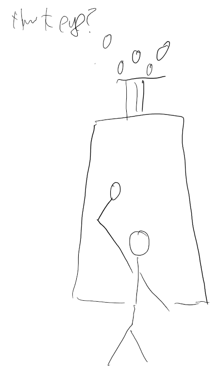
This was a really fun dataset about which animals Americans thought they could beat in a fight. I initially thought about putting all the data on the page, but thought it would be fun just to focus on one animal, the one that came out lowest in terms of Americans wanting to fight them!
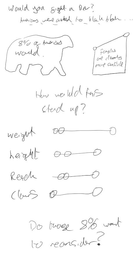
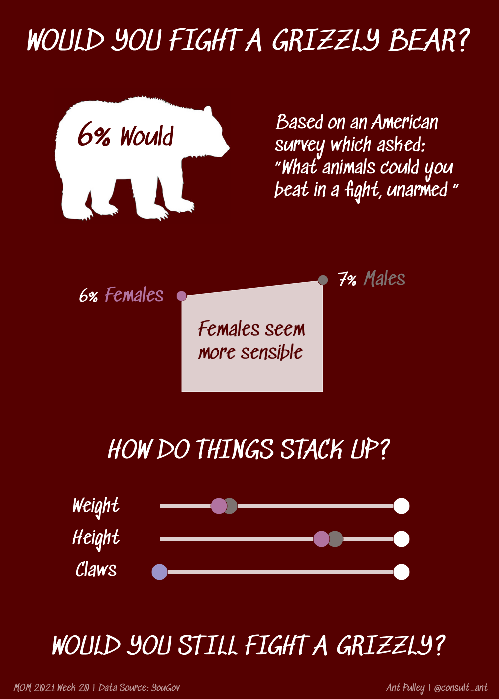
Pretty close – I decided to move the slope chart to the middle and fill the space it left with Text as that felt more balance to me. Also I kept the last statement a bit simpler.
