I finally plucked up the courage to submit my first Makeover Monday entry in week 33 of 2020, so thought I would kick off my blog with how I went about it.
For those not familiar with the Makeover Monday initiative, then worth a look at makeovermonday.co.uk. In short it is a community project that presents differing visualisations each week that could use improving – you are provided with the data set and tasked with improving the visuals.
The week 33 original viz was as below:

This had a nice simple data set behind it and quite a straightforward topic, so thought this would be a great one to start with.
I liked the fact it used the Scotland map as the background, but found it hard to really see the differences in the areas highlighted, despite the numbers and circle sizes. Also the marks are points, so don’t give any reference to the size of area that is being referred to.
So based on this I thought I would stick with a map but bring out the areas and numbers in a different way. I wanted to stick to a strict Blue and White theme to mirror the Scottish flag.
The Map
This was more problematic than I was expecting! And if you watch the MM Viz Review for that week, the map issues are mentioned a lot.
There were two main issues:
- Not all regions of Scotland were present
- The ones that were present were aggregated at varying levels that weren’t identifiable with the Tableau ‘County’ geographic default
For point 1, I decided that I did want the other regions in the data set, so I could add them into my map – i did these manually by appending the additional counties (thank you google) to the data set with 0 against the number of companies.
For the differing aggregations I did two things:
- Where the original data set had an aggregate of two counties, I split these out into two in the data set, set one with the total number of companies, and one as 0.
- Where there was a lower level of detail available, I created a group where I could aggregate these up to the right level. In this group I could also aggregate the new data from part 1 and combine back into one ‘County’ for the viz
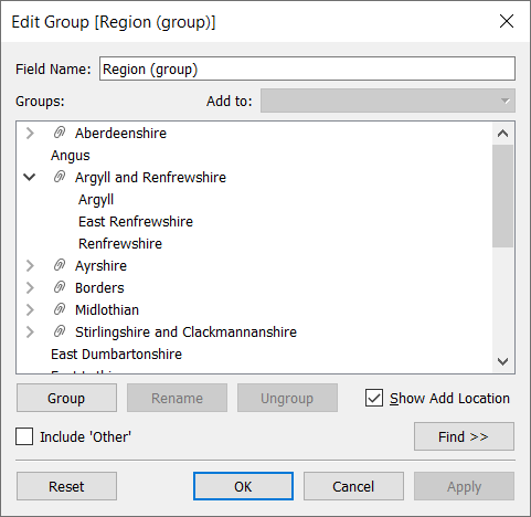
This was all a bit manual, but it did mean I could get all of my map filled in, and for the tooltips on the regions that had no data, I was able to say that none existed rather than having a blank space.
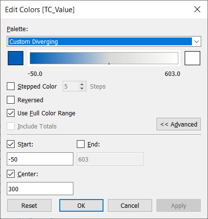
The Dendrogram
I have seen a number of ‘Dendrogram’ visualisations and really wanted to try this out, so I followed the Tableau Magic tutorial on them, and this made it super easy to produce it.
I had to filter out the ‘0’ company regions I created earlier to keep it to the ones that had values, and then I made the line thicknesses change by number of companies, and made the line colours graded from White (largest) to the same blue as the rest of the dashboard. To make sure the smallest lines didn’t disappear into the background, I manually adjusted the lower limit of the colour range and checked ‘use full colour range’ so it went below what was in the view:
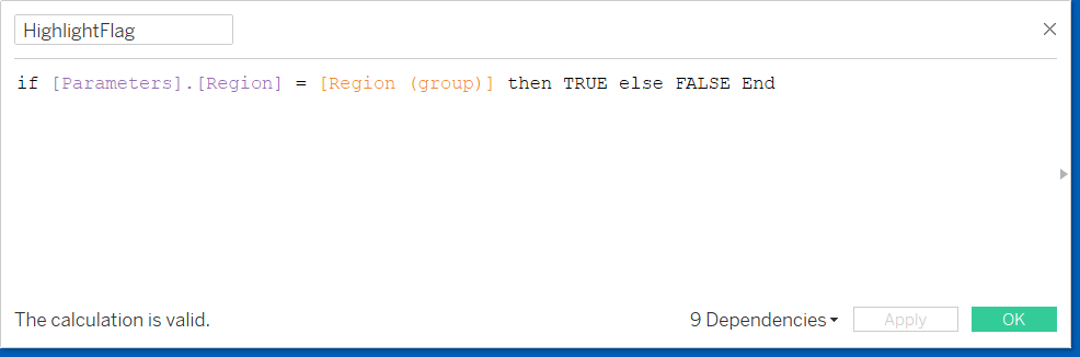
This gave me the dendrogram, but I also wanted the number of companies and the Region to appear at the ends of each line. I did this using two very simple bar charts formatted to appear as text – the reason I did this was so I could then highlight a particular region when it is selected by changing the bar and text colouring:
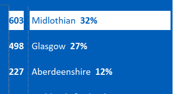
I used a parameter action that updated to a specific region when selected on any of the charts, and used the following calculated field to test if this region is selected – if it was, colour it white and if it wasn’t, blue.
I also had two versions of the region and number/% fields in the label shelf, each formatted for the opposite colour to what the background would be. these would be set to ‘Null’ based on the same flag above when not required.

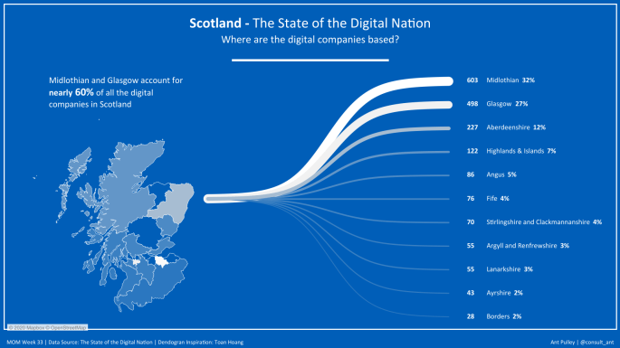
And this was where I got to:
I was pretty happy with this as my first submission, but when viewing the MM Viz Review for this week there was one thing that came up which would have made the viz much better. This was changing the dendrogram element so that the lines went directly to the correct region of Scotland, rather than seemingly all coming out of one point.
I haven’t (yet!) made these changes, but not long after this week there was a great blog post by Wendy Shijia (@shijiawendy) on the Flerlage Twins blog that shows you exactly how to do it!
Here ends my first Tableau specific post!
Thanks for reading,
Ant.
