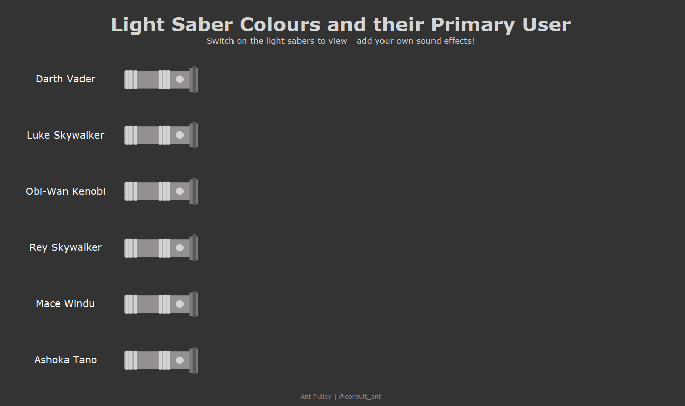
May the 4th be with you!
I built this Viz showing the various light saber colours and their primary users, and thought I would write a quick blog on it for May 4th!

This is actually a relatively simple viz, containing two main elements. Lots of Lines to create each of the colours, and two shapes to get the ‘hilt’ of the light saber and the clickable ‘Button’ for which to use a parameter action on.
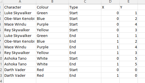
Data Set
The data set I used for this was very simple: 2 records for each light saber, with an X and Y coordinate for the start and end of each line (when the light saber is ‘on’).
Lines
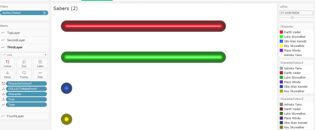
My Light Sabers are made up of 4 lines of varying widths stacked on top of each other. They have varying hues of their primary colour so as to give them some kind of ‘Light Saber’ effect. To do this I used Map Layers so I can have them all on one sheet, and some calculations and a parameter to determine if a particular Light Saber is on or off.
pCharacter
First I need a parameter to hold the ‘switched on’ light sabers:
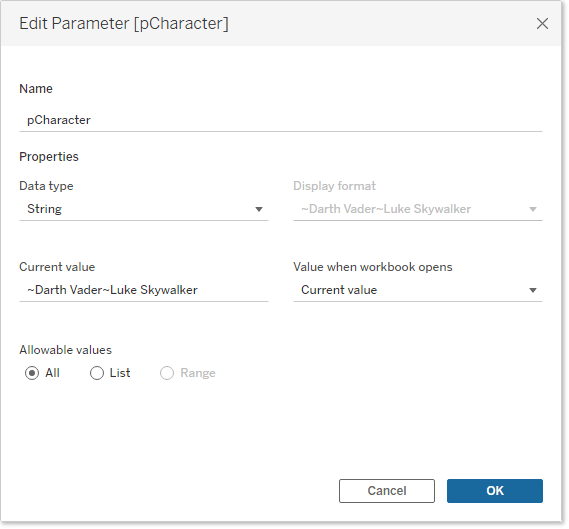
This will updated with a ‘~’ followed by the character name whenever a saber is turned on.
UpdateX
Then I need a calculation to update the end point of the line if the saber is on:
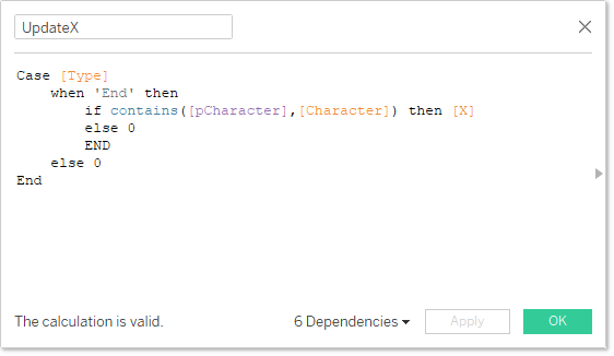
What this will do is check if the record is an ‘End’ type (i.e. the end of the line). If it is, it will check the pCharacter parameter to see if it contains the character name, and if it does it will take the X value from the data, or if not it will return 0 (keeping the saber off).
MakePoint
Then I need my MakePoint calculation to be able to use Map Layers:
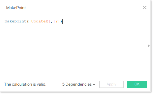
This makes a point on a map at coordinates UpdateX and Y.
Next, I can drag my MakePoint onto the canvas 4 times (adding as a separate Map Layer each time), before switching rows and columns.
Change the Mark Type for each layer to ‘Line’ and add Type to the path shelf (so Tableau knows how to connect the line) and Character to Detail (so Tableau knows how to split the line)
Finally, double-click the Y axis and reverse it:
This got me to the place where my lines are working, now I need to size and colour them accordingly.
The Top mark on the layer shelf will be the one that displays on top of everything else, so this needs to be the thinnest line with the lightest colour. And worth noting this can’t be a transparent colour as the layering with the other colours will be compromised.
For the Top layer, I used a very close-to-white colour for all sabers. For the next three layers, I needed differing colour palettes for each saber. So I used the Character field for one palette, then made duplications of this field twice more to get the other layer palettes. In this screenshot you can see the colours I used:
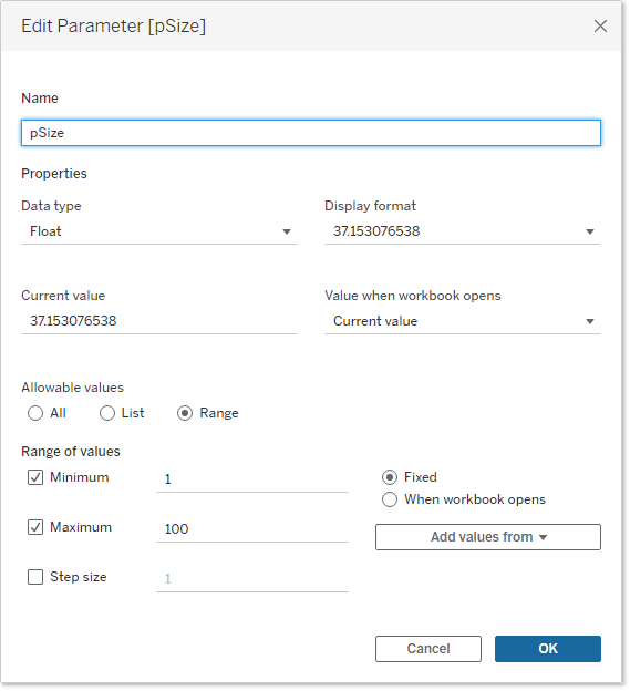
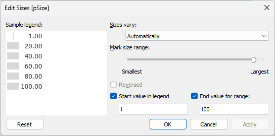
I then need to adjust the Size to make the colours work well. For the first three layers I was able to do this just using the Size slider in the marks card – however for the last layer (the largest one) it wouldn’t let me go large enough for what I needed.
Tip: if you need your mark size to go higher than the default slider, then you can get around it by putting something on the Marks card and editing the size defaults. I decided to use a parameter called pSize which goes from 0-100, and then edited the size shelf to increase the size range:
I talk about this technique a bit more in this blog: https://consult-ant.uk/2023/01/31/sizing-marks-across-worksheets/.
With this in place, we are pretty much there. Next we fix the X axis so that the initial circular mark won’t display on the canvas, and will enable the lightsaber animation to work well.
And finally, hide the axes and set the background colour to the same as the dashboard default (a near black):
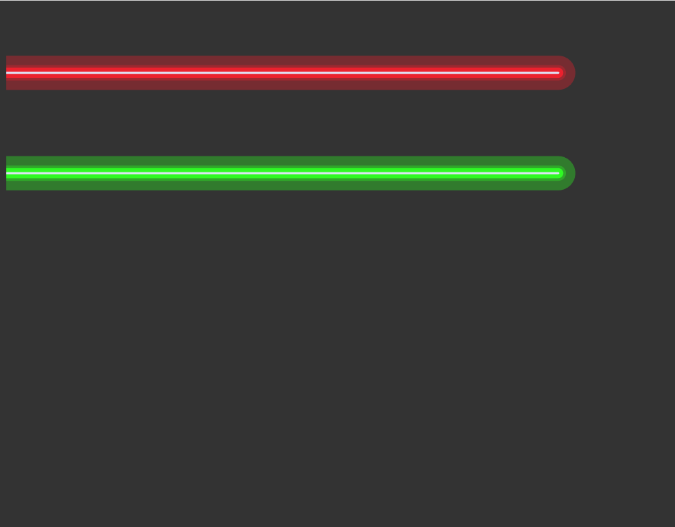
These are the lines done!
Icons
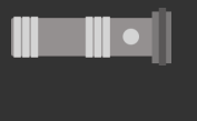
For the light saber hilt and button icons, I headed over to Figma and first created a frame with my Light Saber hilt within it formed of a number of different rectangles and a circle. The frame background was set to transparent.
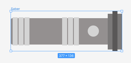
This gives me the hilt, but to get the appearance of only the button being clickable, I need a second icon. For this I copied the above frame and deleted all of the rectangles, and left only the round button – but in the same sized Frame:
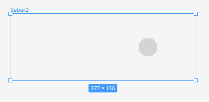
We keep the frames the same size, so that when the icons are placed on top of each other in Tableau, the button only icon is the one we will want to press, and it will appear in the exact same spot as the main icon.
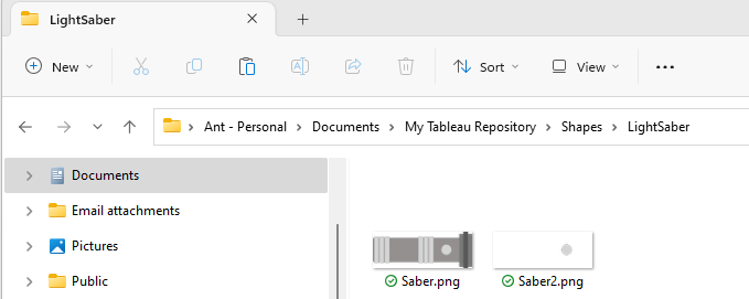
I then export these two images as “.png” files and save them in my Tableau Repository -> Shapes folder in a new folder:
Back in Tableau, we need to build a sheet to use for the icons.
Drag MakePoint onto the canvas twice as map layers, and Type to filter so we can only choose ‘Start’ (we want a static point to display these icons) and then flip the axes. Put Character into detail, and change the shape for each layer to be the button only (on the top layer) and the full hilt on the bottom layer (if your icons haven’t appeared – click ‘Reload Shapes’).
Finally drag the size slider up to max for both layers:
This is the saber hilts set up – it just needs removing all the background ink (gridlines etc.) and changing the background to match the previous sheet.
Now when you hover over the hilt, you will see that only the button appears to be highlighted (as we put the button-only icon on the top layer):
Now we need to add some calculations so we can get the functionality working when on the dashboard. This involves the following calculations:
AddCharacterToParameter
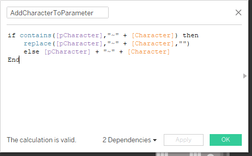
This field will add a character to the parameter string, or if you are selecting a character that is already there, will remove that character from the string. We will pass this value through to the pCharacter parameter when the user clicks on the hilt.
True and False
The trusty true and false calculations:
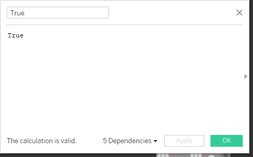

These will be used to automatically deselect the marks once a user has selected them.
These three calculations are placed on the Detail shelf of the top layer in this view. With this complete, we now need to position the two sheets on the dashboard.
Dashboard Build
The two sheets are placed next to each other in a ‘Horizontal’ container, and the padding on the right side of the hilt sheet should be set to 0. On the left side of the lines sheet, this should also be set to 0. Also both sheets should be set to ‘Fit -> Entire View’. The result means the two sheets sit right next to each other with no break, and appear as one. Note you will need to adjust the width of the hilt sheet until the icon fits exactly.
With these set up, we then need two dashboard actions:
pSaberSwitch
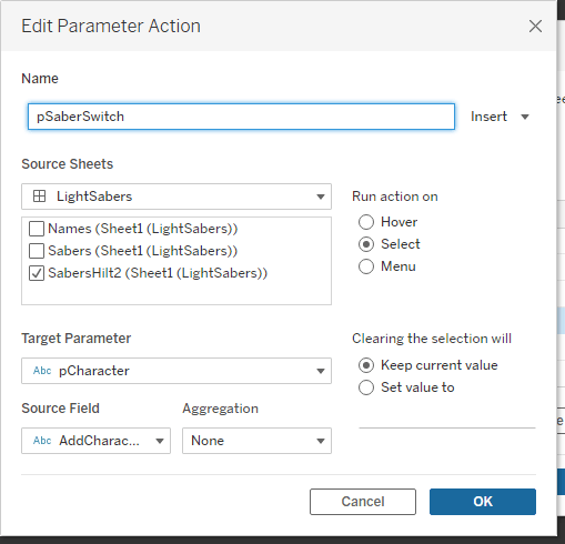
We want to update pCharacter with the field AddCharacterToParameterwhen the user clicks, and the value should stay when the selection change
DeselectSaberHilt
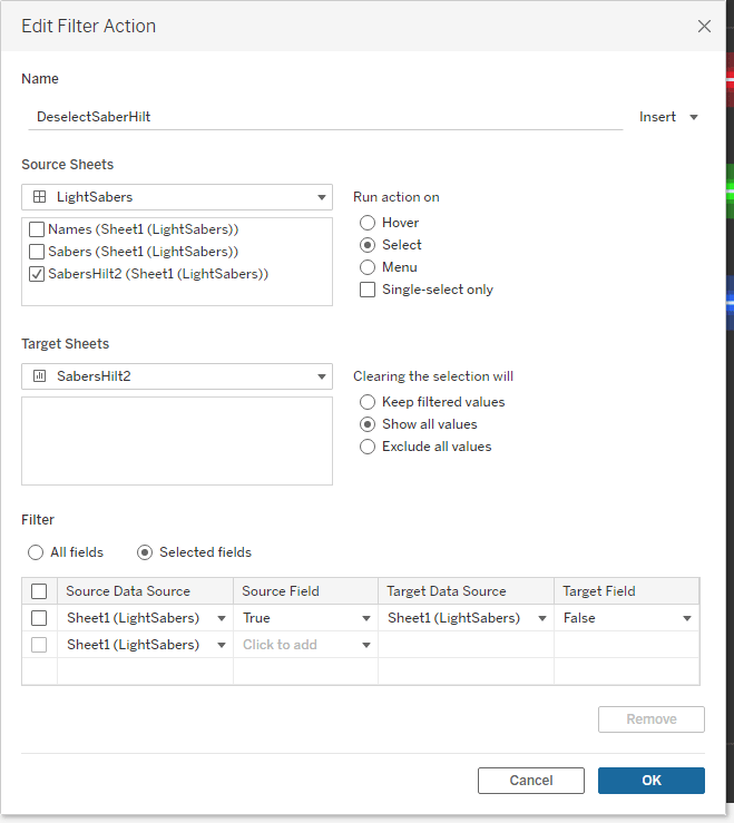
This filter action will utilise the True and False fields to automatically deselect a mark once the user has selected it (and the parameter has been updated).
With these two in place the animation will work! The only thing to add is another sheet with the character names to the left of the hilts – this is built in a very similar way to the hilt, but using a transparent shape and Labels to show the character name.
If you look at my workbook, you will also notice I have two other ‘Deselect’ filter actions – these are to apply to the Lines and Labels sheets just like the hilt sheet – and just makes sure that if the user selects one of them, it will just stay unselected. Another way of doing this is just to float a blank object over the parts you don’t want the user to touch.
And there we go! May the Force be with you!
Ant.
 Ant Pulley | Blog