A short-ish blog for this one, as I wanted to go over some of the colour/size fun I had in this visualization to get the animations working.
This week was a #Viz5 for Operation Fistula, and focussed on the performance based pilot they ran in 2012-2015, and it’s aim was to highlight the great things it accomplished.
The original visualization is below:

This looked pretty good to me already, and highlighted all the main points. I did think that the blank areas of the map took up a lot of space, and the actual numbers displayed in the visualisations were not as clear or punchy as they could be, and are a bit hard to read.
I did this Makeover Monday challenge a little later in the week this time, so I had already seen a lot of great vizzes. I had seen a lot of dot plots showing all the individuals in a square, and I also saw a great viz by Ryan Hart (https://public.tableau.com/profile/ryanahart#!/vizhome/OperationFistula_DonateToday_MOMWeek482020/OperationalFistula-ChangeLives) which showed all the dots as a heart.
After having a think I decided I wanted to try to do a bit of animation to create a little story using dots. Starting with one key statistic/number and then splitting that out a number of ways, and they finally showing a heart shape and displaying a donate link. The final version looked like this:

The main viz here is just one sheet with animation based on a parameter that has four entries. The sheet is set up with X, Y co-ordinates that change based on the parameter (these must be continuous). It has a dual axis, one showing filled circles and another showing text (only for the 1st circle). The sheet looks like this:

The reason behind having a dual axis for the text, rather than just using the main text shelf, was due to animation. As I wanted the text to disappear when you chose a different view (which I did using a calculated field) this would mess up the animation as it alters the level of detail. By putting it on a secondary axis, this issue goes away.
Coordinates
The calculation for the column switch field (very similar for Rows) is as below:

For the square dot plot ‘All’, I added the rows and columns into the data source ([Column]).
For the One dot initial view ‘Average’ I set this constant at 14 (roughly in the middle of the ‘Column’ fields so the animation zooms from the middle) – this means all dots are still there, but overlap each other.
For the years gained view ‘Gained’ I set the columns to ‘Patient ID’ and rows to ‘Years Gained’.
For the ‘FilledHeart’ option I added ‘X’ and ‘Y’ data to the data source. To do this I followed a great blog by CJ Mayes written on Amar Singh’s blog (https://www.amarsingh.uk/2020/09/how-to-ace-shape-making-guest-post-by.html).
Colours
In order to make the colours work with the animation (I wanted them to change based on the parameter selection) – they needed to be continuous value, as a discrete category would have broken the animation.

I then assigned a custom sequential range as below which meant the higher number would always be the strong yellow, and the lowest number would be the whitest. This also means that if everything is set to 1, then it will default to being yellow (rather than white)

Sizes
This took the most trial and error, as I wanted my dot to be big for the first option, small for the second and third, and slightly varied for the fourth. I achieved this with a calculated field and some manipulation of the size options:
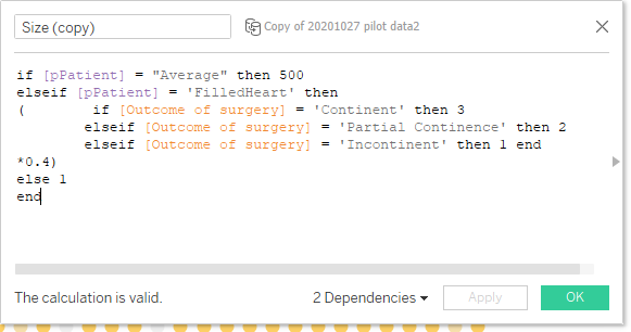
This calculation sets the size to 500 for the first view, 1,2 or 3 for the 4th view, and a static 1 for the other two views. The 0.4 multiplier was me using trial and error along with the size shelf to get the dots a size I was happy with. Then on the size shelf:
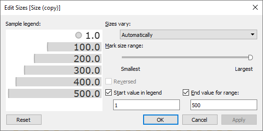
Here I set the start and end values as fixed between 1 and 500, and put the mark size range to largest (so the first view is as big as possible). The 500 number took a reasonable amount of trial and error to make sure the dots worked on all views.
Finishing Up
This was the bulk of the work in the dashboard, the rest was setting up the parameter action on the button to switch between the parameter values, and setting up Text sheets that show and hide with the parameter. I created the key’s for two of the views as separate sheets that show hide, as well as the donate button that appears on the last view.
And the final view again:

Hopefully this blog was useful. The downloadable workbook is here:
Thanks,
Ant.

Very well explained.
Awesome 👍
LikeLike