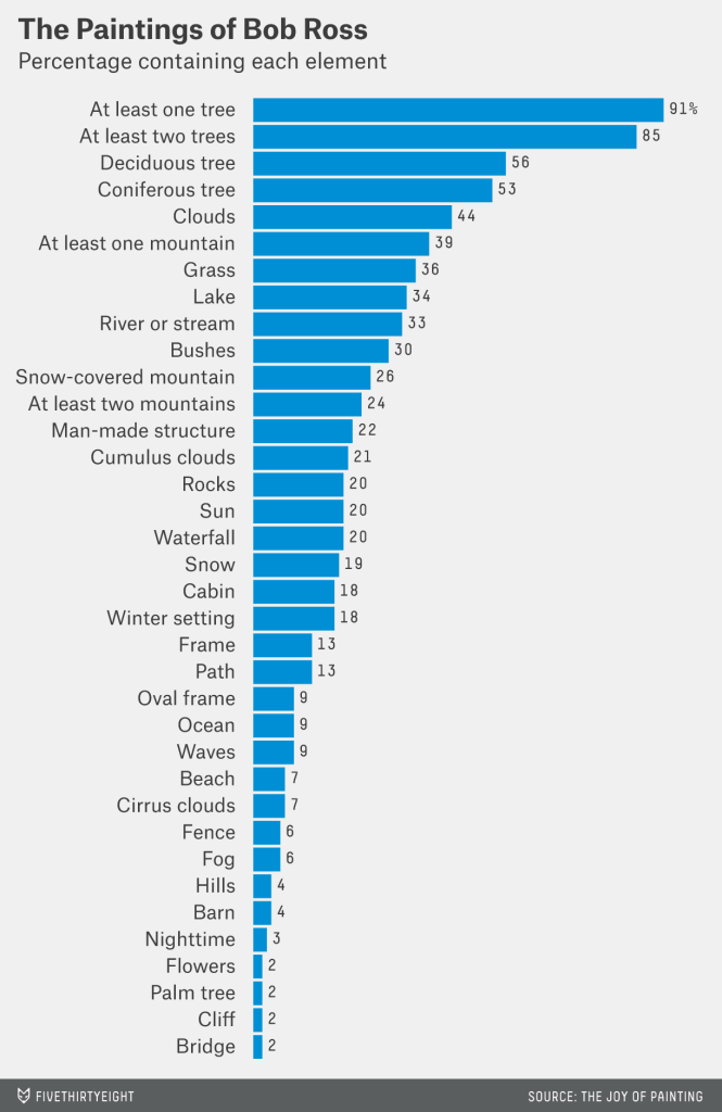
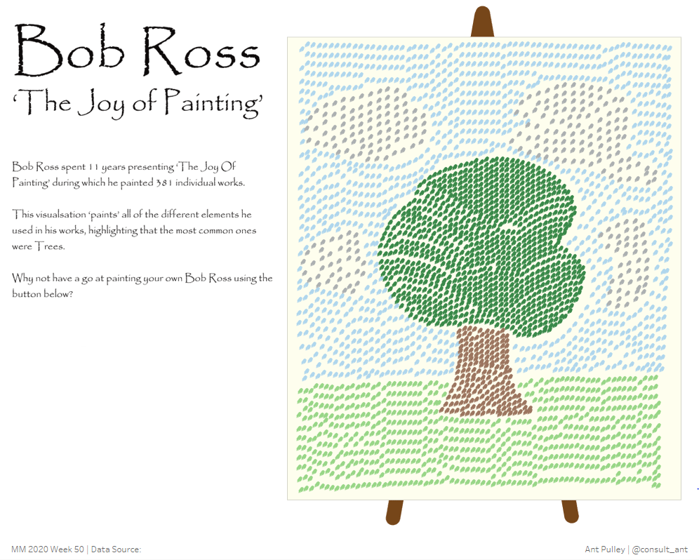
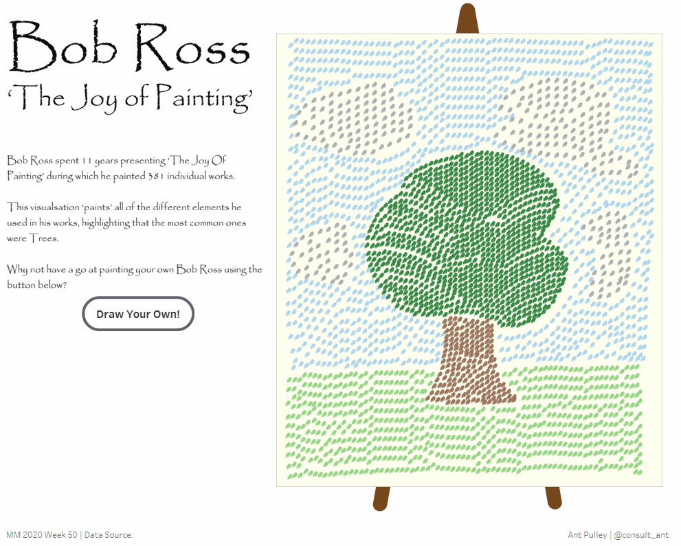
The week 50 data set looked like a fun one – and featured the work of Bob Ross on his show ‘The Joy Of Painting’. the original visualisation is below:
This is a pretty simple visualisation that shows the key points, that Bob Ross liked painting Trees! But also it seemed a bit too simple given the artistic nature behind the data set. I myself, am not that artistic (in a drawing/painting sense) but I had an idea of having a simple picture using the main elements in Bob Ross’s work, and creating a filled shape with them. I managed this, but then decided I wanted to go a bit further and allow the user to ‘Paint’ their own version as well – I saw Marc Reid (@marcreid) do something similar with colour changing parameters that gave me this thought.
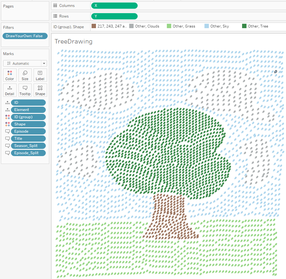
Here is what I ended up with:

The First Page
The first page is just the main tree picture, along with the Easel background and the Title and Text.
Tree Picture
For this I used the same method as per my previous blog (https://consult-ant.uk/2020/12/04/makeover-monday-2020-week-48/) where I used CJ Mayes’ tutorial for filling shapes. As I wanted several block colours, this made it slightly more complicated.
I wanted to do this Hand drawn, so the first step was to use my Tablet and an app I have called ‘Infinite Design’ which enables me to draw things and save down as an SVG. In this app I created 4 layers, one for a Tree, one for Sky, one for Clouds and one for Grass, which looked like:

Artistic Right?? The aim of this was to get four separate colour blocks that I can run through the point generation tool to fill with dots. I opened up this svg in Inkscape and split the four blocks into different layers, and then exported each in turn to a png file (with the other three layers switched off) so I got four png’s of the same dimension, each with a single colour block on them. Grass example below:

With the four png images saved, I then needed the data in the correct format to fill each shape.
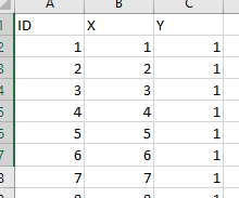
The original data looks like this:
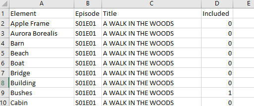
So I took out all of the ‘Included=0’ records so I only had the ones that appeared in paintings, and then I categorised the ‘Element’ into 4 categories: ‘Trees’ which contained anything tree related, ‘Clouds’ that contained anything cloud related, ‘Grass’ that contained anything grass/ground related and ‘Sky’ that contained anything sky/high related.
To be honest the last two categories are quite stretched in definition and I played around with it a bit to get the right number of dots in each section.
With this set up, I could use each chunk (category) of data with the corresponding picture to get the coordinates for the points as per my previous blog where I made a heart shape (https://consult-ant.uk/2020/12/04/makeover-monday-2020-week-48/). This would generate 4 separate files which I could just append together to make one big co-ordinates file.
Then I can place these on a scatter plot and colour them appropriately due to the category flag.
The final part was making the Tree Trunk brown – I did this by using a group, and just simply highlighted all the points I wanted brown, and added them to a group to use for the colour:
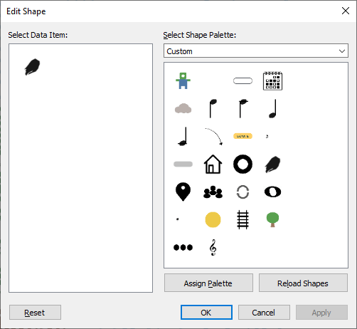
The final thing I added was a ‘Stroke’ mark to give it a bit more of a ‘Painted’ appearance. To make this mark, I used the same Infinite Design app I used for the drawing, and chose a brush effect. I played around making a few marks until I found one I liked, and then exported this to a png – this gets saved into my ‘Custom’ folder in ‘My Tableau Repository’:
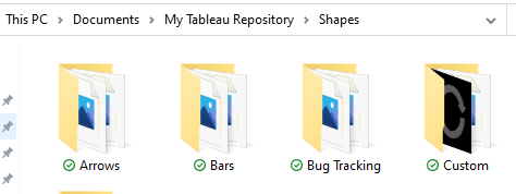
Once it is here, you can go into your ‘Shapes’ shelf, choose ‘More Shapes’ hit ‘Reload Shapes’ and it should appear under the ‘Custom’ folder (or whatever folder you choose to put it in):
This is the main picture done.
Title and Easel Image
For these elements I used Figma. The easel is a simple rectangle and some thick lines behind it. The text I used Papyrus font, which gave quite a nice hand drawn look.
Putting on the Dashboard
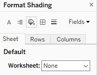
These elements were all then floated on the dashboard, with the Easel sent to the back of the floating order. Also important to set the background of the tree image to be ‘None’ so you can see the easel through the background:
And this is the first (and easier!) page done!
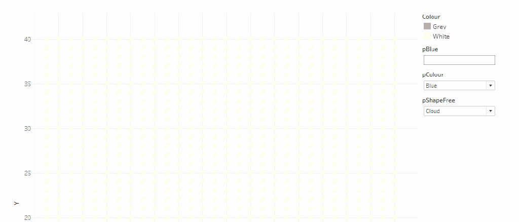
THE DRAW YOUR OWN
Right – this is the fun bit! Depending on your idea of fun… I’m going to try and work through this element by element, and hopefully it will all makes sense! First thing to note is that this is not based on the above data set at all – it is completely separate.
Canvas
To build the canvas for the user to paint on, I needed to create a plot containing a reasonable number of marks, but not too many. I had a play with some options and came up with 30 wide by 40 tall. So to get this in Tableau I just created an excel file that looks like this:
With X going up to 30, and Y 40. The formulae I used were:
- B3: =IF(B2=30,1,B2+1)
- C3: =IF(B3=1,C2+1,C2)
This can then be loaded into Tableau and and plotted:
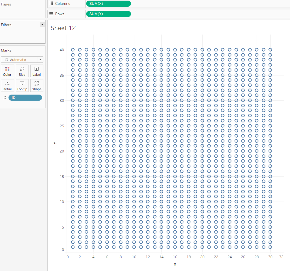
This gives a decent amount of space and resolution to get some pictures drawn, without making it too onerous.
Then I can use the same shape as we used in the original Bob Ross image to have brush strokes instead of the default circles. We will deal with colouring them later.
Getting one paint colour working
Making this work with one colour per click is reasonably straightforward, and doing the rest is essentially an extension of this. I start with a parameter pColour which contains a list of the colours we want to choose from:
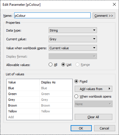
This will be how the user chooses which colour to paint with. Then I also need another parameter called pBlue (as we will start with getting blue working):
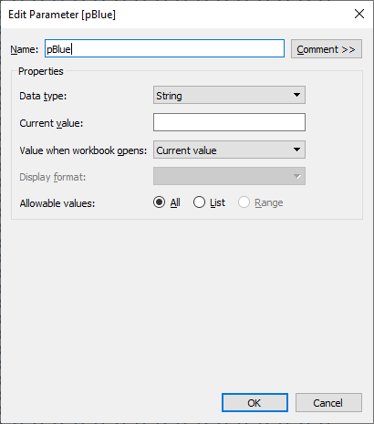
This parameter is a String which we will populate with all the IDs that are selected by the user. We will do this by wrapping an ID in tilde’s (~) so we can easily find them in the string at a later point. For example ‘~21~’
Next we need a calculation to send to the pBlue parameter when a user clicks, this is called ‘BlueOnOff‘:

This calculation checks that the colour selected is Blue, then if the parameter already contains the ID selected (so it can find e.g. ‘~21~’ in the string) it will replace that ID with blank (so if a user selects a blue mark when blue colour is selected, it will remove the blue colour).
- Is the pColour parameter showing ‘Blue’
- if the pBlue parameter already contains the ID selected (so it can find e.g. ‘~21~’ in the string) it replaces that ID with blank (so if a user selects a blue mark when blue colour is selected, it will remove the blue colour).
- if the pBlue parameter doesn’t contain the ID, then add that ID to the end of the current parameter value (wrapped in ‘~~’).
- The final else is for when pColour is not blue – this just makes sure that the ID selected is not within the pBlue parameter so we don’t have conflicting colours.
We need another calculation to actually show the colour change on the canvas, this one is quite simple:
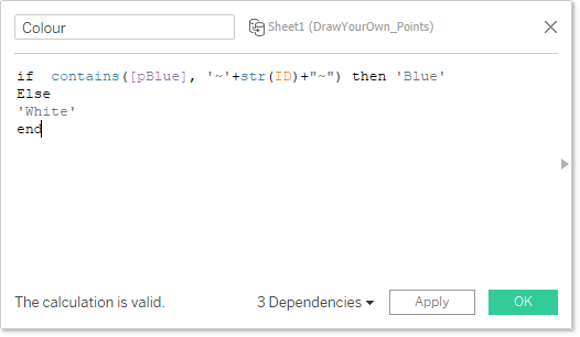
This checks if the ID is within the pBlue parameter, if it is then call it ‘Blue’, otherwise ‘White’ (our default canvas colour).
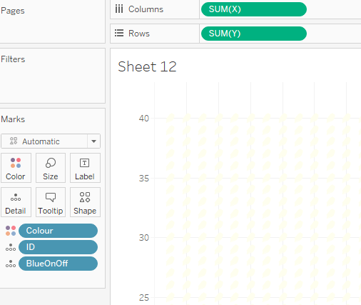
We add all these to the canvas:
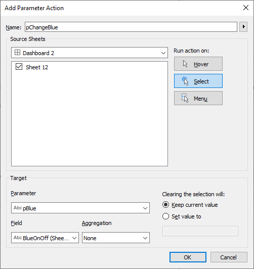
And finally add the parameter action to make it work:
This should give you the following experience:
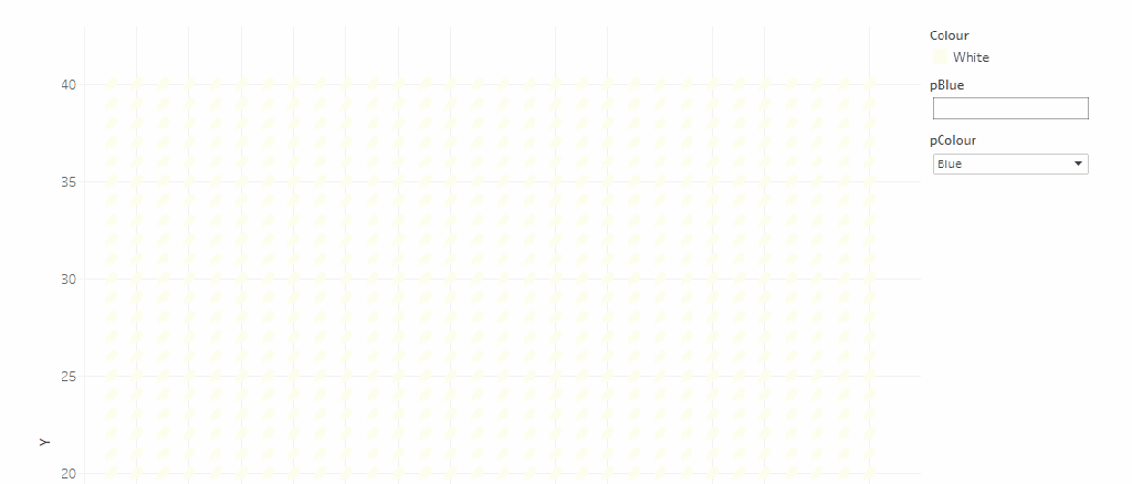
This is one colour up an running, and is essentially the basics of how the rest of it works, it just gets increasingly complicated!
Getting multiple paint colours working
Adding extra colours essentially means replicating the pBlue parameter, BlueOnOff calculation and pChangeBlue action for each additional colour you require, and then updating the Colour calculation so it looks like this:
This should now work for all the individual selection colours and allow the user to produce some kind of painting.
I wanted to go a little further and challenge myself to be able to allow the user to choose a pre-selected shape to put onto the page, so a simple picture can be created very easily. This is where the complexity ramps up a little!
Adding in a Shape
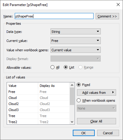
In order to add a shape on a user click, I need a parameter that allows me to switch it between single colour mode (which I am calling ‘Free’ mode) into a ‘Shape’ mode, so the calculations know what to pass. To do this I created a pShapeFree parameter which had ‘Free’ as well as a list of shapes I wanted to be able to add:
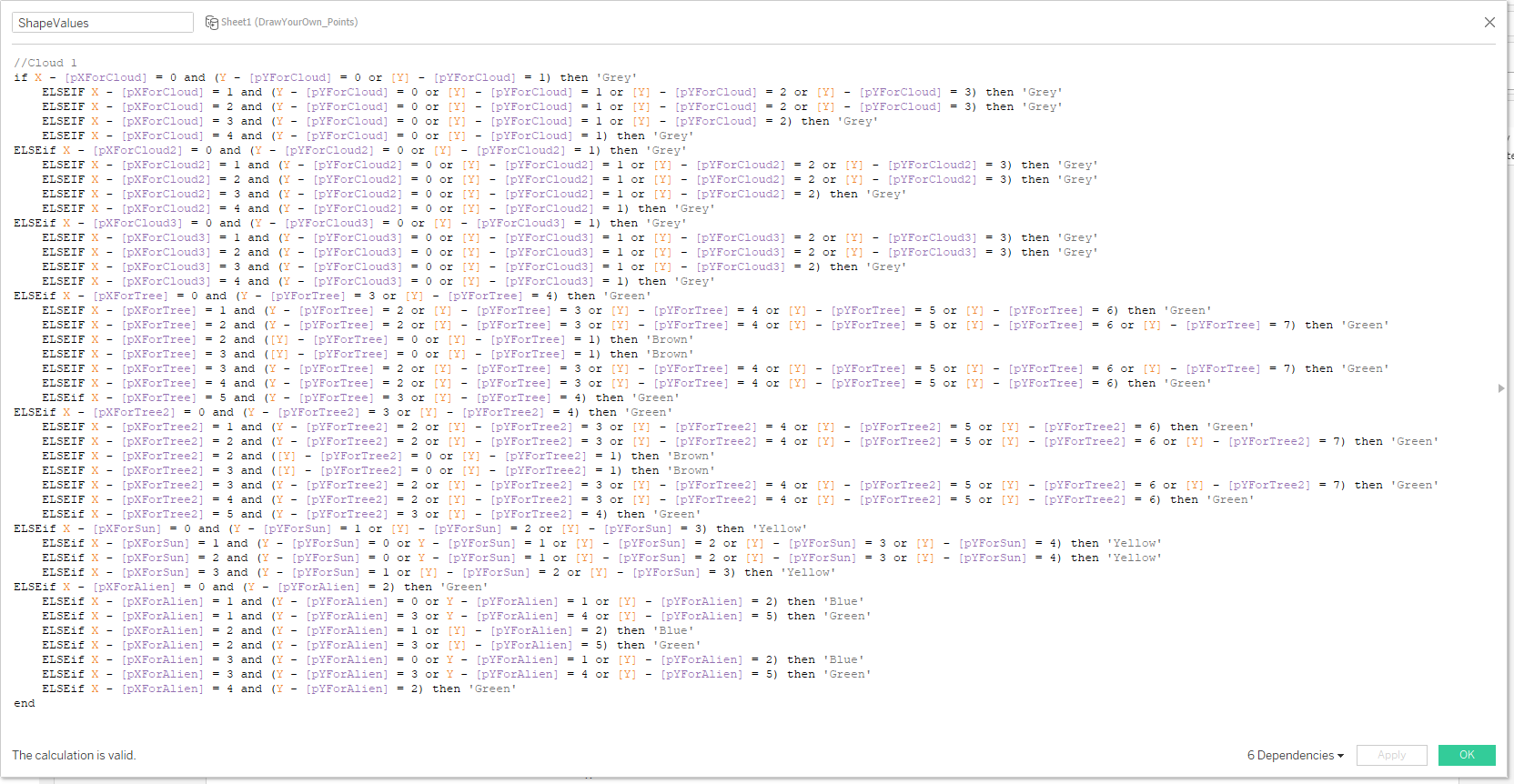
Adding the shape is more complicated than the single stroke, as you need to be able to colour cells relative to the one the user clicks, rather than just the cell they are clicking. To do this I need to set up a couple of parameters for the X and Y coordinates of a shape (using Cloud as an example):
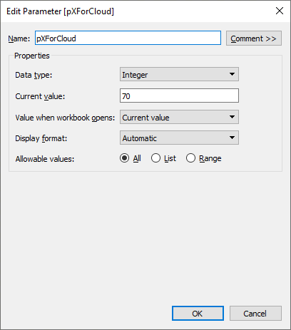
Notice the current value (default) set to 70 – this means when not changed, the shape will appear ‘Off’ the canvas – i.e. you can’t see it. pYForCloud will take the same form (although you don’t need a default value).
This allows me to store the X and Y coordinates that the user clicked (rather than the ID as per colour strokes).
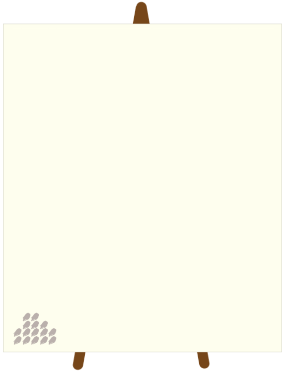
With these coordinates I can draw the shape and assign colours using a relative calculation. I did this by first using my current drawing functionality to draw the shape I want in the bottom left of the canvas:
Then I could use this to build my new calculation called ShapeValues:
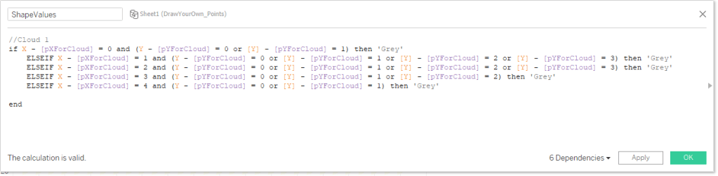
This is the key calculation – it uses the point the user has selected to work out which relative marks should be coloured a certain way. By drawing it first on the canvas I could work out where to put the various colours.
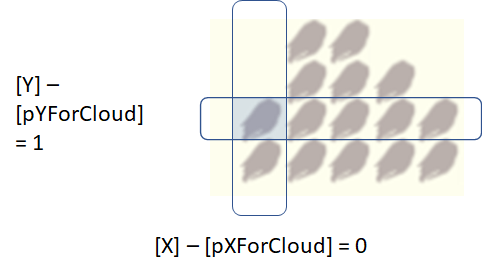
[X] – [pXForCloud] will return the x position as in the manual drawn one (assuming x starts at 0) so I can use this to work out what colour to put where – and the same for [Y]. This diagram hopefully explains it a bit:
By doing this, it means wherever a user clicks, we can work out where the shape colours should be.
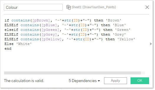
With this calculation complete, we need to incorporate it into our ‘Colour‘ calculated field from earlier. It is important to note, that in this IF statement, order matters – so the order you put statements in here is the priority order for the colouring. I decided I wanted the free colours to have ‘priority’ so that you can add embellishments to the shapes when used:
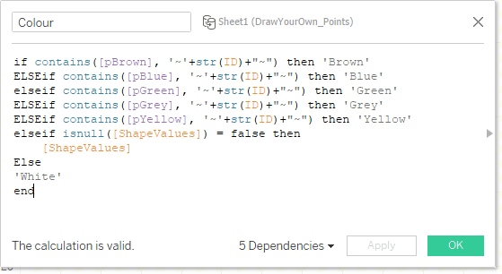
The isnull statement checks if the ShapeValues has a value or not – if it has something it puts in the colour from ‘ShapeValues’, otherwise it defaults to ‘White’.
Next we need two calculations to be able to send through to the two ‘ForCloud’ parameters we created:

The Y version is the same. All this does, is to choose the coordinate and return that only if ‘Cloud’ is selected. If ‘Cloud’ is not selected, then keep the parameter value the same. Add these calculations to the Detail shelf.
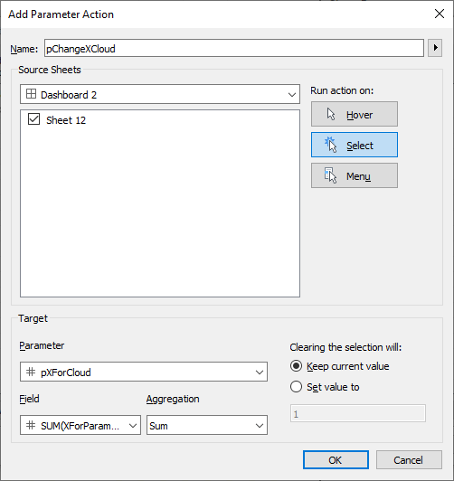
Finally! We want to add the two X and Y parameter actions:
And do the same for Y. Then you should see the following:
And that is the basics for making the shapes! Phew!
Adding in Multiple Shapes
To add multiple shapes, it is basically repeat the above steps, there needs to be Parameters for X and Y for each of the shapes, equivalent XForParam and YForParam calculations and equivalent X and Y parameter actions. And also the ShapeValues calculation needs to be updated. I had 7 shapes in mine so my ShapeValues formula ended up looking like this:
Which is pretty Epic! But I was happy with the end result!
This basically was most of the hard functionality cracked, next was a list of tidy ups UI tweaks.
Tidying Up
This is the meat of it done – to tidy up the rest I did a few things:
- Used the False/True filter trick to deselect all marks once selected.
- Created a button and parameter to switch between Default view and ‘Draw Your Own’
- This involves showing and hiding the various sheets based on the parameter selection
- Creating a button to switch between free drawing and shape selecting (rather than a parameter drop down)
- Creating the colour palette for free drawing (rather than using the pColour drop down)
- This just used the same brush icon and some parameter actions to change the colour
- Creating the Shapes selector (Rather than using the pShapesFree drop down)
- Here I created the icons in power point, and for the ‘Reset’ buttons, I send the pXFor… parameters a 70 value, as this pushes them off the screen
- Create a reset all button.
- This sends a blank through to all the colour parameters, and a 70 through to all the pXFor parameters.
And that is it! Finished product:
And the downloadable workbook is here: https://public.tableau.com/profile/ant.pulley#!/vizhome/PaintYourOwnBobRoss/BobRossPaintingElements
I hope you found this useful and it made sense – it is quite fiddly and I am sure there are more efficient ways to deal with all the parameters. But I think the end result is quite fun!
Please let me know if anything needs clarifying or anything isn’t explained too well, and I am happy to update!
Happy Painting!
Ant

3 thoughts on “Makeover Monday 2020 – Week 50 – Parameters and Painting”