Hi all,
I have been taking part in Makeover Monday and more recently Diversity in Data since August last year, and have found it interesting how my inspiration week on week ebbs and flows.
The last two Makeover Mondays in particular I have found myself lacking in inspiration and thinking ‘What should I do?’ before managing to complete them.
So I thought to help myself (and possibly others!) I would write down some thoughts on how I approach these initiatives and revisit some previous vizzes to see where I got the ideas for them from.

My main aim in joining Tableau Public is to try out new techniques and to improve my design skills. I use this as a base for how I approach the various challenges.
I have a list of techniques I would like to try based on what I have seen on Twitter or Tableau public and I find this helps get me started when I perhaps don’t know where to go with a data set. I also have a list of bookmarks/favourites of vizzes I liked the look of for inspiration.
To give you an idea, here are some of the things that have been on my list recently, some of which I have been able to tick off:
- Waffle Charts
- Small Multiple Maps
- Networks
- Curved Lines on a Map
- Something 3D
As you can see, some of these are more specific than others!
On top of the techniques I want to use, I am trying to improve my design skills, bringing in other tools like Figma or Inkscape to add that little bit extra. I think I am getting there slowly but surely!
When I am looking at completing some of the community initiatives, I find that I tend to fall into one of three categories:
- Instant Inspiration – get straight into it
- Slow Burner – needs some time for the data/story to sink in
- Wing It – No idea what I’m doing!
These all have different pros and cons! But I thought I would go through some examples I have had of each.
Instant Inspiration
These tend to be pretty fun, and often for me reasonably complex to build, so take a little more time! These also tend to be the ones were I am more likely to use external tools to tableau for design elements.
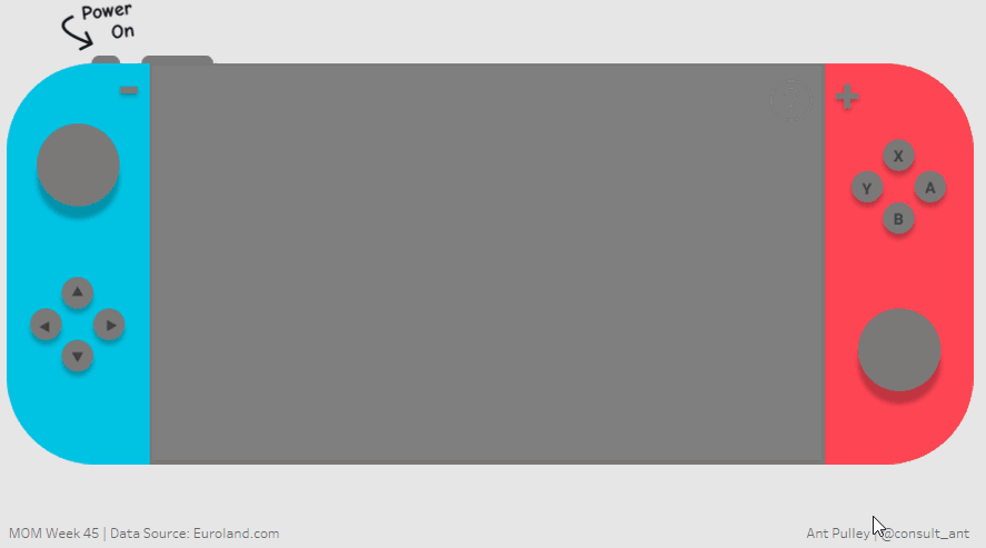
My favourite one of these was the Nintendo Switch data set (Makeover Monday 2020 – week 45) – I have a switch and love it, so I instantly knew I wanted to build a viz that was an interactive switch! I love building vizzes with lots of parameters, so this was really up my street. I used plenty of parameter actions and Figma for the design. I was really happy with the result, and it is my most favourited viz on my profile, so far anyway…
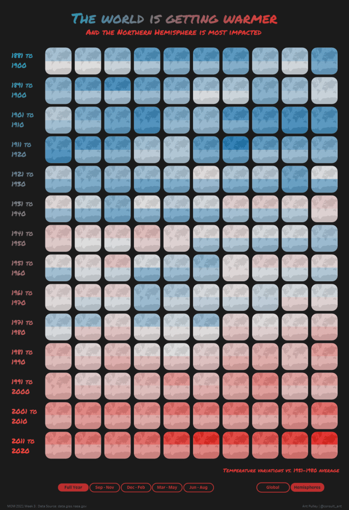
Another one that came very quickly to me was the Makeover Monday 2021 week 3 challenge on Global warming. As luck would have it, I saw a picture on twitter showing small multiple maps over a period of years with warming information on it, and I thought it looked great so I noted this down on my list of things to try:
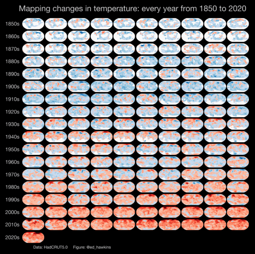
I couldn’t believe it when the next data set for Makeover Monday was basically what I wanted, so was very quick to decide on this one. It was a combination of Figma and Tableau and there were a couple of iterations to it, but I ended up very pleased with the final version:
Slow Burner
These ones I tend to think about for a day or so (or more!), and then something hits me and I know what to do. These tend to have a bit more of a plan to the build as I have had time to think.
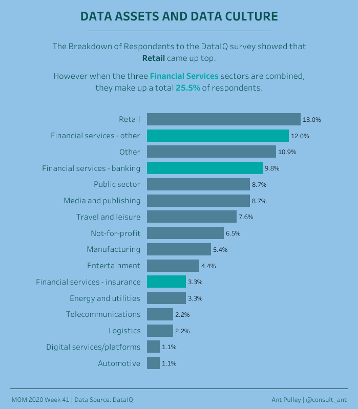
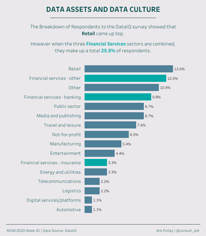
A good example of one of these recently was the Diversity in Data challenge in January 2021 on Female CEOs in the Fortune 500. It was a simple data set, but I didn’t initially know what I wanted to do about it.
I ended up watching twitter and seeing all the great entries appearing for that one to help me on my way. I saw a lot of entries showing a line or area graph highlighting how small the number was, and I saw a few highlighting the improvement there had been. I quite liked the idea of being able to show both of these angles in one viz, and pleasingly that also meant using something else I love playing with – animations! I ended up with the below, done in Tableau only, which I think got the message across well:

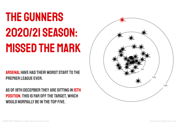
Another slow burner for me was the Makeover Monday 2020 week 51 on Arsenals worst ever premier league start. Again this was one where I watched a lot of twitter to see what was going on and saw loads of great vizzes exploring all the elements of the data.
I didn’t really want to follow what a lot of people had done, so was trying to think up a good theme – and ended up with going down the ‘Gunner’ and ‘Target’ route, with the idea being the viz is just a target with all the seasons as ‘Shots’ on it. I was really pleased with the idea. The only part of the data this really worked for was League Position, as that way 1 was the centre (and best) and it got worst the further out from the target. It also ticked off ‘Radial’ on my list at the time which was a bonus.
This was a Figma/Tableau combo and I was happy with this result; happier when it made it into the Makeover Monday favourites!
Wing It
These ones are quite tough, but can also be rewarding! This is when I don’t really know what I am going to do, perhaps I’m a bit low on energy or enthusiasm. If this is the case, then generally I try to make this a ‘Clean’ and simple viz, so nothing too fancy and just focus on giving it a clean look. Also for these I will often only use Tableau to speed up the build – and also as good practise for building Tableau only dashboards.
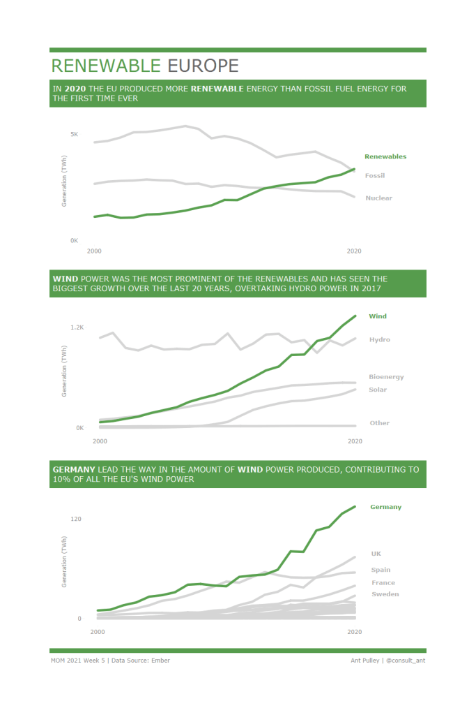
My latest Makeover Monday was one of these – 2021 week 5. It was on renewable energy in the EU, which is a really interesting subject, but I couldn’t quite get any ideas about what to do. So I decided to play it really safe with a few line charts to tell a story and see where the wind took me. As it happened it took me to Wind power (see what I did there?)!
I kept the colours really simple: green and grey, and kept the page uncluttered. I initially didn’t have the green background to the subtitles, but decided I needed a bit more definition to the page to break up the elements, so switched the background to green. When I did that I then decided to finish off the framing by putting green lines at the top and bottom. I was more pleased than I expected with the final result (Tableau only) – so definitely worth persevering even if unsure:
Another ‘Wing It’ example was from a while back, Makeover Monday week 43 – apparel Exports to the US. Another one I decided to keep clean with a simple bar chart and simple colours and build only in Tableau.
This one was a good example of getting the twitter community to provide feedback, as I got some invaluable suggestions to do with the colours of the bars (muting the ones not in focus) and the background (toning it down). You can see below the iterations that I posted on Twitter from first (left) to final (right) and can see how the feedback I received really cleaned it up!
Summary
Its great if you have instant inspiration for a viz, but sometimes it doesn’t hurt to just wait for the idea to come and watch what other people are doing. I also find it quite satisfying coming up with something half decent when you didn’t know where to start in the first place!
I think doing these challenges regularly particularly helps with the ‘Wing It’ approach, as I am finding it increasingly easy to make something look ok (at least in my view!) with not too much effort.
I hope you find this interesting! I definitely found this useful to write down and revisit how I went about some of my previous vizzes, and has highlighted to me a few things I should do more – like ask for feedback!
Ant.
