The Makeover Monday for 2021 week 2 was a Viz5 focussed on Gender Inequality of HIV Infections in adolescents. I’m writing this one up as I tried out some new techniques using maps – curved lines and map layers – I had a few bumps along the way so thought it would be worth sharing what I did.
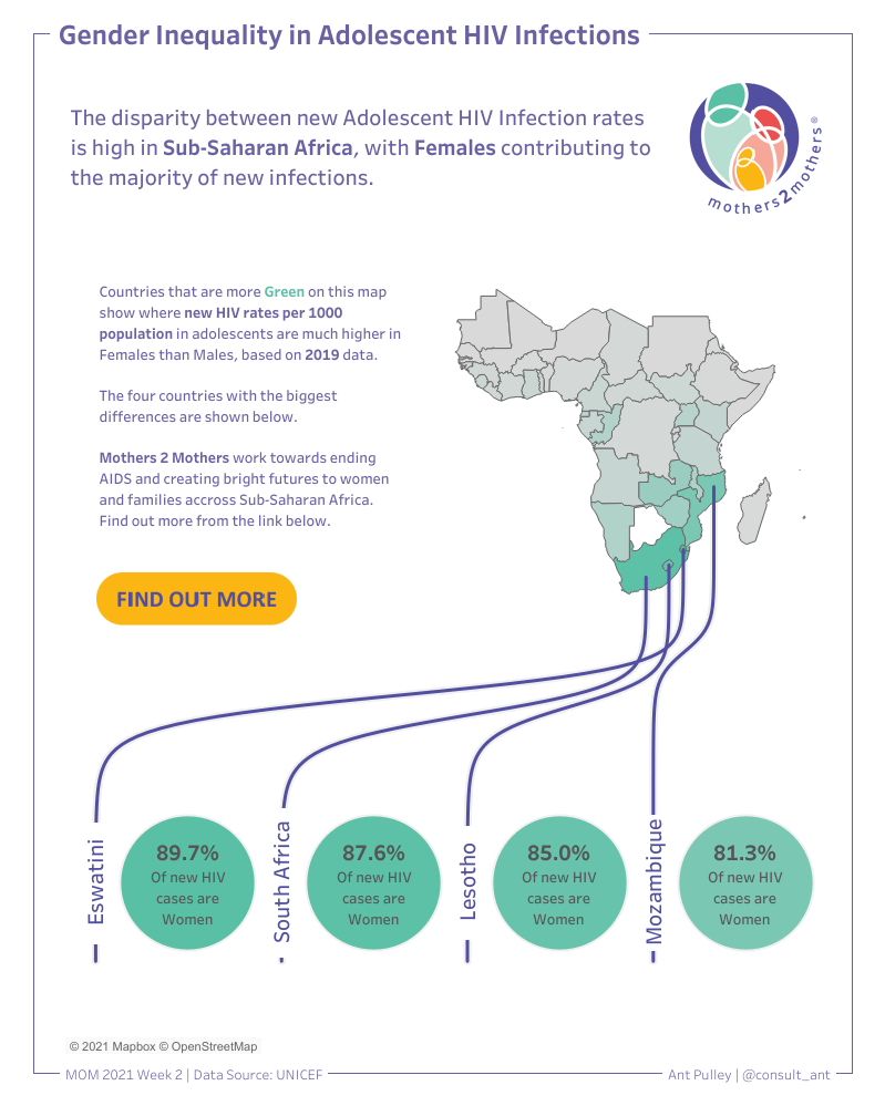
The original Viz looked like this:

This is pretty clean and easy to read in general, but I found it hard to draw any direct conclusions from the Male/Female split. I also found the map a little hard to read with all the numbers scattered over it – it feels like some specific areas need pulling out and focussing on.
My final viz is shown below, and looks at the difference in new HIV rates for Males and Females, highlighting the countries with the biggest absolute difference. This viz also only has one worksheet in it (plus some text boxes and images):
Plan
I quite often dive straight into doing my Makeover Monday’s without writing anything down first – although sometimes I have something in my head. I am trying to start sketching more before I do them, and this time I managed to do it. My initial sketch looked like:
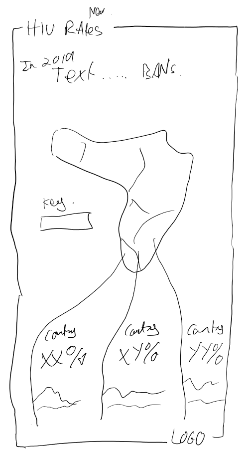
This actually isn’t too far off how it ended up looking, so pretty pleased with that, although in my final Viz I ended up with a simpler bottom section. More on that later.
As this data set contained country/map data, I have been wanted to try two things with Maps out for a while:
- Drawing Curves on a map as per Wendy Shijia (https://www.flerlagetwins.com/2020/08/map-curves.html)
- The new Map Layers functionality (Tableau 2020.4 – allowing you to have many different layers and marks on a map view) – Marc Reid, Luke Stanke and Adam E McCann have done some great work in this area – worth a look.
So as you can see in the sketch, I aimed to keep the format reasonably simple, with a title, intro text, coloured map (by a metric I was going to choose) and then use the curved lines and map layers to draw the bottom section where I would pull out the top 3 or so countries.
I broadly got there, but there were a few challenges along the way, so I wanted to share them!
Implementation
Firstly I wanted to decide on a measure, and I wanted it to be one that directly compared Males vs. Females which could be represented by a gradient colour on the basic map.
I settled on the difference between New cases of HIV per 1000 population in males and females, as this also highlighted four countries that had a lot higher difference than others. I also decided to only focus on the most recent year.
To get the difference measure, I used three calculated fields, two of these pulling the per 1000 figures for male and female:
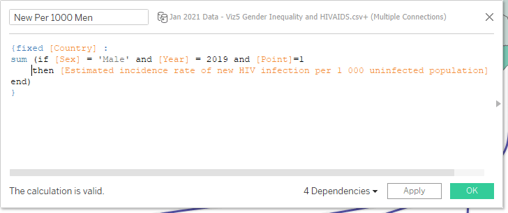
I used a fixed calculation by country so that when you sum up for only Male or Female, you get a value against the row regardless so we can then calculate the difference field:
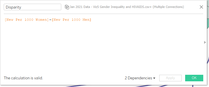
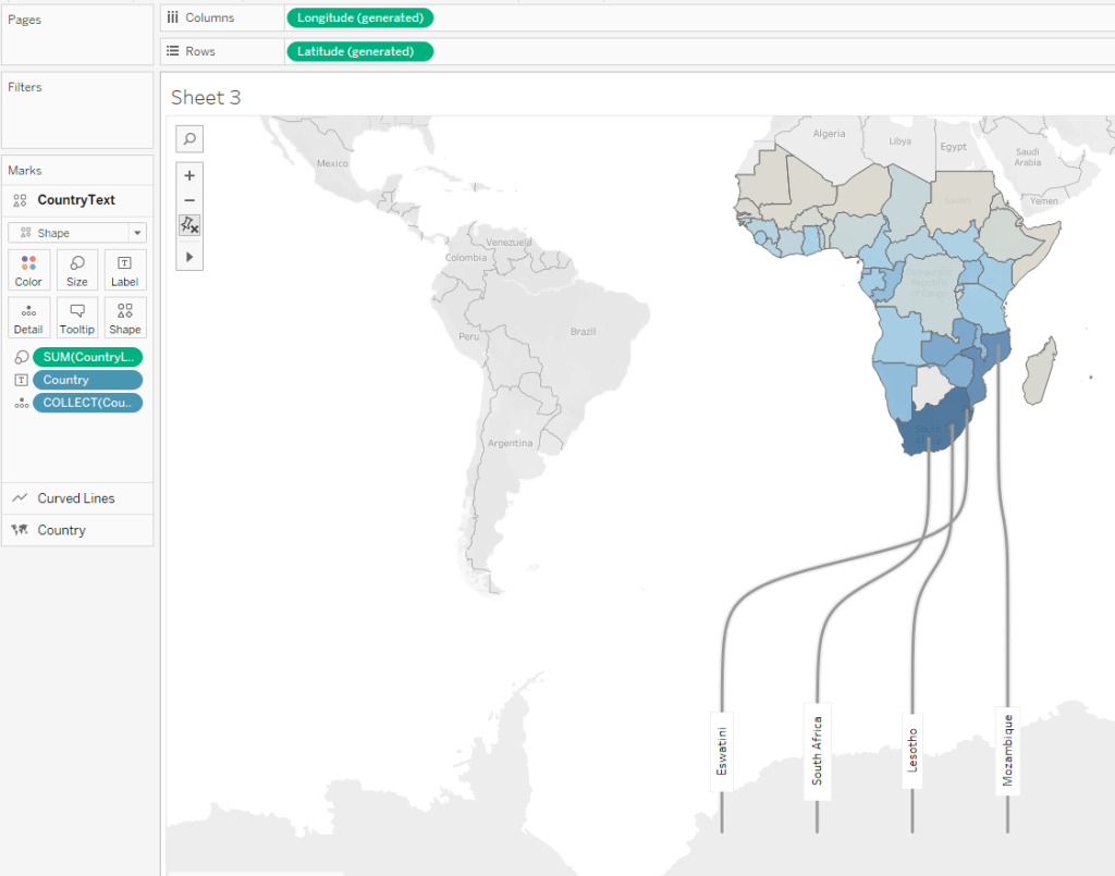
This works out the absolute difference between the Female and Male values, and from this I can see that four countries stand out at the top of the list (South Africa, Mozambique, Eswatini and Lesotho), so these will be the ones I want to highlight.
Next I wanted to make sure I got the curved lines drawn, and I did this following Wendy’s blog (above) very closely until I got to this point:
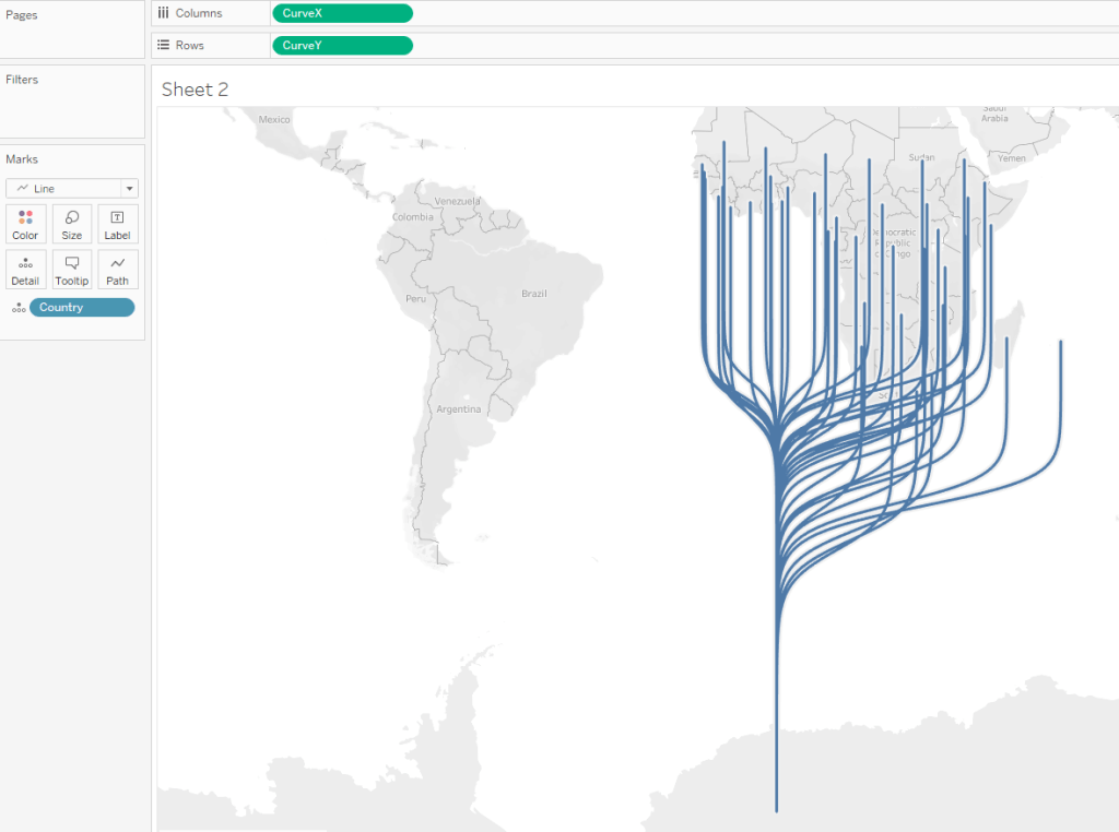
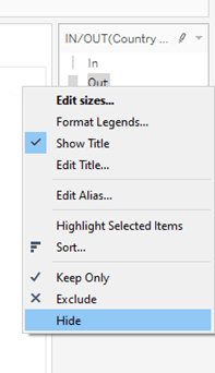
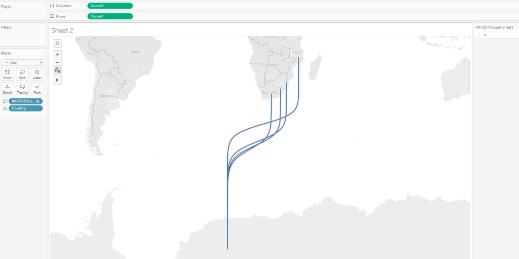
Which is a curvy line from every country to a single point. I know I only want to show 4 of the countries, so I want to remove the rest. I did this using a set – create a set based off Country and add only the four I am interested in. You can then add this to Colour or Size shelf (I chose Size) and then on the legend that is created – right click on ‘Out’ and select hide.
Note: I have done this rather than a filter, as I do want all the countries data for the filled map.
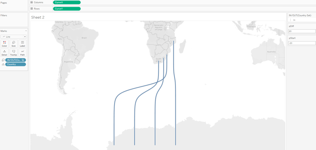
This gives me:
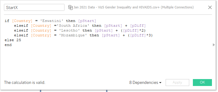
Next I want to change the start points at the bottom to be evenly spaced out so I can fit my other viz in later. I don’t worry about specifics at the moment, but I want to make it easy to change, and I can do this using a couple of parameters:

pStart will be where my X value/Longitude will start on the left – i.e. the end of the first line.
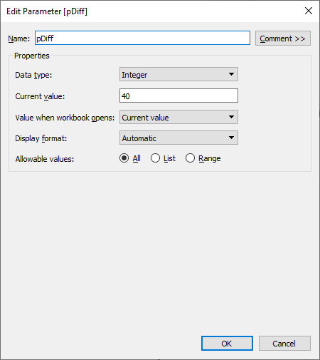
pDiff is the difference between each of the four line ends.
With these parameters set up, I can alter my StartX calculation (from Wendy’s blog) to space out by country, and as I am doing a static viz I can code in the countries (I put the highest difference country first):
With some initial values it now looks like this, and I can change the left-most point and the space between them at will using the parameters:
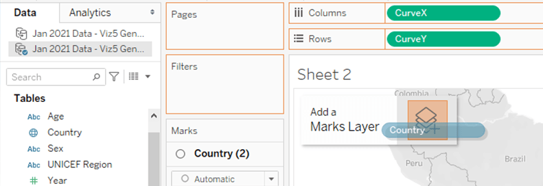
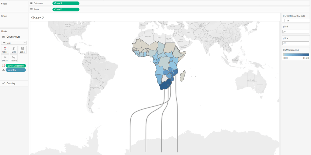
With this part set up, I can now move onto the other elements, first being the filled map. For this I can simply pull ‘Country’ into the view and drop it onto the ‘Add Marks’ area:
Change the mark type to ‘Map’ and drag the ‘Disparity’ measure (created earlier) onto colour to get the filled map:
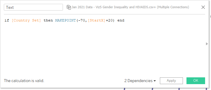
Great! Things seem to be going well! Or so I thought…. My next step was to try to add a label to the bottoms of the lines as a separate map layer, and my plan was to just use some MakePoint calculations. So I created this:
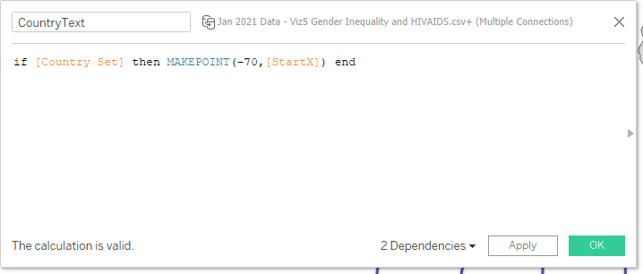
Which would create a point at -70, and StartX (same start as the lines) only for the four countries I am interested in. Then I can drag this into the view as another map layer – what I got wasn’t what was I expecting:
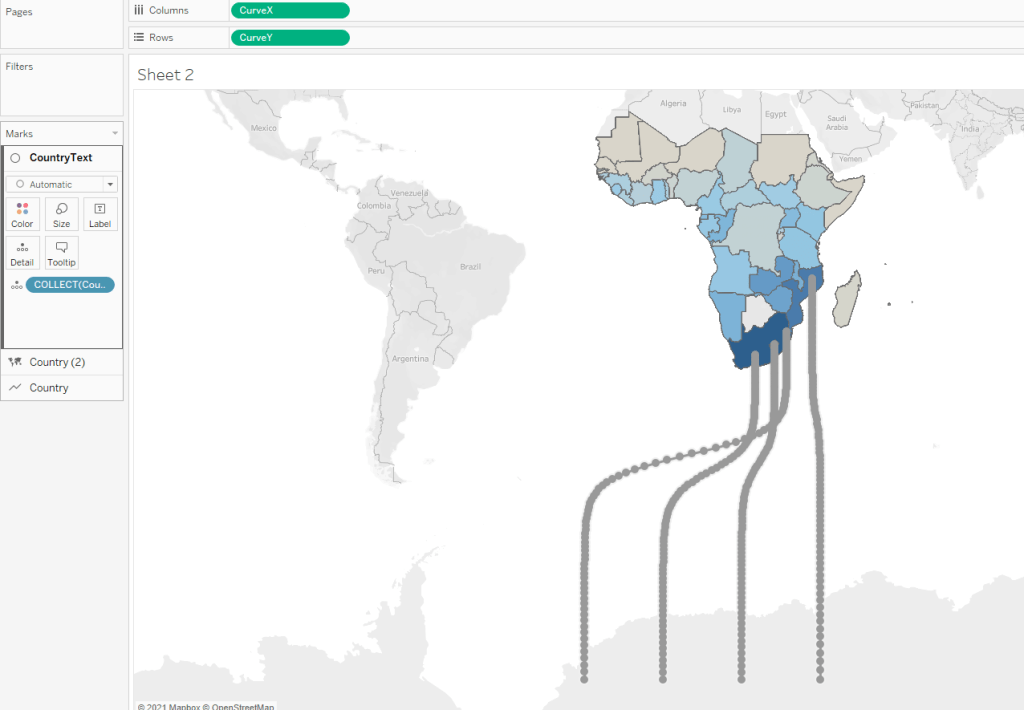
First Hurdle!!
I got additional dots all along the curved lines, which definitely isn’t what I wanted! This had me stumped for quite a while until eventually I realised that the problem was that I had CurveX and CurveY on my rows and columns, but the make point method I was trying to implement would only work if that had the generated Longitude and Latitude there instead. I can’t fully explain it, but after a fair amount of trial and error I managed to rework the views to replicate the curved lines and filled map:
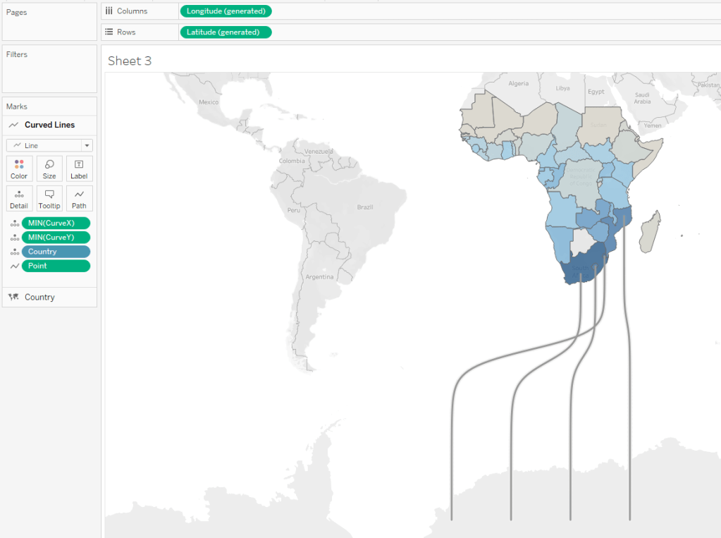
This involved moving the CurveX and CurveY to the detail for the Line chart rather than using them as the base longitude and latitude.
So now I tried my makepoint layer again:
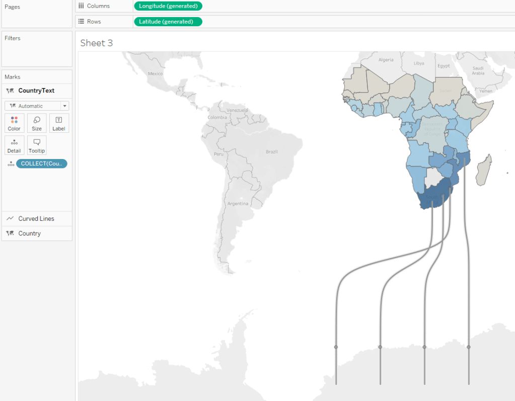
It worked! Now I have some marks where I expected them to be – and where I wanted my labels to be. Now I can change them to actually be labels:
What I have done above is add a white rectangle as a shape and aligned the text to be centred so it appears over the line and blocks it out. I also created a calc ‘Len([country])’ for the size shelf which just adjusts the size of the rectangle based on the length of the country name – not perfect but gives a bit of variation for the different lengths.
Right – happy with this so on to trying to add some sort of viz in the gaps. Alas this is where I hit…
Second Hurdle!!
Here is where I envisaged putting some kind of bar chart showing the difference in Male and Female rates, but I couldn’t get anything working for bars. I fiddled with this for too long before realising it didn’t seem possible (for my brain anyway). I was able to get a Pie chart working, but I didn’t want to use one. I also think I could have got a line chart working, but by this point I had spend too long on it so I decided to go with just some simple BANs in circles to complete it. So I didn’t quite jump the hurdle!
Creating the circle and text was pretty straightforward having done the rest. I created another makepoint:
Which would put the mark to the right of the line, created a calculation to get the % numbers, set the mark to a circle and colour to the same as the filled map to get:
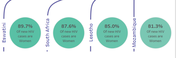
Note: at this point I adjusted my original parameters so this all fit nicely (the benefit of doing this up front) and ended up with a start position of -95 and a difference of 40.
And this was the foundations done of the dashboard!
Tidying Up
Tidying up the dashboard I did a number of things:
- Used the Mothers 2 Mothers logo as a basis for the colour palette
- Altered the line colours to be the main purple colour, as well as the country labels
- As a result of the above, I had to separate my Country Label from the white rectangle – moving that to a separate map layer. This was so the rectangle didn’t then take the purple of the text
- Adjusted the sigmoid curve slightly to fit the viz best
- Added border round the whole sheet, and floated titles over that
- Added main text and context
- Added a find out more link button to the Mothers 2 Mothers website (simple image created in powerpoint)
And there we are!
Hope it was useful to see how I went about it, and also some of the blockers I came up against – it was definitely a good learning for me! Downloadable public workbook here: https://public.tableau.com/views/GenderInequalityinAdolescentHIVInfections/GenderInequalityinAdolescentHIVInfections
If you need any clarifications or have any questions, please drop me a note!
Ant.
