I thought I would take a little time to reflect on how IronViz went for me this year – as I had quite a different experience compared to last year (which was my first entry).
I’ll admit I struggled to get properly into it this time – perhaps partly due to the January timing and the unexpected-ness of it coming so soon! And I didn’t have an idea immediately in my head, whereas last year that came very easily.
However I did manage to get an idea together, and it was somewhat related to last year’s viz in that it was about music and linked to my band. My band is a member group of ‘Making Music’ (www.makingmusic.org.uk) – which is the UK’s largest leisure-time music community – and one of our band members works at the company. As a result, I was able to get some membership data from the 3,900+ music groups associated with Making Music.
Once I had the data and a bit of idea of what I wanted to do – I was able to get going on building it out. I found this time I did keep hitting a bit of a ‘Wall’ and having to take breaks from it, as it wasn’t really flowing.
I had shared an image with a few people at this point to get a bit of feedback (including CJ Mayes and Marc Reid – thank you!) who gave me some good pointers on it (and some positive encouragement, which is always good).
Then I saw Sarah Bartlett offer the 15 minute feedback sessions and I thought this would be a great idea to go along and get some kind of steer for it, and I am pleased I did. Here is the image of the Viz I took to that feedback session:

In my session I had a fantastic group to talk to – Zak Geis, Michelle Freyman, Sam Parsons and Judit Bekker. Slightly intimidating at first when I saw the names – but they were all really great and each gave some really helpful feedback. If you didn’t do a session this time, then if it comes up again I would definitely recommend it.
The main themes that came out were:
Red – the overall view was that the red overpowered and didn’t work well with some of the more pastel colours. It is also quite a ‘Danger’ colour, and perhaps didn’t fit well with the theme. I had taken the red from the Making Music main logo but had probably used it a bit too heavily in the end. The advice was really helpful – use your own palette if the Red isn’t working, and whatever colours I do use, make sure the highlight/chart colours balance well with it so they aren’t overpowered.
Text – Keeping the readable font size the same was a really good spot. I had used (unnecessarily) larger font for my introduction text on the left, whereas I should have just kept it the same size as all the other reading text. Also it was advised to add more annotation/description in certain areas, particularly for those not into music at all (e.g. what is a ‘Promoter’ group)
Layout – I had squeezed some charts into certain sections, whereas it might be better to just give these areas more space.
Story – It was noted that this viz was primarily showing data about Making Music and not particularly telling a story – so the advice was to see if I could bring in a bit more of a story element to it.
Keep the Conductor – There was a firm ‘Keep’ for the conductor in my parliament chart viz!
I really appreciated the feedback above, and was very surprised how much you can cover in 15 (well maybe 20) minutes! So thanks again to everyone involved with that.
I had about 6 days left at this point, so I decided to implement what I could in the time and see how I could work some of this feedback in.
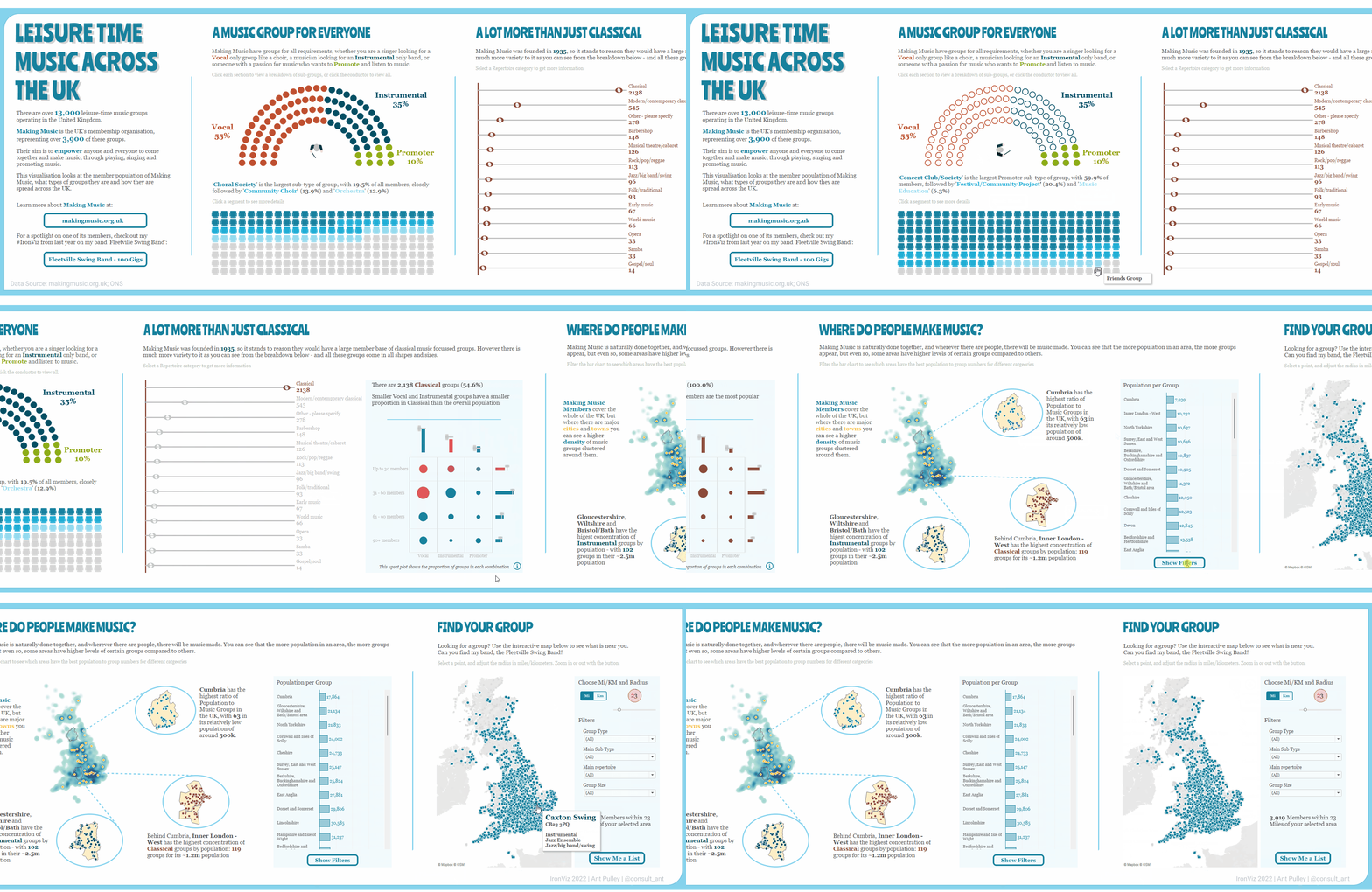
My final viz ended up looking like this:

Which I think (hope!) is much more balanced from a colour perspective and I feel the blue works better. It ended up being wider to allow room for a bit more in terms of the viz, and I tried to make a bit more of a story about repertoire types and where certain group types are clustered in the UK.
Cleaning up the text sizes and not being afraid to add more width definitely makes it feel a lot cleaner.
And there it is. I think I am broadly happy with the final output given I struggled quite a bit at times! So a quick summary of learnings from this IronViz:
- Be careful with colour
- Be sure to constantly look at the viz as a whole and see how it holds together and also use colours that may suit the subject
- Get your story straight
- I don’t think I managed this particularly well this time – but it should be front and foremost in your mind for IronViz
- Get some feedback! It is really valuable
And here is my final interactive version – because it wouldn’t be my viz if it didn’t have a few parameter actions in it:

Thanks for reading!
Ant.
One thought on “#IronViz ’22 – A Quick Review”