Hi All! A lot of people gave me some nice comments about the Map I made in my recent Skyrim #VOTD as part of #GamesNightViz and, slightly later than planned, I thought I would write a blog on it!

This map is all built on one worksheet and features a few techniques:
- Using a Background Map
- Using the Automeris tool to plot points
- Using Map Layers and Parameter Actions to create interactions
- Using Figma to design labels
Background Map
The first step was to find an appropriate map to use for the background – I got mine from uesp.net. I then need a ‘Clean’ version of this saved to use as the background, and I need to make an additional version which I can use with the Automeris tool to get coordinates of the points I wanted to plot.
Automeris to Plot Points
Using Figma, I drew a number of circles onto the map for the points I wanted plotted – I choose pink for the cities and blue for the towns. These colours needed to be different to any of the colours on the underlying map for the Automeris tool to be able to recognise them. I could have only used 1 colour in the end, but initially I decided to split the towns and cities up.
This is the image I would load into Automeris:

I can then load this into Automeris using File -> Choose Files -> Image -> Align Axes:
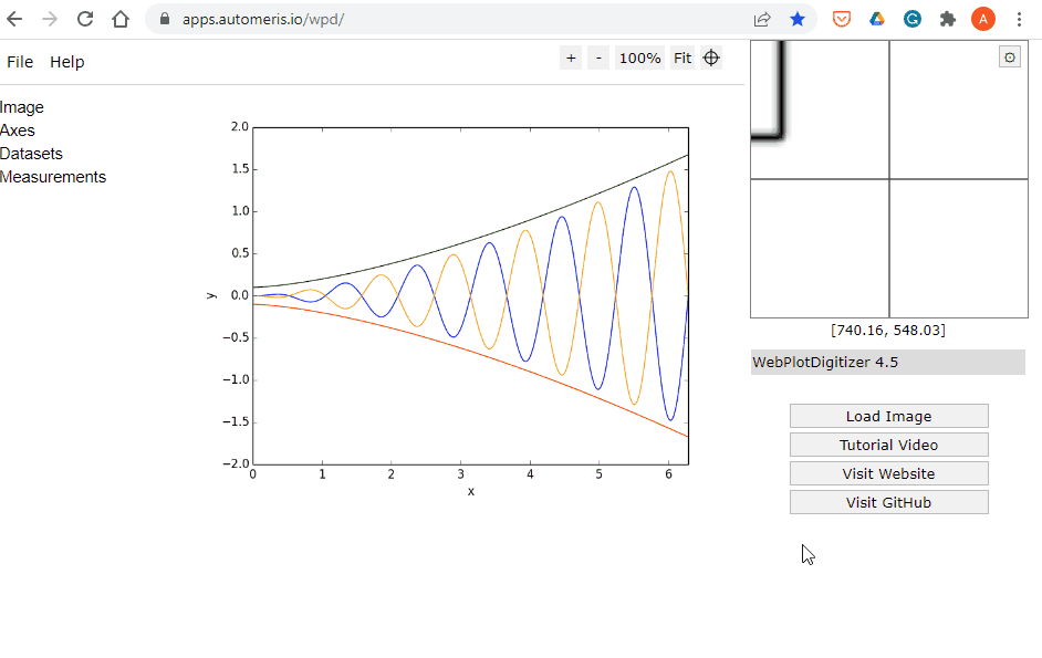
Now we have the picture loaded we can set the foreground colour to be the pink or blue, and then hit Run with everything else as default. You can see that the tool picks up each of the points we made on the image.
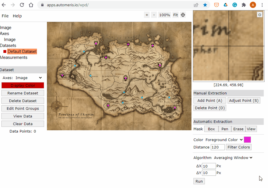
From here we can export the data (click ‘view data’ -> ‘download .csv’) to get a file with a list of coordinates.
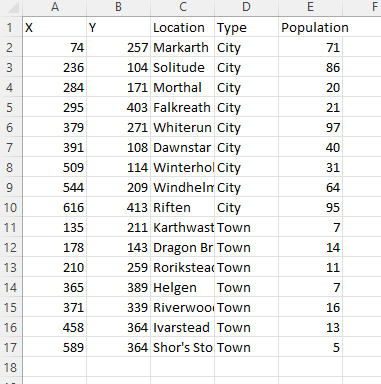
As there were only a small number of points, I manually assigned these to the towns and cities in my data to build a data set with the data I needed:
Now I have my data set and background image to go into Tableau and start building.
Map Layers and Parameter Actions
Note – as Map Layers only allows you to work between certain numbers ranges (-90 to 90 for Latitude and -180 to 180 for Longitude) I decided to divide all my coordinates by 1000 so they would work properly.
The first thing I will do is get the points plotted onto a map. To do this I need a few calculations:
YAmended
522-[Y]
I have amended my Y value as Tableau will plot them in the reverse order to what I want them by default. So to correct this I have taken the number of pixels hight of the map picture (Map is 696 * 522 px), and taken off the Y value – which will in effect reverse the axis. I chose to do this so that I didn’t have to use reversed images when putting a background map on.
MakePointMap
MAKEPOINT(X/1000, [YAmended]/1000)
This takes the X and amended Y coordinates, divides by 1000 and uses the makepoint function to convert to a spatial field.
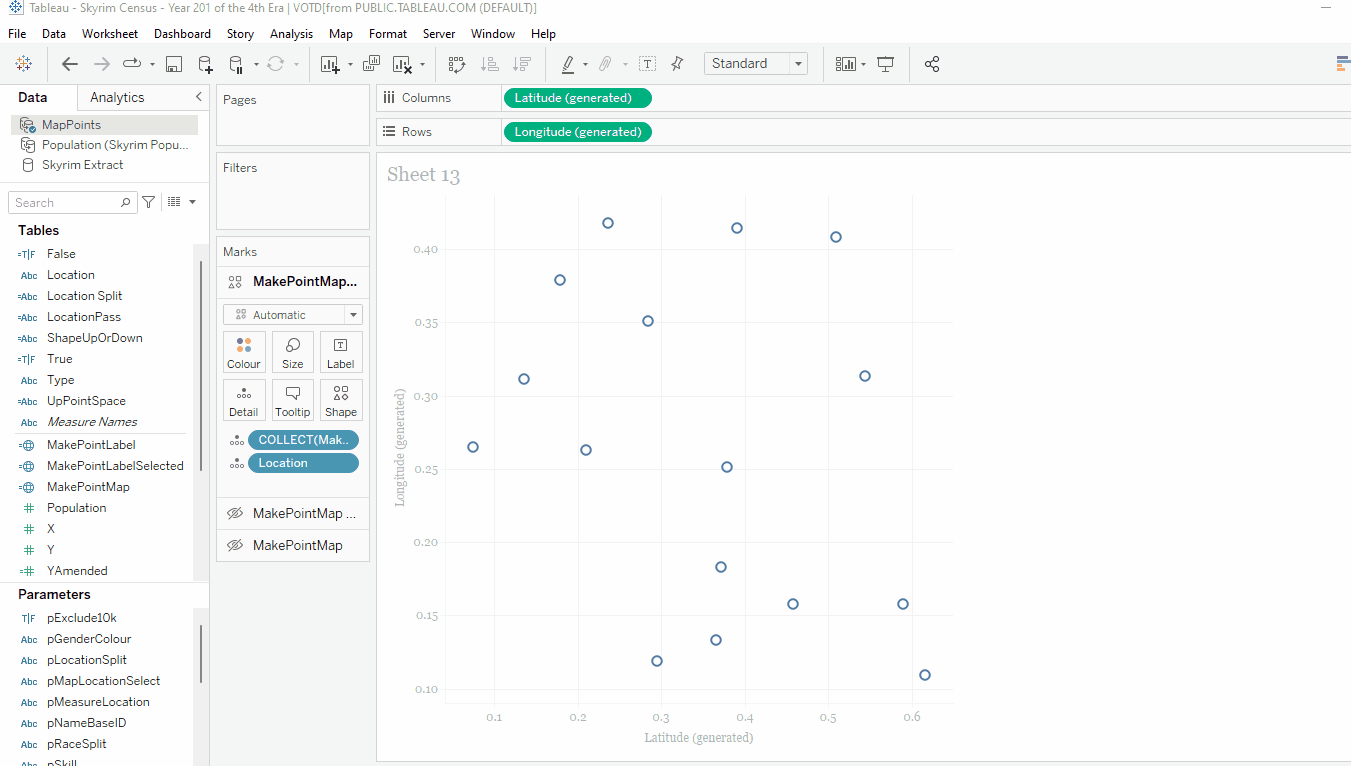
Now we can put these on the map. As per normal I would drag three of these onto the map, to make sure Tableau recognises the map layers, add location to detail and switch the axes:
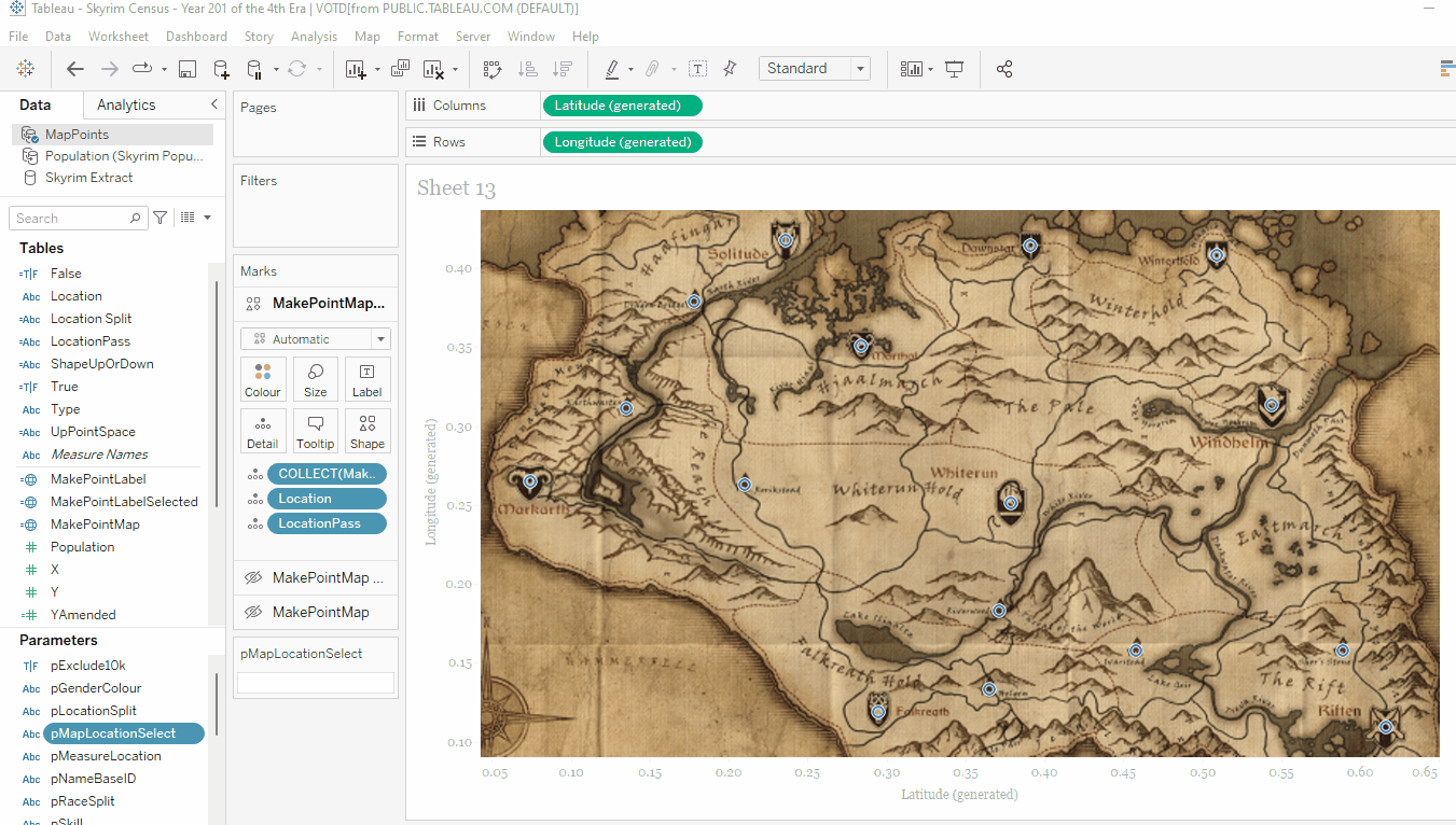
You can see the dots look about right, but it is a bit strange without any context. So next we want to add the background map. This is quite straightforward, you got to Map -> Background Images -> MapPoints (or whatever your data source name is. From here you can ‘Add Image’ which will allow you to browse for your original map file.
When chosen you can then specify the area it fills on the chart. We know our map is 696 x 522 px dimensions, and that we are dividing by 1000. So in this case we would set our X value between 0 and 0.696 and y between 0 and 0.522 to ensure the map perfectly fits the background:
You can see that the background map appears, with the dots nicely on top of the points we wanted. You will also notice the axes grow to show the whole map, which is ideal.
I will actually use this layer I have created as my selection layer, so I want to create a parameter and associated calculations that will allow the user to choose a City or Town to view:
pMapLocationSelect
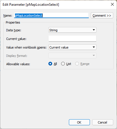
This simple string parameter will store the user’s selection.
LocationPass
if [pMapLocationSelect] = [Location] then “” else [Location] end
This calculation will decide what is passed into the parameter – if the location is already in the parameter it will send a blank value (hence hiding the mark), otherwise, it will return the location selected (and show the mark).
LocationPass gets added to the Detail shelf on the map layer, and a parameter action set up on click that updates pMapLocationSelect with the result of LocationPass. See how the parameter changes here:
This is the fundamentals all done in terms of functionality – now all I need is a couple more layers, one for the circle around the town and one for the actual label.
To get the circle, this just needs a couple of calculations:
YAmendedSelectedCity
if [pMapLocationSelect] = [Location] then
522-[Y]
END
This will only return a value if the location is selected, and null (not shown) otherwise.
MakePointLabelSelected
MAKEPOINT(X/1000, [YAmendedSelectedCity]/1000)
And this makepoint will only populate when the selected city matches.
This can be added as another layer and sized to circle the city properly:
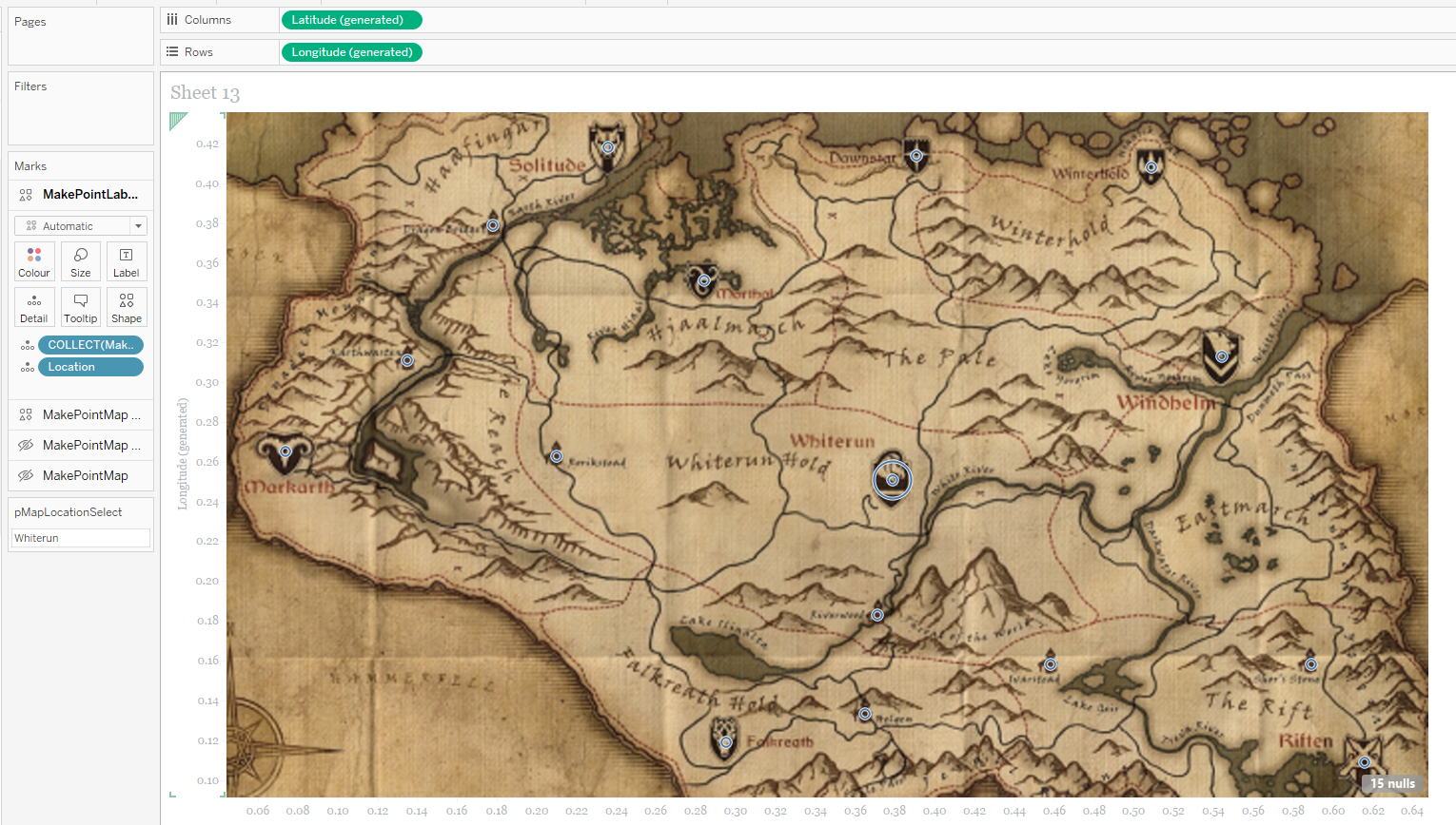
I also ended up using the ‘Type’ (city/town) field to size them both differently.
Now this layer is set up, the original layer can now be changed to a transparent shape mark so you can only see the selection:

Now finally we need to add the label.
Design and Build the Label
To design the label I went back to Figma. I used the original map image, and put that as a background to a custom polygon shape. I then cropped the background so I could get a fairly clear part of the map:
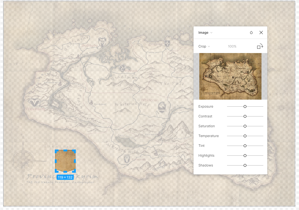
And just added a dashed border to it using a dark brown colour from the map, and created a downward and upward version of the label:
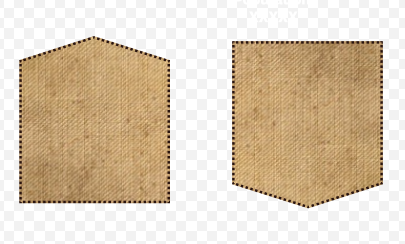
I added these to my custom shapes library in Tableau so I could then use them as icons.
To implement this in Tableau I need a few more calculations:
ShapeUpOrDown
if Y<= 261 then ‘Up’ else ‘Down’ end
This defines which shape to use based on a mid-point of the Y value.
Location Split
replace([Location],” “,char(13))
This splits any locations with a space in them onto two lines (using char(13) which is carriage return) so they fit better in the label.
UpPointSpace
if Y<=261 then char(13) end
Adds an extra space to the label at the top if the arrow is pointing Up.
YAmendedLabel
if [pMapLocationSelect] = [Location] then
if Y<= 261 then 522-[Y]-[pYChangeLabel]
else 522-[Y] +[pYChangeLabel]
END
END
This places the label at a point above or below the selected location depending on if it is above or below the mid-point of the map. I used the parameter pYChangeLabel so I could adjust this on the final dashboard to be in the correct space.
MakePointLabel
MAKEPOINT(X/1000, [YAmendedLabel]/1000)
Final makepoint calculation to place the labels.
Next we again place the new MakePointLabel onto our worksheet, adding Location Split, Type, Population and UpPointSpace to the text mark as well. Also add ShapeUpOrDown to the shape shelf and set the relevant icon to each:
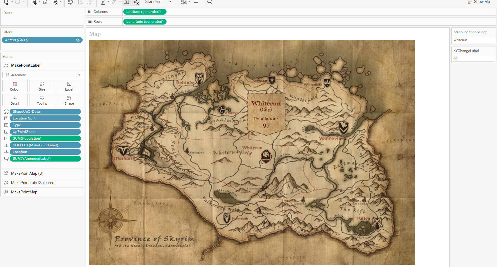
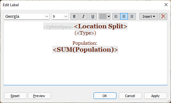
And the label format looks like:
In the worksheet the label doesn’t appear in the correct place, but this is adjusted using the parameter when it has been placed onto the dashboard.
This is all the steps done – now just time for…
Tidying Up
When everything is placed onto the dashboard in the correct position, this is the time to tidy everything up:
- Make the worksheet actions into parameter actions
- Add in some true/false ‘Deselection’ filters to deselect any mark that has been selected
- Hide any axes and remove any formatting of gridlines etc.
- Adjust the pYChangeLabel parameter to make sure the labels sit in the correct place on the final dashboard
And there we have it!
I hope you found this useful, please let me know if you have any questions. My full viz is downloadable on Tableau Public if you want to have a play!
Ant.

One thought on “Building an Interactive Skyrim Map”