The last Makeover Monday of the year! So thought it was worth a blog.
This week it looked at Cocoa imports around the world:

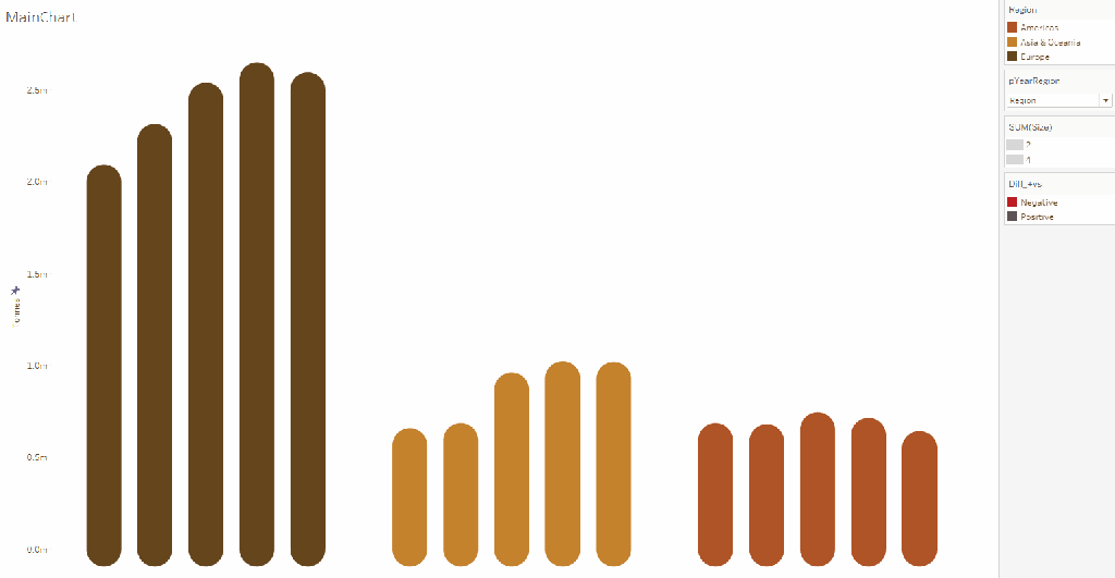
This has a lot of bright colours, and a lot of white space, you also can’t tell a huge amount other than the general trend for each region. And it is a little bland.
I decided this time round I wanted to keep the chart type as above, but also be able to animate between grouping by Region, and grouping by year, and as an added bonus, adding on a ‘Year on Year difference’ bit as well. The final visualisation came out as below:
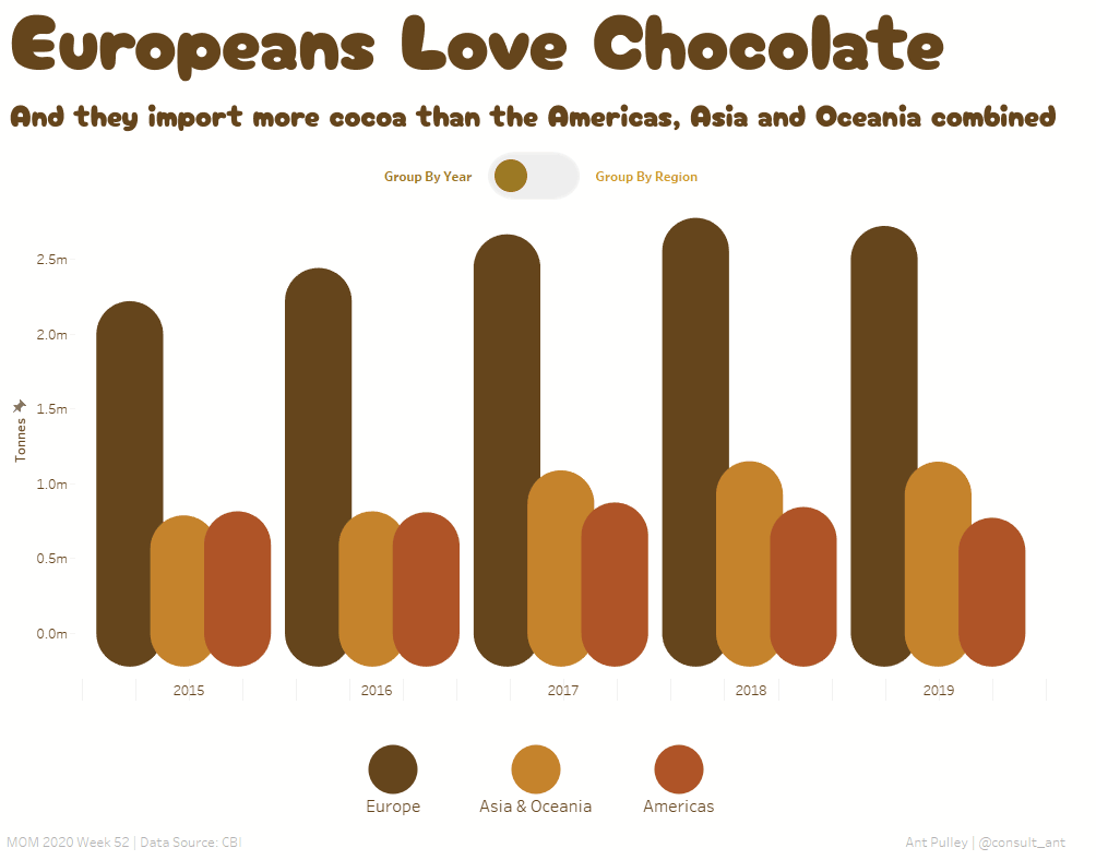
I was reasonably happy with this – even though it didn’t quite go how I had planned (e.g. I was planning on normal bars rather than rounded – although the end result I think is more chocolatey!). There were a few bits in this I thought worth sharing in this blog around Animation and a few quirks I found, and also a bit around Data Prep on this data set in order to plot the bars as you can see above.
Choosing The Chart
I wanted to create a clustered overlapping bar chart for the yearly grouping, and then a normal bar chart for the regional grouping. However to get animations working, the normal quite simple method of having a dynamic dimension on the Columns shelf (which switches based on a parameter) does not work (no animation). This is because in order for an animation to work, all the marks have to have consistent non changing Dimension values – which is not the case when you are changing them based on a parameter.
I then considered drawing the bars as Polygons and then animating these until I remembered that you cannot currently animate polygons.
There are probably other ways to do this, but given I didn’t want to spend too long on it, I decided to go down the route of using a line chart mimicking a bar chart instead. This would mean I can plot it using X and Y values, which are continuous measures, and can change these values based on a parameter and still get the animation.
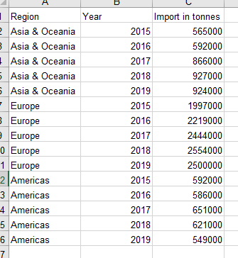
Data Prep
I decided as this was a very small data set, it wouldn’t take long to prep the data prior to loading into tableau in order for me to get the format I need to get the animation and different charts working. The raw data set looks like:
In order to plot X and Y values rather than having a categorical axis I needed to create an X and Y column, and ID column to identify the original 15 points, and a Path column to identify the how I want to draw the line.
I also needed to duplicate the data set so that one half had Path = 1 and the other Path = 2. The path 2 would contain the upper Y value (i.e. the import in tonnes) and the Path 1 would contain 0 (so the start of the ‘bar’). This gets something like the below:
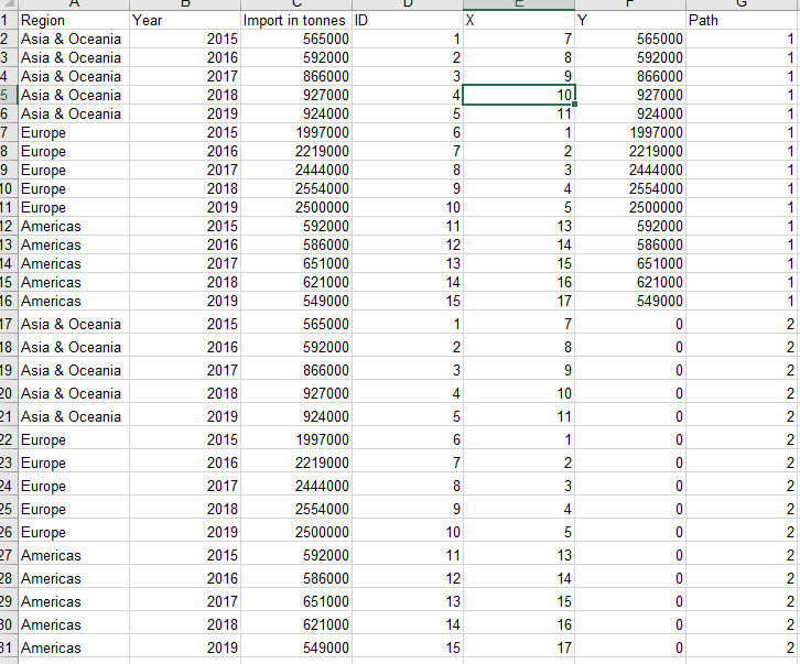
Here you can see I have filled in the X values so that the positions for the Region grouping view are as I like – so in Year order, but also having Europe first (as it is the largest).
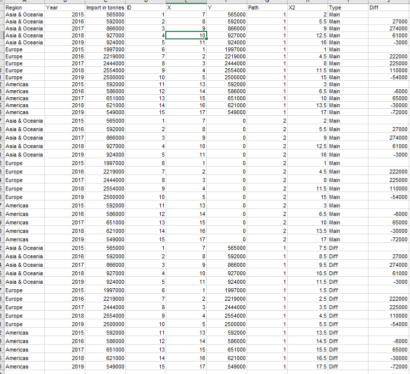
This gets me what I need for one chart, but I need to be able to also group by Year, and then bring in the Differences. To do this I add in X2 containing the alternate X positions, a Type column to differentiate between main charts and Difference numbers and a Difference column for the year on year differences. I needed to create a third duplicate of the data to hold the difference data – the final data looked like this:
Building the Viz
To make the basic switch between Region and Year groupings, I need to make a few calculations and a parameter:
Parameter pYearRegion:
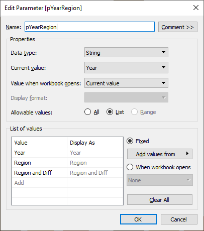
This controls what view we see – choices are Year, Region and Region and Difference. We will deal with the third later.
Calculation UpdateX:
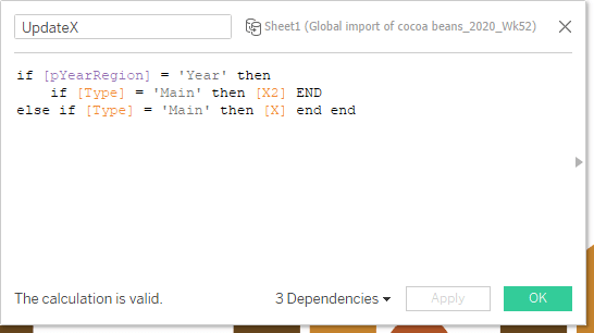
This chooses what X value we want to plot based on the pYearRegion parameter – it also only returns values for ‘Main’ type (i.e. nulls out the Difference data so we don’t see it).
Calculation YCalc:
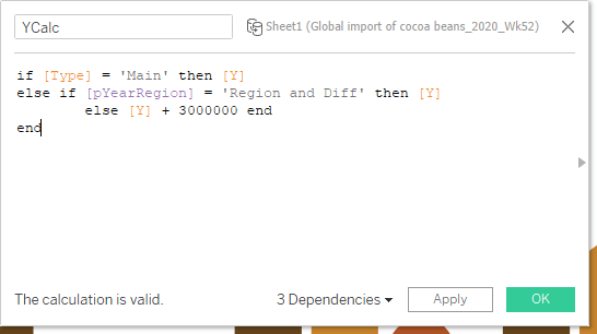
This returns the Y value we want, which is ‘Y’ for any Type = Main, but it Y + 3,000,000 for when ‘Region and Diff’ is selected. This means the difference part of the view gets put off the canvas until it is required (3,000,000 is above the maximum Y anywhere else).
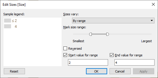
Calculation Size:
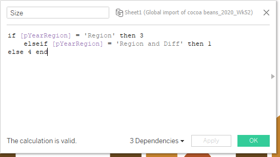
This changes the size I want the ‘bars’ to be based on the parameter chosen. Big when ‘Year’ is selected as I wanted them to overlap, small when Difference is also selected so there is room for the additional bar, and in between for ‘Region’ as I wanted the bars to be close together.
With these set up you can set the viz up like below:
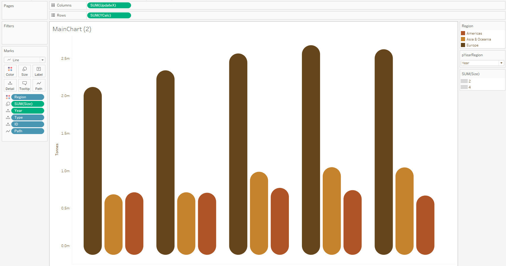
Make sure UpdateX, YCalc and Size are all set as measures and continuous for this to work. Also I fixed my X axis so it didn’t move about when the sizes were changing. ‘ID’ goes on detail and ‘Path’ on path in order to get the lines drawn and linked to each individual element.
Set animations to be on for the sheet (Format -> Animations) and then this should have the desired behaviour:
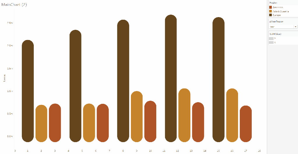
Notice not much happens when ‘and Difference’ is selected other than the bars change size. Also you will need to play around with the size settings to get this to work on the dashboard:
To add the difference element to the viz, I need a few more calcs:
Calculation UpdateX (Copy):
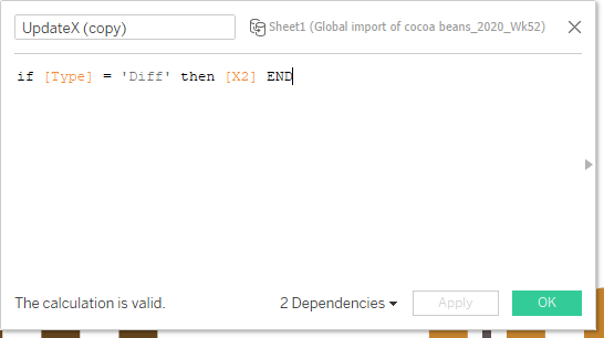
This is just a copy of the other calc, this time only putting a value in for type = ‘Diff’ so that the rest of the data doesn’t show up.
Calculation DiffSize:
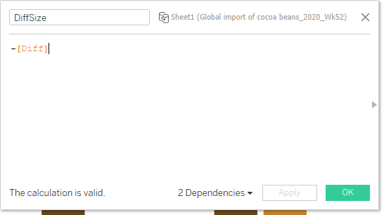
This is just the negative of ‘Diff’ which we need to get the size of the bar in the correct direction.
Calculation Diff_+vs
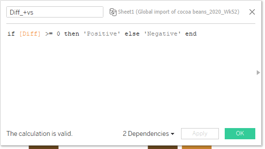
This is to get a colour for our difference bar (negative or positive).
With these created, you can select ‘Region and Diff’ from the parameter menu and add in the elements to the viz:
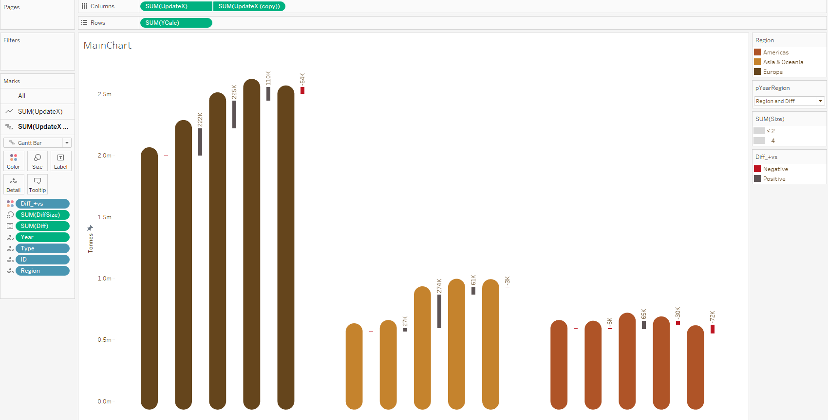
UpdateX (copy) gets put on Columns and made a dual axis – make sure to synchronise it! Change the mark type to Gantt Bar .Our Diff_+vs goes onto colour, and DiffSize gets added to the size shelf. Then you should see the chart coming together. Amend the Label to include the difference amount and set it to appear at the top of the mark. You should also see the animation working as expected!
You can see now the Gantt bars come in from above, and animate out the same way – this is because they are always on the chart, just above the range we fixed the Y axis too – so they move downwards when required.
And this is the main workings of the dashboard!
Tidy Up
For tidying up I needed to make a few buttons. One I made as a slider for Year and Region, and they other one was a button that toggled the Gantt view on and off (I updated this from my original button design as I saw Tamas Varga @imperativusz did a viz this week using a good button design). This latter button was set to be ‘White’ when ‘Year’ is chosen, as we can’t add Gantt to the year view.
I also did the text in Figma using the same colour as the European parts of the chart.
I added in two additional sheets for the X axis – one to show the Years grouped, and one when they were regional grouped.
Finally I added a custom Key to show the three colours related to regions.
Animation Issues
I had a few issues with the animation beyond not being able to do this with normal bars.
I noticed that on Tableau Public, the labels for the Difference Gantt’s don’t seem to animate in for some reason, despite doing it on desktop, so not sure why that is.
I also had fun when sorting out my buttons. Initially I had the ‘Difference’ button as a hiding sheet, but this seemed to break the animation doing it this way, so I changed it to set the font to White when not needed instead.
Done!
And here is the final product:

I hope this all made sense – if not please drop me a line and feel free to ask anything! You can find the interactive version here: https://public.tableau.com/views/EuropeansLoveChocolate/EuropeLovesChocolate?:language=en-GB&:display_count=y&:origin=viz_share_link
Ant.

2 thoughts on “Makeover Monday 2020 – Week 52 – Animations and Parameters”