I thought I would write a quick blog on this Makeover Monday as I combined a few different things I have done before into one, and also this is the first viz I have published making use of Pages and animating them.
Concept
The original chart looked like this:

I wanted to do something that would show the relative size of an ‘Average Worker’ compensation against the CEO equivalent, and I wanted to try this using squares. I also wanted to try out page animations and make it so that the relative sizes changed over time and to add a little bit of humour in there with some speech bubbles narrating the story.
This is what I ended up with:

This involved using Polygons to build the squares, Map Layers to enable the year label (text mark) and speech bubble (shape mark) as well as the Polygon marks. It also used the Pages shelf to cycle through the years.
Polygons
To build the two polygons, I need to add extra data to my data set so that I have 8 sets of coordiates for each year – 4 for the orange ‘Worker’ block and 4 for the blue ‘CEO’ block. This essentially means I increase the data file by 8 times.
The original data set looked like this:

And the additional coordinate data looks like this:

This gives me a point ID that I will need for drawing the polygon and a ‘Type’ which I can use for colouring and identification.
I then join these together in Tableau:

This uses an Inner join and a ‘Join Calculation’ set to 1 for each side. This means that it will perform a ‘Cartesian’ join and join every member from one table to the other meaning we end up with 8 records for each year.
With the data set up, I then need a few calculations to draw the polygons.
[1/Realised]
I want my CEO Square to always stay the same size, and my Worker square to decrease over time (to keep the visual smooth). So to do this I need to first work out the value of a ‘Worker’ if the ‘CEO’ is equal to 1:

This is a simple calculation as the CEO data is already presented as a ratio anyway. Also note I have decided to only use the ‘Realized’ measure in this viz. Also notice my inconsistency in spelling ‘Realised’.
[X2]
Next I need an X coordinate.

Here you can see I am drawing the four points for each type. The CEO square will always be 1 unit square so these numbers are hard coded.
The ‘Norm’ (worker) coordinate will be based off the [1/Realised] measure we just calculated. This will also be the square root as we are looking at the area of the square and not the length (i.e. if this was a bar chart where the end user is only measuring length, we would not square root this value).
[Y2]
This is exactly the same as [X2] as we are working with squares:

[Coordinates]
Finally as I will be using Map layers for this viz, I need to take the X and Y coordinates and turn them into Points using MAKEPOINT (note, for a great intro to using Map Layers in this way, check out this blog by Luke Stanke: https://www.tessellationtech.io/beyond-dual-axis/):

To build the view I need to drag ‘Coordinates’ into the view (defaulting the chart to a ‘Map’ type, change the mark type to ‘Polygon’, add ‘Type’ to colour, and Year to pages and ‘Point’ to path (this plots the order Tableau draws the Polygon) so it looks like this:

And this is the fundamentals built – now we need to label it up.
Year Label
Polygons in Tableau don’t allow you to add a label, so we need to add this separately. This will involve another MAKEPOINT calculation:
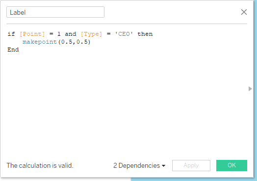
This will add the year into the view at point 0.5, 0.5 – so right in the middle of the CEO square. Also note I have chosen Type = CEO and Point = 1. This is so I only get one label showing per year.
Now you simply drag this onto the viz as another Map layer and change the mark type to text – then drag ‘Year’ onto the text shelf:

And this label can now be formatted as you like.
Speech Bubbles
I wanted to add a bit of levity to this viz by adding some speech bubbles that changed as the years moved on. For this, I created four images in Figma containing the text and speech bubbles and saved these into my ‘Shapes’ folder in my Tableau Repository so I can reference them in the view.
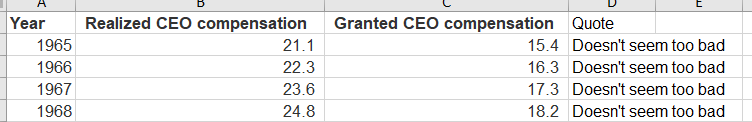
I also added a column to my data set of the comments so I can assign the correct shape – I ran through the viz at this point a few times so I could decide where I wanted my ‘Commentary’ to appear:
A final calculation was needed to decide where to position the speech bubble, and this needed a little trial and error to find the correct point:

I wanted to the quote to appear at the top right corner of the ‘Norm’ square – so I took Point 3 (the top right point) and ‘Type’ = ‘Norm’ to use those coordinates with an offset to position the shape. These hard coded offsets were what I would use to tweak the position.
Note using the ‘Apply’ button means you can make changes and see what is happening to the Viz without closing down the calculation window making it really easy to keep tweaking.
‘QuoteLocation’ is dragged onto the viz as a third map layer, the type is changed to ‘Shape’ and then the ‘Quote’ field I added to the data set is put on the Shape card. Then I drag the ‘Size’ slider up to full to get the below:

And this is the viz built, all in one sheet. Nice!
Page Controls
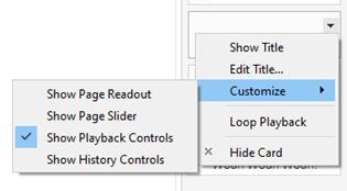
I can now put this sheet on the dashboard and add my page controls for the animation. I decided to only show the playback control options on my pages card by changing the options like this:
I just floated it above my one sheet viz and set the speed to high in order to record my gif:
Note I have also added a background image built in Figma for the titles and Key.
One thing to note about the page controls is that you get a slightly different experience on Tableau Public vs in Desktop. Here is what I have noticed:
- Speed controls don’t appear in Public so you are limited to a slow speed
- The size of the playback buttons renders differently so you tend to have to make the object Taller in desktop so it appears properly in Public
- If you include the page readout or slider options, these also have some visual differences
And there we have it! Interactive link here:
Final Thoughts and ScreenToGif
This was a nice one to try out a few different things, as each element was relatively simple (not too many map layers, simple polygons). And also good to see the performance differences between Public and Desktop with the pages controls.
I’ve been asked a few times what I use to record my viz gifs. I use ‘ScreenToGif’ (https://www.screentogif.com/) which is a free download and really easy to use! I like to make a gif as often as I can.
Hope you have found this interesting or helpful – hopefully even both!
Thanks,
Ant,
