Hi everyone! I wanted to get in on the action and write a blog about my Iron Viz experience.
This blog is in two sections as I wanted to reflect on how I found my first IronViz competition, but also wanted to go through in a little bit more detail how I built my entry:
How I found it
This was my first entry into #IronViz and also the first time I really saw how it all worked, as I didn’t enter the Tableau Public and Social side of things until August last year. So although I was aware it existed, I didn’t really have any idea how it worked! If you haven’t heard of it before – have a read of this: iron-viz
The theme for this year was ‘Data + Joy‘ which is really wide – wider than I thought it would be – but luckily that worked out for me. I’ve had a few ideas on my list to do for a while, and one of them was related to the 10 year anniversary of the swing band I am in – so this presented an opportunity to really put some time and thought into it and try and get something that I could enter into the competition but also share with the band.
My focus on Tableau Public prior to participating in this was mainly Makeover Mondays and a few other initiatives, but I had never spent a large amount of time designing a viz or prepping the data. This was the first big difference I noticed when I started the viz – I had to think a bit more long term and not rush things (like I tend to do with the weekly vizzes!).
Spending more time on it meant I also had time to think on certain design elements, and the curvy musical staff timeline – which is the core of my viz- actually took a while to come. This wouldn’t have happened if I had rushed it!
In terms of the three elements of the judging – Storytelling, Design and Analysis – I’ll admit I didn’t focus too much on these and more on enjoying the experience and building something I was really happy with. I think in the end I probably did ok on Storytelling and Design, but not really sure I did enough on the Analysis side – but I can live with that!
I’d seen a few excellent early entries into IronViz on twitter (like Brian Moore’s Marvel viz) which did make me second guess a little bit around what I was doing (is mine really good enough etc.) – but I just kept reminding myself that it isn’t about what other people are doing, it is about making the best viz you can and be happy and proud of it. I’d say I did manage that, and I ended up submitting mine pretty early too (not long after CJ Mayes’ excellent entry).
I actually decided to go earlier than planned – mainly because I had pretty much finished, and I knew that if I didn’t submit, I would spend the next week or so making relatively pointless tweaks, and I just wanted to submit it and relax to watch the other entries roll in! I was glad I did it this way as it meant I could enjoy (and be often in awe) of all the other entries coming in – I couldn’t believe the quality of vizzes that people were putting out. Again I did question at times if mine was ‘Good Enough’, but went back to my earlier original point of being proud of what I had produced – and I was.
Sarah Bartlett shared this tweet towards the end of the entry period, and I couldn’t agree more!
I thoroughly enjoyed the experience, particularly the last weekend of submissions, and would recommend anyone one the fence about entering to just do it next time – you do get swept up in it!
Now am looking forward to seeing how the judging goes!
How I did it
I wanted to also write a more technical part of the blog where I spoke about how I built the viz – this isn’t a complete walkthrough, but an overview and some notes along the way. The bulk of it was pretty straightforward to be honest – but the main technical part of it was the curvy timeline.
The Idea
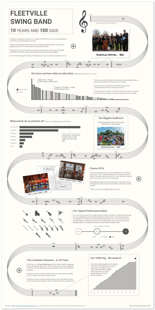
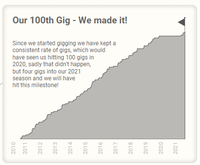
As I mentioned above – I had an idea to do some kind of viz on my band as it had hit it’s 10 year anniversay in 2020 and was approaching 100 gigs in 2021. I’ve been part of this band for most of that time, and have directed it for a while as well as being on the committee – so definitely something that brings me joy!
The Data
There were a number of pieces of data I used throughout the viz.
- Performance List – a list of the gigs and dates we played
- Gig Lists – a list of the numbers we played in a subset of these gigs
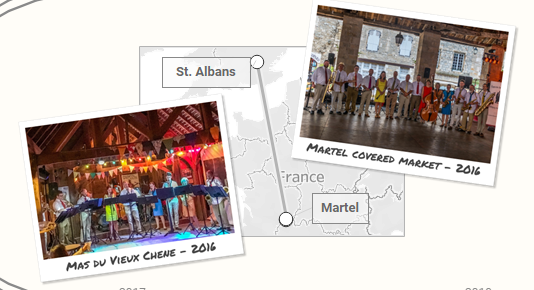
- Longitude/Latitude for St Albans and Martel – for our Tour to France
- Band Makeup – our minimum, typical and maximum band sizes.
- YouTube links – for our various performances
The performance list was simple to get hold of – it is stored on our website (www.fleetvilleswingband.co.uk) and just required a small amount of tidying before using.
For the gig lists, I was lucky enough that I directed the band for a number of years and kept hold of all of the music lists we had for the gigs. I was able to get hold of some of the additional gig lists as well as the ones I had kept, so ended up with about 6-7 years worth of lists – which was great!
All of the gig list data I had was on separate excel spreadsheets – so I actually tried my hand at some very basic Python to pull them all together. I actually did this a while ago before the IronViz was announced as I was interested in trying some Python – unfortunately I can’t find the Python script I ran, but suffice to say it was very basic!
The Longitute/Latitude data was from trusty Google Maps.
For the Band Makeup data – this was pulled from subject matter knowledge and attendance at gigs – so I was able to collate a simple data set showing the min/normal/max band size and specific instrument numbers.
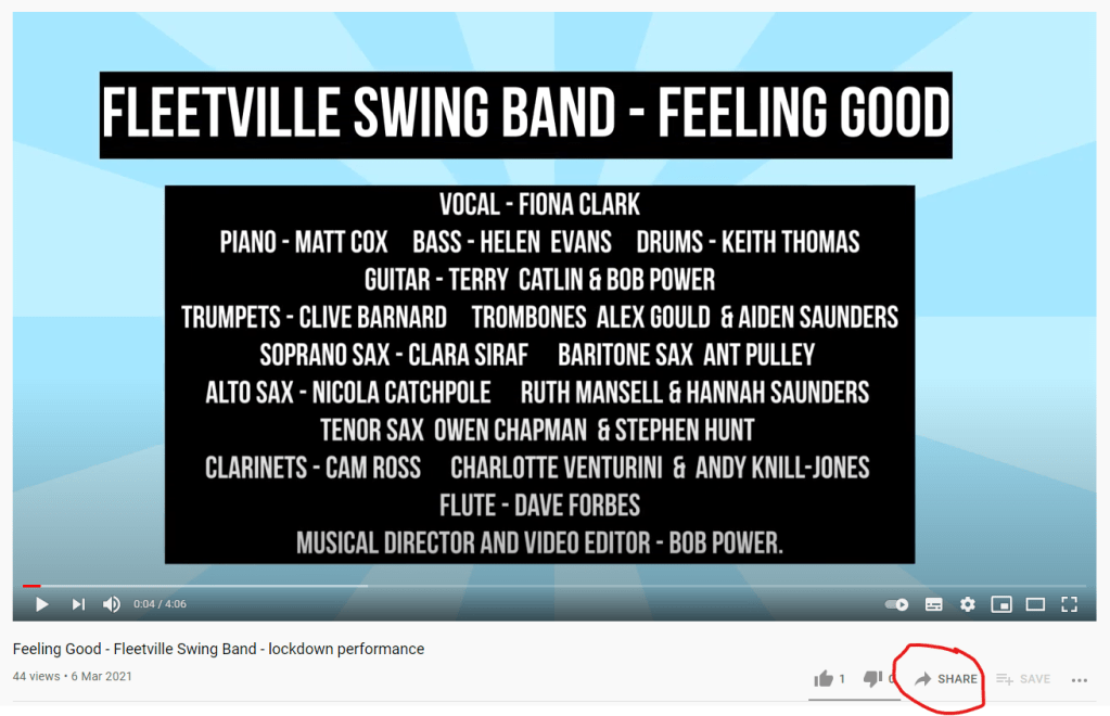
We have a You Tube channel where I was able to get the links (Fleetville Band).
The Story
My story idea was pretty straightforward – it was fundamentally a ‘tour’ of the 10 years we have been playing together, showing how we have reached our 100 gigs and giving some information and context on what we play and how we are set up.
As the fundamental element of my design was a timeline, this lends itself quite well to the feeling of a story, and with the end goal essentially being our 100 gigs.
I wanted it to work as a one page viz, but also have some interactivity and drill-ability in it as well (as I love that kind of thing!)
The Design
I went through plenty of sketches on my tablet before I settled on something! I started with this:
So initially I was very much keeping it sectioned out, focusing on specific things in each block. I had a timeline in the first section but it was pretty basic.
I then had a bit more of a play round:
Here I introduced a curvy timeline at the top, a band makeup section and something networky for our tunes. I sat on this for a while until I had a bit of a brainwave for the timeline:
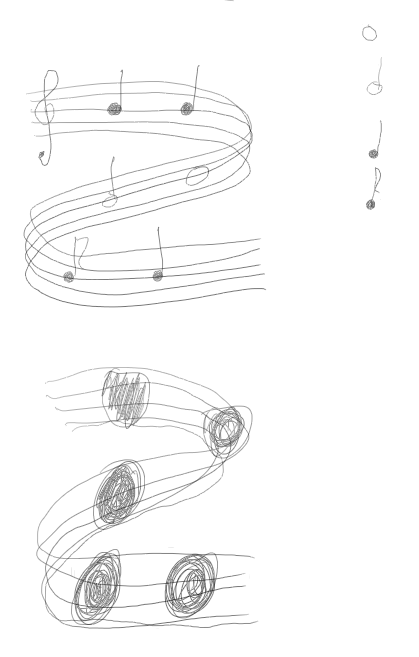
This was when I decided to introduce the musical Staff to my timeline, and this is where the theme of my viz really came together. I thought if I can get a curvy timeline to work like this it would be a really cool idea for the focus of the viz.
For those who aren’t aware – a Staff is what you see in all sheet music, and consists of 5 lines which notes get places on. The lines refer to the pitch of the note.
I played around with having notes as markers vs. just shapes, and potentially using the notes as a key.
From this I decided to make the timeline more of a focus on the viz – and thought about picking out specific points on it to show the story – as shown below.
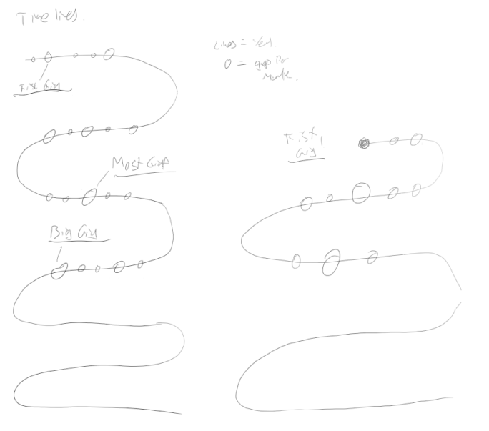
I then came back to my ‘Block’ approach of having different sections, but this time dotting them in between the curvy timeline – and this is ultimately what I ended up more or less going with.

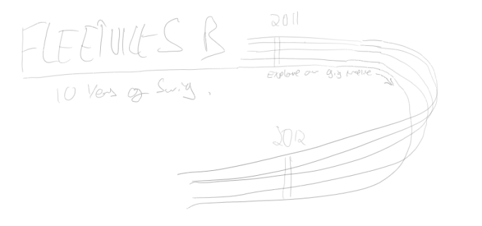
The very final sketch I did before I started making sure it all works was the above, which basically mirrors the top of the actual final viz – here I had a title, added bar lines and year labels, and added the ‘explore our gigs’ text.
From these sketches I then jumped fully into Tableau (and some Figma) to complete the viz.
The Timeline Build
This was the main event, and underpins the rest of the design. The backbone of this was the excellent tutorial by Ken Flerlage (Curvy Timeline Tutorial) which I adapted a little to get my 5 lines working. I should probably now insert this quote from Ken which I am rather proud of!
I followed the tutorial pretty closely, although I didn’t use the supplied templates. As my timeline was working with days, and not years I decided to build this out myself.
The main differences between what I did and the tutorial were:
- I used Days as the level of detail rather than years (and yes I know this meant I was going to have a lot of rows!)
- I duplicated the data in the densification page 5 times – so I had one for each line of the staff – and named each of these separately
- I introduced a ‘StaveOffset’ parameter – which basically altered the ‘Y’ coordinates up or down by a certain amount to get the distance between the staff lines. I set it as a parameter so I could tweak it easily
- I Introduced a ‘Curve Parameter’ which controlled how the curved edge worked – also allowing me to tweak it easily
- I used Map Layers to make my viz so I could also add some additional elements (e.g. year label, bar lines) – if you haven’t used this approach before I would suggest looking at Luke Stanke’s blog on it (https://www.tessellationtech.io/beyond-dual-axis/)
Once I had this set up, it was relatively easy to get the other elements in.
Note
As I had expected, using days and densifying by 20 records for each day, and having 5 timelines – this meant the number of rows got very large and performance dipped. I found a nifty way to reduce this burden when I realised that for most of the dates, I only need one point – it is only the curved sections I need all 20 densification points. So I created a filter field that looked like this:

Basically this checked the ‘Curved’ field and if it was ‘None’ (i.e. no curve) it would only keep the ID of 1 – filtering out the other 19 records. this significantly reduced my performance and also improved the visual due to having a lot less marks on the line.
The Bar lines (year markers) I created by making a line between the different staff lines using the day, but only displaying one of these at the start of each year and filtering out the rest. The Bar line labels worked the same way.
For the ‘Rest’ and ‘Pause’ notation in year 2020 (this is musical notation for no playing and an elongated pause) I did a similar thing for the bar lines, but only filtered on one specific date.
I’m pretty happy with how this turned out!
Other Viz Build
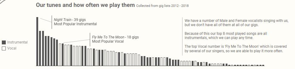
The other vizzes on page were all fairly straight forward. I used bar charts for the most played numbers, and types of gigs sections:
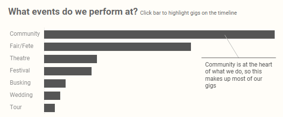
For the second of the above – I included a parameter action that highlighted the relevant gigs on the timeline (as I can’t do a viz without a parameter action!).
For both of the above I also used the annotation function to add the text to to the charts.
I used a simple map to show the tour we did to Fance:
The instrument/band section was just an icon map and a dot plot:
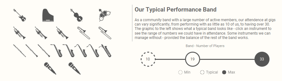
I sourced the icons from Noun Project and recoloured. And I created the dot plot icons in Figma. I used another parameter action for when the user clicks on an instrument to change the dot plot.
The final viz was a simple area chart to show the number of gigs performed over time:
You Tube Embeds
I have three show/hide containers on the viz which allow the user to watch YouTube clips of the band. This is pretty straightforward to do and uses the ‘Web Page’ object in Tableau.
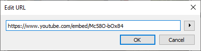
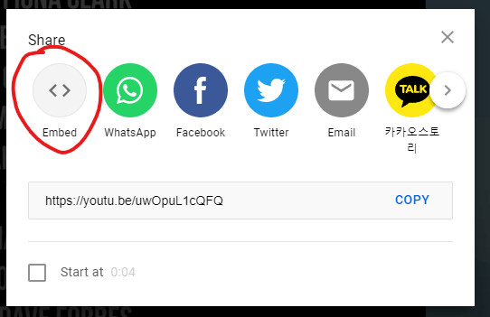
You can drag the object into the dashboard and add a URL link. You can just use the standard YouTube link, but this will display the whole webpage in a (potentially) small container. I opted for using the embedded YouTube link which means the video will fill up your entire container. You can get the embed link from a YouTube clip by hitting ‘Share’ -> ‘Embed’ and then finding the link in double quotes from that output:

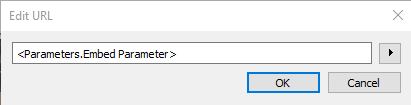
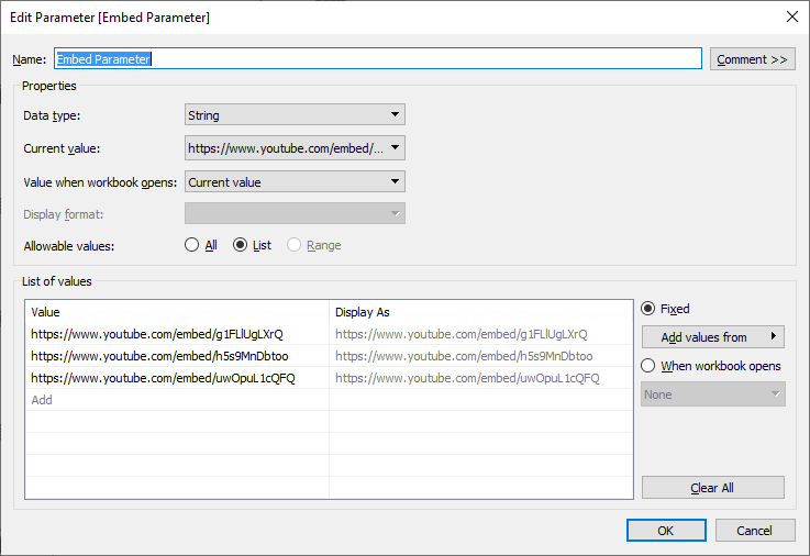
For the very last YouTube embed I had, the user could choose between three videos. This can be done with a parameter action again – where the parameter is updated with the embed URL, making the container dynamic:
Tableau/Figma
Most of this viz was built in Tableau – I kept all the text in Roboto so I knew it would render well on the server, and it meant I didn’t have to back and forth too much with Figma. But some elements I did build in it. Here is my (very messy) Figma file for your amusement:
Background
The overall background is just a simple drop shadow rectangle. There are also some simple backgrounds for the title and a couple of the other elements
Pictures
Thanks to Stu Mack for the suggestion of ‘Polaroid’ style pictures. I used pictures from our website and added text and the polaroid style in Figma.
Icons
The instrument icons are recoloured noun project icons (referenced on the viz), and the ‘Treble Clef’ was a free png image I found and recoloured.
The rest of the icons I built myself in figma.
A couple of little extras
I added a couple of extra things that people may not notice at a glance
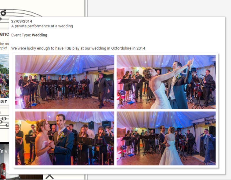
My Wedding – FSB played at my wedding on the 27th Septeber 2014. On the timeline this is represented by an engagement ring rather than a note like all the other gigs. Also when you hover over it you will be greeted by some pictures one of the band members took on the day! This was done using a hover parameter action and a viz in tooltip.
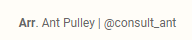
Arr – in sheet music, you will often have a composers name or an arrangers name quoted. often whoever arranged the music will have ‘Arr.’ written next to their name. So I did this against my usual name placement in the dashboard:
Round Up
A thoroughly enjoyable viz to build – as it should be! And now I hope to be able to put this much effort into all my vizzes!
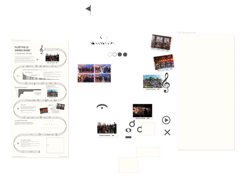
Fleetville Swing Band – 10 years and 100 gigs
Hope you enjoyed this blog – any questions on my build or anything else, please let me know!
Ant.

2 thoughts on “#IronViz – How it went and How I did it”