Hi everyone! I recently published my ‘One year of Tweets’ which has gone down pretty well – and while building it I picked up quite a few little tip and tricks I thought it would be fun to share!
I will include:
- Sectional Radar
- Diagonal Controls
- Time Chart and Dynamic Labels
- British Summer Time observation on Twitter Data
- Sheet Swapping and Padding
- Line Feed character (CHAR(10))
- ‘Default’ View Toolbar
- Background Image Swapping
- URL Actions with Parameter
- Figma Background
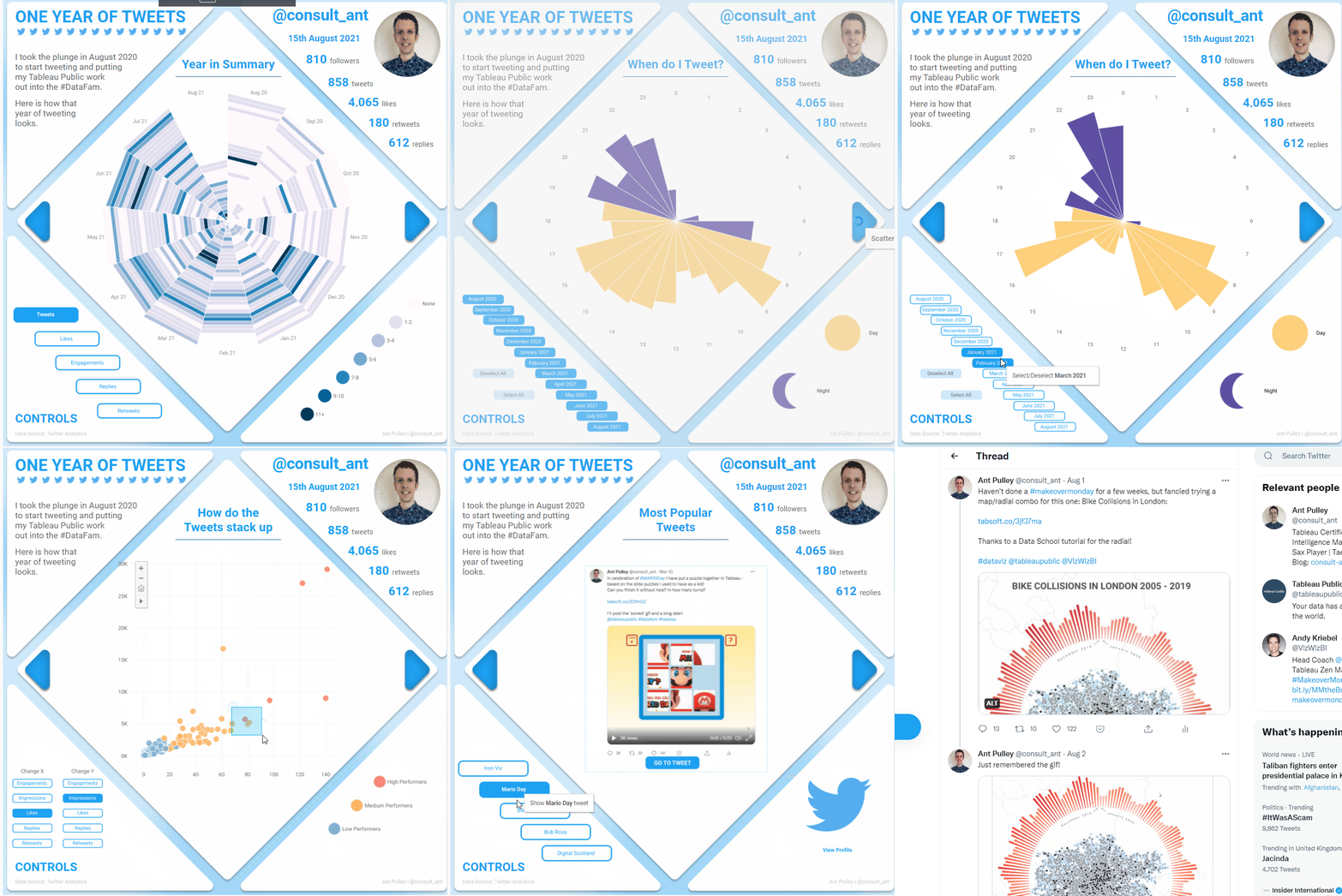
This won’t be a full walkthrough of how I built it, but will pick up on some of the techniques I found that were new to me or particularly interesting. I’m off on holiday soon so this may be a bit of a ‘Whistle Stop’ high level tour of the tips – any questions, feel free to ask!
Sectional Radar Chart
I won’t go into detail about how I built this one here, as I basically followed Kevin Flerlage’s blog post on it and tweaked it slightly for how I wanted it to look.
However I also built it using map layers, and you may be asking Why? Particularly as I only use two layers, which means I could have done this with a dual axis chart.

The answer is pretty simple – it is because originally I had planned to use more layers to add some other bits in – but by the end of the build I had decided there was enough in there already! However building it this way means I have the option to add if I want to in the future.
Diagonal Controls
For a lot of the Controls in the bottom left corner, I made them diagonal to fit the space:
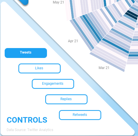
This was the first time I had tried this and was pretty straightforward – although I did it in a couple of different ways in the dashboard.
Before looking at this – if you are not familiar with this method of changing parameters using a sheet, check out a blog I did a while back on generic data sources for parameters as it goes through this.
To get the above diagonal effect, I used a calculated field to move the labels along the X axis:
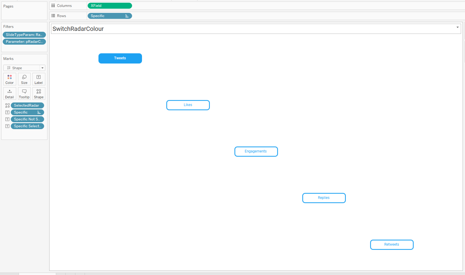

So pretty straightforward for this one.
Another method I used where I couldn’t do this so easily was for the time of day selection:
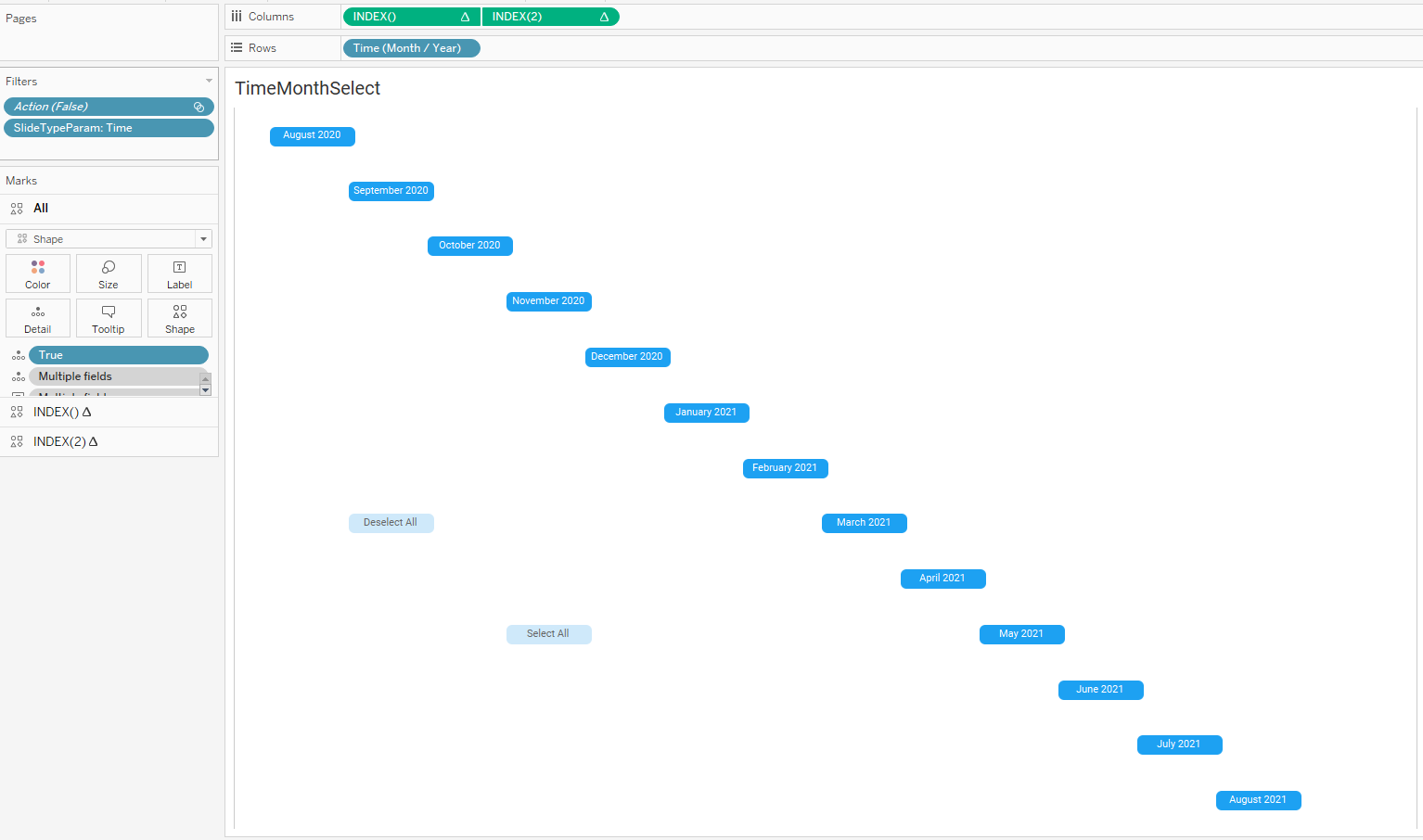
Here I actually used two INDEX functions to decide where to put the buttons. One for the months, and one for the ‘Deselect All’ and ‘Select All’ buttons.
The first INDEX() function is a straight INDEX, and the second one is based off the first:
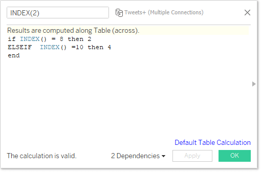
This says if the original index is 8 or 10, then put 2 or 4 (and leave null otherwise). I chose this based on how I thought the buttons looked on the sheet.
As this is a dual axis chart – I can put different things into the detail of each to enable my parameter actions to work properly when clicked. So for example the Deselect/Select buttons have this calculation in the detail:

Which will set the month parameter to ‘Null’ if you deselect all, or puts all the months in the parameter if you want to keep all.
Time Chart
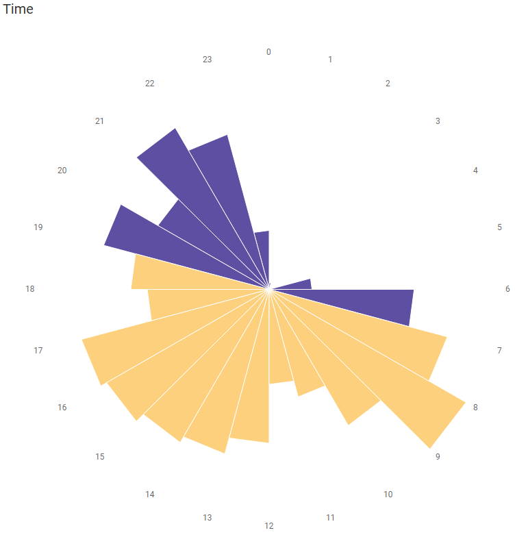
The ‘When do I tweet’ chart is built using the same basic methodology as the Sectional Radar above. The difference being I got rid of the ‘Sectional’ bit of it and just sized my ‘Radius’ on tweet counts.
The trickiest bit I had with this viz was getting the Labels to place appropriately with the bars when you are choosing different numbers of months.
In the end I worked out that I needed a different Radius field that used an LOD to work out how large it should be:

This basically finds the maximum number of tweets in a given hour period for a specific month – and fixes this over specific month so that we use the ‘Maximum’ radius for the whole of the view.
It also uses ID = 2 as this is the point on the polygon that I wanted my label to be at (i.e. it sits at the start of the polygon rather than in the middle).
BST Impact on Twitter Data
A useful tip if you are using the Twitter data that you export from the analytics pane, and you are in British Summer Time – the tweet times don’t reflect this adjustment. So basically in the summer months the twitter data will say you are posting an hour earlier than you actually did (hence it looked like I had a few posts at 5am!!). All my images in this blog I haven’t updated that yet – but hopefully I will have on Tableau Public soon!
Sheet Swapping and Padding
I utilise a lot of sheet swapping in this dashboard – which is where you use a parameter to show or hide particular sheets. Basically when the blue left and right arrows are selected by the user, a parameter updates switching the ‘View’ on the dashboard.
I’ve used this technique a lot in the past (see this post on Tableau’s help site for how this works), but this time I had three different sections where I was switching the sheets – the Main Chart area, the Controls area and the Legend Area.
Each of these three areas has a floating container which holds all of the different elements I want to cycle through. However what I found when initially doing this is that each element tends to fill up a different amount of the container, so would not fit well in the design – for example the scatter chart filled up a very large area and the radar didn’t fill as much:

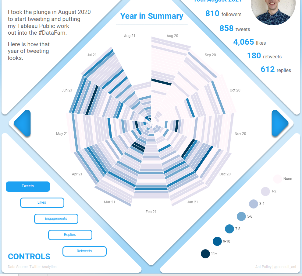
What I then happily realised is that you can use Padding to alter the fit of the element, and this doesn’t impact the collapsibility of the element when filtered out (i.e. it always filters out to 0 pixels).
Hence amending the padding on the scatter element gives me:
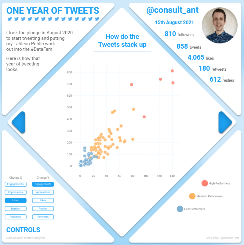
This was especially useful for fine tuning the controls and legend elements and I ended up with quite a variety of padding options!
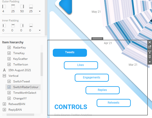
Chart Titles and CHAR(10) Line Feed
I had slight sizing issues with my chart titles – as two were slightly too long for the space:
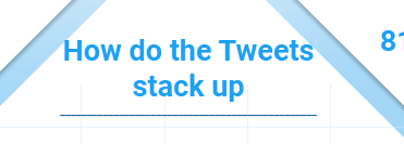
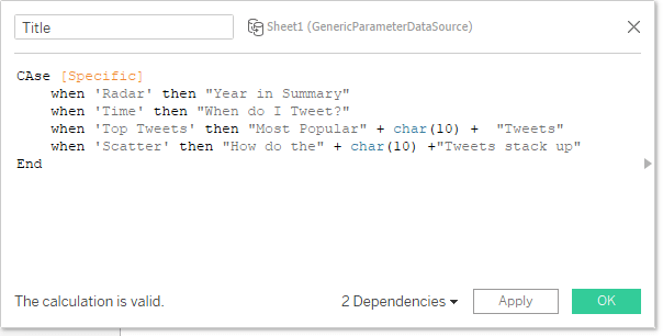
This is quite a simple fix using the Line Feed character, which is CHAR(10). This basically tells Tableau when to start a new line in a text field.
I created a ‘Title’ calculation that included this at the appropriate points to make the title fit better:
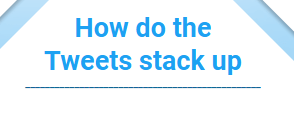
So now my title does this instead:
Setting Default View Toolbar
On my Scatter plot – I changed the default mouse behaviour to be the Zoom option rather than Select – this was as simple as publishing the dashboard with the relevant behaviour selected:
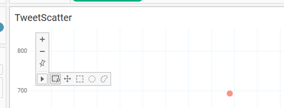
Now on Tableau Public it will default to the zoom option.
I also set my ‘Show View Toolbar’ to be ‘Show On Hover’ – so it is more easily available.
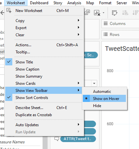
Background Image Swapping
The last slide of my dashboard showed my top 5 tweets. I did this by using the ‘Background Images’ option in tableau and screenshots from Twitter.
Firstly, the screenshots to use as images work best if they are all the same dimension – as my tweets were not the same, I used Figma to basically add a white rectangle background to each of the images that made them all the same. This background also had some space below the tweet for the button:
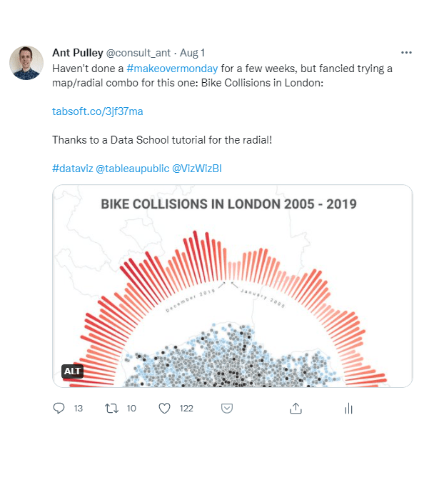
Before adding these as background images, you need to set a worksheet up that can accept them as a background. I kept it simple by using a ‘MIN’ function on each axis. I then fixed the axes at a resolution that matched the images I made in figma – I ended up with X from 0 to 1 and Y from 0 to 1.178. This kleeps the images in proportion.
Finally you can add the images using Map -> Background Images -> Add:
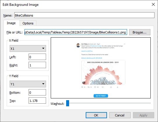
Here you enter where the image will fit (set to the same as we just set the X and Y axes). And then you can move on to the ‘Options’ page to set when this image displays (i.e. with a parameter change):
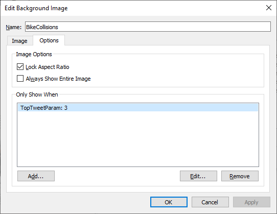
I set this for all five images as below:

And then my sheet looks like this – all done (once axes are hidden):
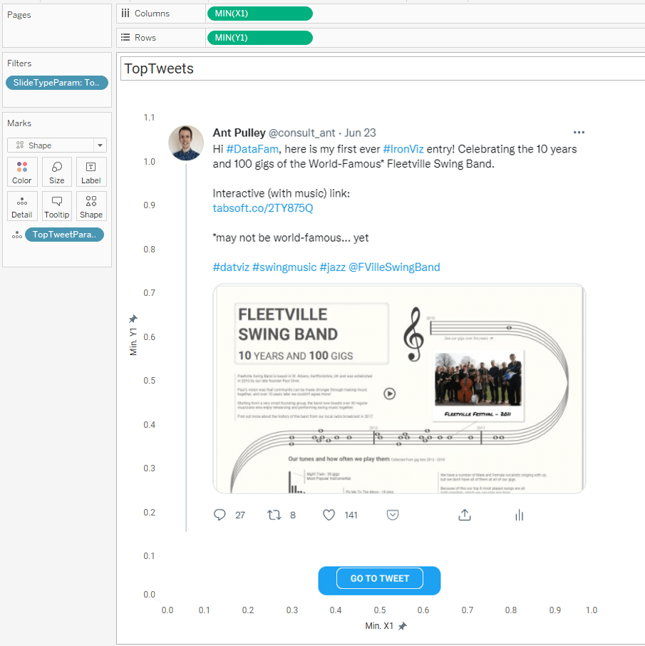
You will notice the ‘Go To Tweet’ button – this is the only mark on the sheet which I defined by the X1 and Y1 fields – and I used a custom shape built in figma.
This leads me on to…
URL Actions
These are pretty simple – and I ran mine off a parameter which stored the relevant tweet url that had been chosen.
This can be set up via ‘Dashboard -> Actions -> Add Action -> Go To URL’ to show this menu:
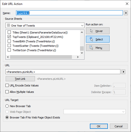
Here I am saying use the pLinkURL parameter to pick up the URL and open it on selection. The pLinkURL looks like:
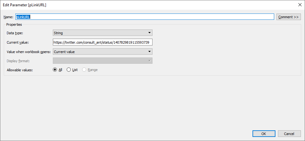
And the URL in this parameter is updated when the ‘Controls’ section is changed.
Figma Background
Finally I wanted to just roughly go over how I created the figma background:
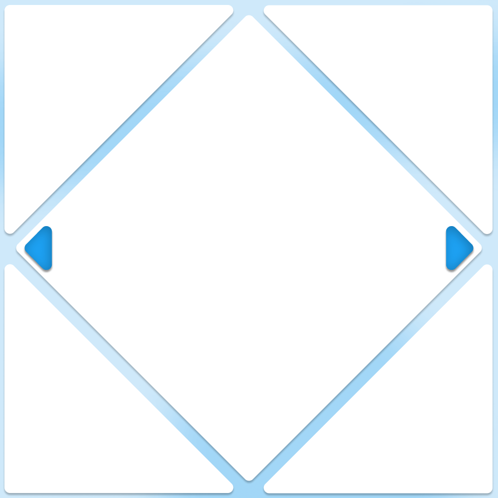
The four large white triangles and central diamond are just simple polygons with rounded edges and all with Drop Shadow effect (default option).
The small blue triangles are the same – but with an additional Inner Shadow effect.
All of this is put within a Frame, which meant I could add some texture to the background using some ellipse shapes:
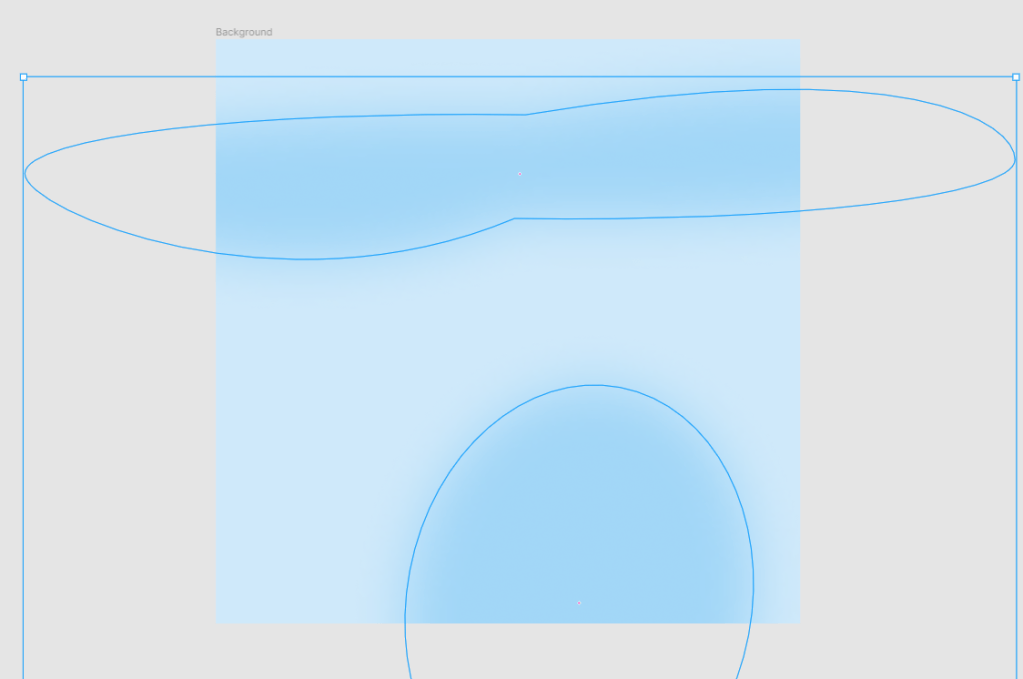
As ‘Background’ is a frame, only the stuff inside it will get exported. The ellipses I used with a strong Layer Blur effect so it was quite a subtle texture. This is the first time I have tried this and I have Lindsay Betzendahl to thank for inspiring me to give it a go – albeit very basic for now!
Wrap Up
So there area handful of varied tips and techniques that I used throughout this – I hope you may find some of them useful. As I said at the top, a bit of a Whistle Stop tour, so please contact me if you have any questions or thoughts!
Link to the full dashboard is: One Year of Tweets
Thanks!
Ant.
One thought on “Tips and Tricks from my Twitter Viz”